
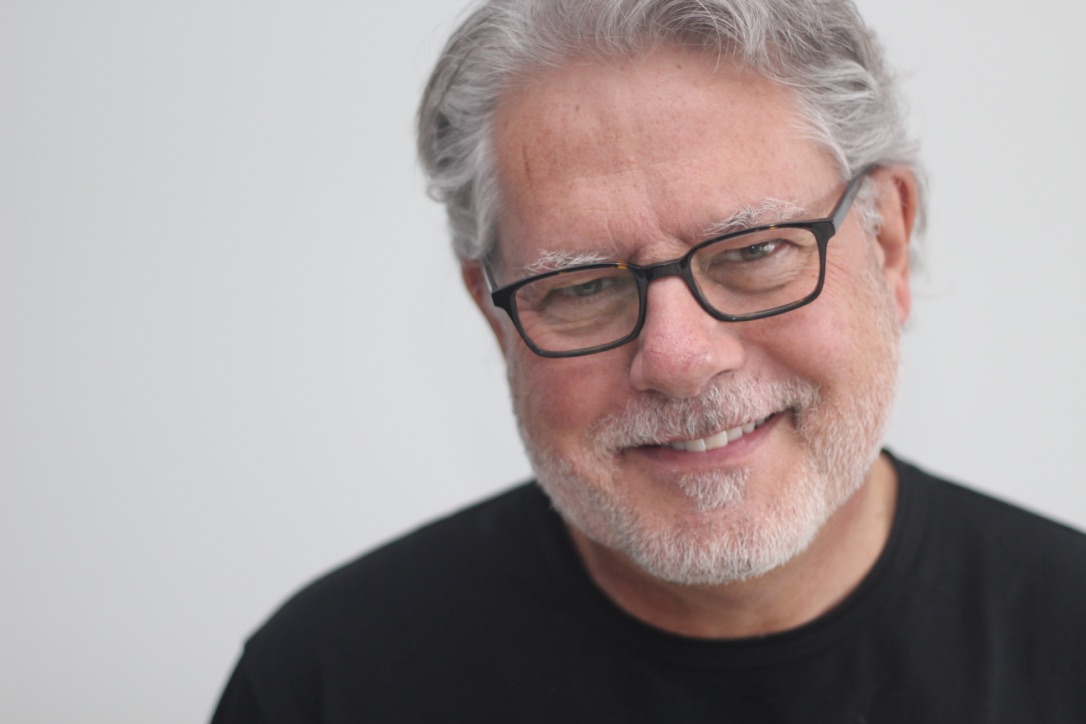
KAREL VREDENBURG
Check out my blogging, teaching, podcasting, Changemaking, coaching, keynoting, consulting, and plant-based living.
Try my new chatbot for quick answers!
Blogging
I’ve been actively blogging for a number of years on a very wide range of topics largely focused on improving the human condition through design, research, psychology, and technology as well as more recently addressing global challenges. Check it out.

Teaching
I’m an Industry Professor in Design at the DeGroote Schools of Business and Medicine at McMaster University. I teach in the EMBA, Directors College, and National Health Fellows programs.
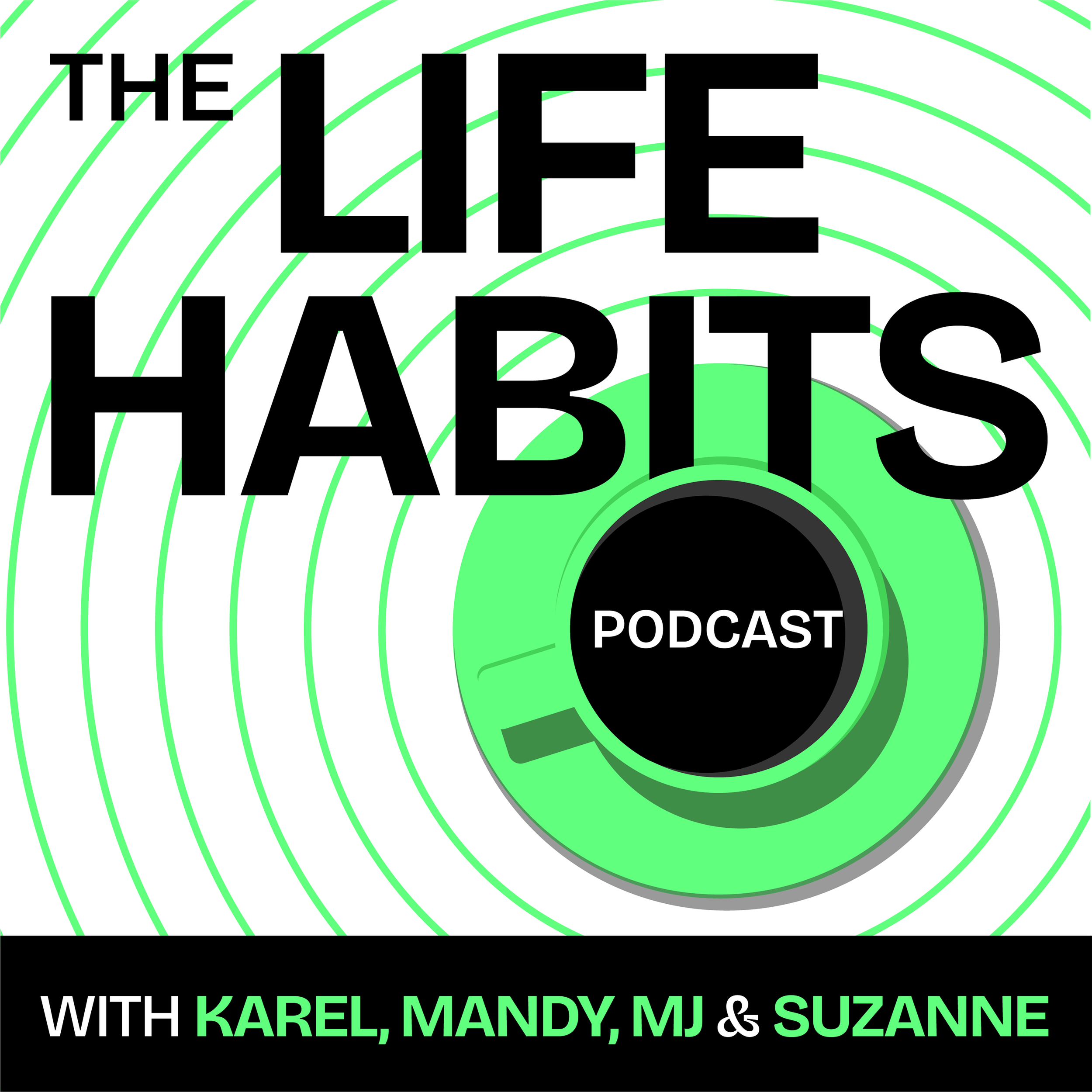
Podcasting
I founded and have hosted the Life Habits Podcast for more than 18 years, the last few months of which with my new amazing permanent co-hosts, Mandy Kloppers, MJ Shaar, and Suzanne Joy Clark. It’s been a purely audio podcast up until recently when we’ve also put out video versions on YouTube. Check it out for yourself.
Most recent Podcast episodes
Changemaking
Carly Williams and I founded the Habits for a Better World nonprofit to address global challenges like climate change, animal and human suffering, food insecurity, human illness, biodiversity loss, and AI. We’ve combined our skills and expertise along with more than 400+ volunteers to take a research-based approach to meet people where they are and social media, website, AI, digital community, and a film-based one to get those ideas out in the world to inspire people to adopt habits to create a better world.
Coaching
While my podcast offers guidance from my voice to yours and my co-hosts and guest voices too, true transformation often occurs in a more interactive setting. Having been a dedicated career and life coach throughout my tenure at IBM, I was asked now that I’m retired to provide online coaching during times I’m not co-leading Habits for a Better World, blogging, podcasting, and teaching. Check it out and sign up if interested.

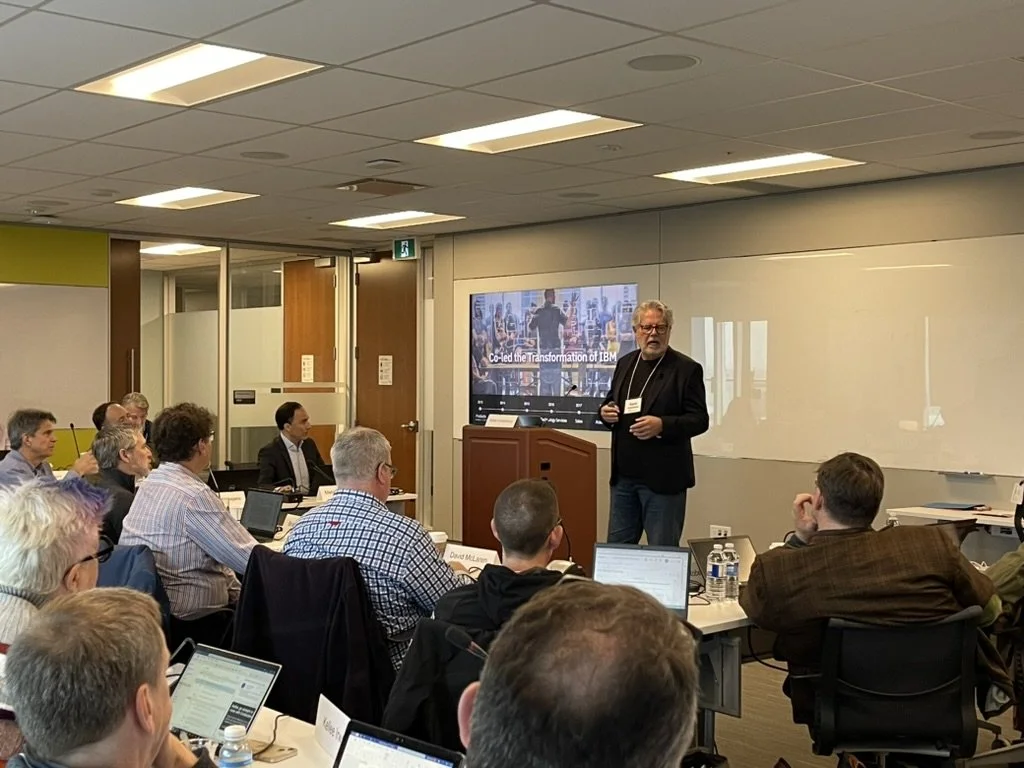
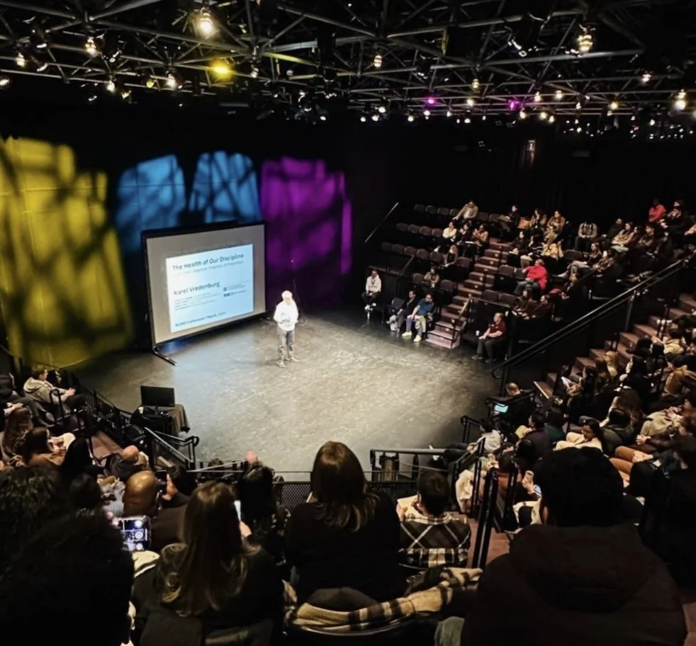
Keynoting
I’ve being presenting keynotes, running workshops, and hosting panel discussions at industry conferences for decades. Some of the keynotes were recorded and you can watch them right here on my website.

Plant-based living
My family and I live a plant-based lifestyle for our health, the environment, and the animals. Find out why and how.
Request
Keynote:
You can request a booking to have me present at your conference, meeting, or other event.
Consulting:
You can also request for me to consult with your organization.

Site-wide Search
Start typing and search results will appear under the search bar. Typing your search and pressing <enter> will provide a new page of results.