
Innovative Mobile App Designs
The number of mobile devices is increasing exponentially and so is the number of apps being developed for those devices. The design of many of those apps while effective, often isn't exemplary. However, the mobile space is seeing its share of true creativity and innovation. In fact, the introduction of a novel design often sets the direction for other apps to adopt aspects of that design as well.
I try to stay on top of innovative designs myself by following podcasts, reading blogs, and exploring app stores. However, as usual, I thought I'd also leverage the wisdom of the social media crowd. I asked,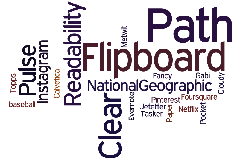 "which mobile app would you say currently has the most creative, innovative, and usable design?" The feedback I received is summarized in the wordle on the right. A larger font size indicates a greater number of people having chosen that app. The results illustrate some clear front runners: Flipboard, Path, and Clear. While the remaining apps have some interesting features, we'll focus here on the apps which were mentioned by the most people. I also followed up with the people who selected particular apps to ask them what aspects of the design of the app they most appreciated.
Flipboard first came out on the iPad and set a design direction there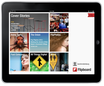 with its novel design patterns and when it came out on the iPhone it did it again but, importantly, with different design patterns. It provides the capability to aggregate content from a growing list of providers but importantly from Facebook and Twitter. The design attributes people mentioned as being exemplary include "a fluid and simple UI", "amazingly beautiful graphics", and "overall ease of use", and "integration". Flipboard truly transformed the aggregation and rendering of content. For example, information from Twitter in most other places is shown as a continuous stream of text which sometimes allows for the inline rendering of photos, visuals, and videos. However, Flipboard turns that content automatically into a beautiful multicolumn magazine style layout which maximizes the rendering of non-textual information and the appropriate clustering of textual and non-textual information together. The navigation model Flipboard uses on the iPad is hand/finger gesture based with horizonal page flipping whereas on the iPhone it is thumb based with vertical page flipping. The page flipping is reinforced with a suble, yet satisfying page turn animation. Both form factor designs have an opening category selection screen which provides the home base that can be returned to with a tap or two. Individual content items can be drilled into by tapping. Flipboard is the app I use on my iPad and iPhone to access social media, news, and blog information. Pulse News is also an information source aggregator and it is instructive here when discussing Flipboard to point out that Pulse is similar in some ways except that it uses a navigable grid with sources being able to be navigated vertically and content items horizontally. Selecting a story in Pulse brings it in as an information card animating from the right and partially overlaying the base content grid in the iPad version and as a full page story on the iPhone. The design patterns used by both Flipboard and Pulse are really effective for the type of content they provide.
Path is another app that was recommended as being among the most creative, innovative, and usable. Those mentioning it used words like "amazing" and "beautiful design". Path is an alternative social media service for just those friends and family with whom you have a close relationship. The number of "friends" you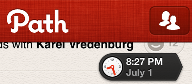 can have on Path I believe is currently about 150. The app is beautiful visually and is fast. However, I find it's controls to be particularly effective. Path has an animated control that appears once you start scrolling down the timeline and shows you the date and the time of the updates being shown. It's nice for the use case when you know there was an update at on a particular day and time that you'd like to access. It's important to point out that it isn't pervasively visable and the dynamically updated clock adds visual interest and relevant information which also appropriately draw your attention to the control even though it is quite small.
 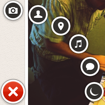 The second control of interest is a menu that appears when the plus sign at the bottom left of the screen is pressed. The menu animates fan-like with a satisfying bounce when opened and includes a rather whimsical spinning and springing back into the plus sign when it is dismissed. The control provides a quick way of indicating what type of update is being created (photo, people, location, music, thought, or sleep/wake). The number of likes are shown with a happy face and a number. Path does a particularly good job of optimizing space for content which is rendered beautifully but it does this by also minimizing the screen real estate that is used by controls. When controls are used, they include animations and visuals that are engaging, informative, and whimsical.
Another innovative app that was mentioned was Clear. ![]() It is essentially a to-do list organizer. Those recommending it particularly liked its "gesture based interface", that it was "simple", and its use of "color". The design pattern that Clear uses is one where virtually everything is accomplished on a single screen via direct manipulation with the content, and only the content, showing on the screen. This app is the ultimate in getting rid of any controls or app-specific chrome. All you see is the content. It is also the ultimate app for doing everything intuitively by direct manipulation. If you'd like to add an item at a particular point in your list, you simply pinch apart the items above and below and then proceed to add your item. You indicate that an item is complete by swiping across it left to right and if you'd like to delete an item, you swipe from right to left. To move an item, you just tap on it and drag it to where you'd like it to go. You can also swipe up and down to access a menu and multiple lists. I actually only use a single list and thus only ever deal with what you see in the photo on the right.
It is essentially a to-do list organizer. Those recommending it particularly liked its "gesture based interface", that it was "simple", and its use of "color". The design pattern that Clear uses is one where virtually everything is accomplished on a single screen via direct manipulation with the content, and only the content, showing on the screen. This app is the ultimate in getting rid of any controls or app-specific chrome. All you see is the content. It is also the ultimate app for doing everything intuitively by direct manipulation. If you'd like to add an item at a particular point in your list, you simply pinch apart the items above and below and then proceed to add your item. You indicate that an item is complete by swiping across it left to right and if you'd like to delete an item, you swipe from right to left. To move an item, you just tap on it and drag it to where you'd like it to go. You can also swipe up and down to access a menu and multiple lists. I actually only use a single list and thus only ever deal with what you see in the photo on the right.
I love how these apps have pushed the design envelope by driving greater engagement through beautiful visuals, effective animation, efficient and natural navigation and actions, and minimal use of controls that are persistent. The mobile design space is an exciting one with new apps like these appearing regularly which raise the bar on innovation, creativity, and usability.