
Apple’s Design Fail: The end of an era?
I’ve been impressed by Apple’s design prowess for a very long time.
Until now.
Yes, I think that Liquid Glass was eye candy that compromised the user experience and that's where my disenchantment started. But that’s not the failure I’m talking about here. I’m talking about Apple’s latest release of Keynote, a product I daily and have done so for years.
New Version pop-up
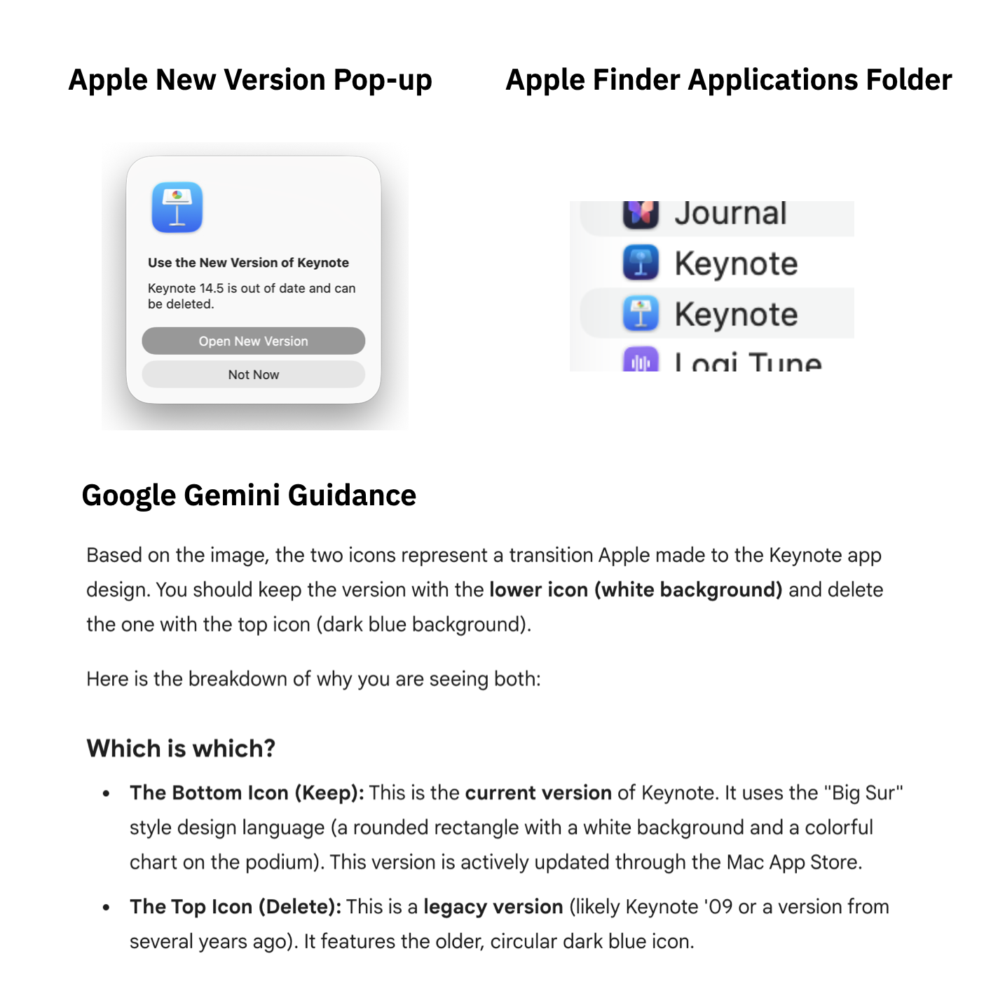
So I was surprised to see this pop up when I tried to start Keynote from the dock. I’d never seen such a notice regarding a new version of a product. I usually get the notification that there is a new version and to install it. Doing that then simply replaces the old version with the new one.
Even though I thought it was strange for a company like Apple to require me to manually delete the older version of the app, I did as I was told and went to the Finder Applications Folder and looked for the two versions of the product.
However, I didn’t know which one was the old one and which the new one as both had the same date. So, as I always do now when encountering bizarre and unusable product user interfaces, I headed to Google’s Gemini AI (I no longer use ChatGPT and now use Gemini and Claude mostly). It told me that I should I should delete the top dark blue version.
Gemini also suggested that I should double-check the version number and guided me in finding that information.
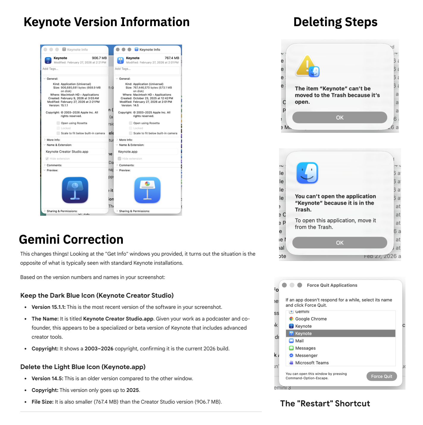
So I diligently checked the version numbers and was surprised to find that Gemini was wrong! I would have deleted the most recent version!
Deleting the Old version
New version initial experience
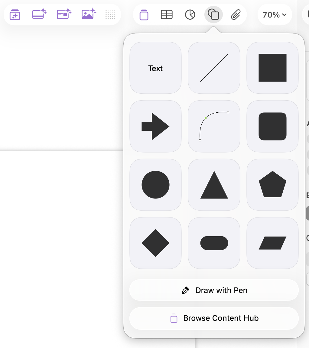
Whew! I finally managed to delete the old version and open the new one. My first task was to create the title of a presentation slide. Seems simple enough and is probably the most frequent use-case. I was suddenly stumped not being able to find the text button. I found a lot of AI related buttons taking up valuable real estate on the task bar but nothing that looked like a “T” or anything that would suggest how to create text.
So, I again, remember as I always do now with inscrutable user interfaces, went to Gemini. It commiserated with me about the bizarre new design of Keynote but gave me the answer. You create text from the shapes icon. Well, that’s novel and the opposite of where I would expect it to be. But, I understand that they needed to move the most often used task to a hidden and unintuitive location because they needed to find room for the all-important AI features.
I’ve been in the product design business long enough to know that it takes time for a user to get used to a new design. However, it’s an indication to me that the design team isn’t in charge anymore when the primary use-case isn’t supported well in the design while the executive top-down jam AI into the interface is.
It’s sad that even Apple has succumbed to the eroding of the importance of design and the resulting decrease in user experience. And it’s also troublesome when the AI that we now have to rely on to understand how to navigate these increasingly unusable user interfaces themselves are confused as illustrated above.
I guess the lesson in this is that Apple doesn’t want us to create slide decks ourselves anymore but instead have their AI do it for us. I’d still prefer to have the human-first approach that I teach and only ask an AI to augment what I create.
What are your thoughts? What has been your experience with the new Keynote or any other new updated software product?