Early Impressions of Google+
I've been using Google+ during the early closed beta. You've got to hand it to Google that they know how to generate interest. Make a new service invitation only, invite the most well-know and prolific social media stars, and then give each person who comes on the service 150 invitations for their friends. Also, calling it an early beta gives them the opportunity to find, acknowledge, and fix numerous problems.

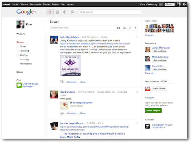
I was struck by its clean visual design that is airy and light. Not surprisingly, Google adopted the now standard social media (Facebook) design pattern regarding the layout and basic interaction of the service itself. Where they introduced some innovation was in the concept and design of circles. It makes perfect sense to simply use the commonly used term for circles of friends as the way of organizing people. They also included a really nicely designed and implented drag and drop interaction mechanism for adding people to circles. However, moving people from one cirlce to another and having them no longer in the first circle isn't obvious. Google+ has improved upon Facebook's mechanism for directing updates to particular circles of friends. However, I worry that if this feature is used too much that we'll lose the wonderful diversity that currently exists on social networks. My biggest concern regarding Google+ is that social networking services are really only enablers of social interaction and as such are only as good as the people using them. If virtually nobody uses the service or if only one type of user uses it, then it loses its appeal. The early adopters of Google+ are the tech enthusiasts and tech stars. They tend to like it because they're seeing so much engagement from likeminded individuals. However, in order to be highly successful, Google+ will have to attract the less tech savy that just recently finally joined Facebook. That crowd is much less likely to move to another system no matter how good the tool turns out to be. Of course, Facebook isn't standing still either and the features that are currently more desireable on Google+ could quite easily be adopted by Facebook.
Those are my early impressions on Google+. However, I wanted to hear the views of others too so I posted the following tweet on my @IBMDesign account, "If you've tried it, what do you think of the design of the latest social networking site Google+?" and here are the replies.
- G+ is very nice. Unfortunately they went about things the wrong way if they think they're going to switch fb users over...
- Looks promising, but it still needs to mature a bit, particularly with regards to its mobile interfaces.
- Pretty aweful, constantly having to scroll past pages of comments on things, stuff moves while reading/watching etc
- Clean, easy and intuitive, it's gonna kick some asses at Facebook
- Easy to use, and nice to have a circles.
- Screens are very sparse, almost unstructured. The UI for assigning people to circles is nice.
- They reinvented the wheel with additional spokes, the thing is, a wheel can run without the addons too
- It's honestly mediocre. The revolutionary features just aren't enough to drag the fickle social networking audience off FB yet.
- From 1 - 5 (5 being highest sat) I'd say 3.5
- FB is just a social network, G+ is going to give a new whole experience to users, video, chat, social sharing in theirs homepages
A quick sentiment analysis yields 40% positive, 50% neutral, 10% negative toned comments. So, it is still in early beta so we'll have to continue to watch Google+ as it develops further.
