
Designing for Mobile Sites
Mobile devices are proliferating at an incredible rate. Designers of websites have to decide what experience they'd like to create for users of their sites and factor in what users prefer. SmartPhones are the real challenge given their screen size. Since the iPhone came out with its amazing screen and the ability to resize portions of the screen, I've come to prefer full websites rather than sites optimzed for the smaller screen. I prefer a three column website design with navigation in the left column, the main content in the center column, and additional information in the right column. I then double-tap the center column to enlarge the core content to make it easier to read.
That's my own personal preference but I wanted to learn what other people prefer. 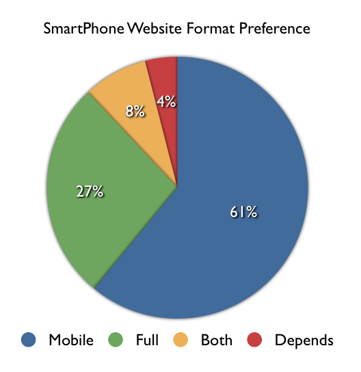 As usual, I consulted the social networks. I asked, "Do you prefer mobile-enabled or full versions of websites on our SmartPhone?" A total of 55 people replied and the results are shown in the visual on the right. A slight majority of respondents (61%) preferred sites to be optimized for the mobile device but a non-trivial number (27%) preferred the full site and a reasonable number wanted both (8%) and a very small number (4%) said that it depends. Given these results and the fact that many respondents felt quite strongly about their responses, it isn't immediately obvious what designers should do in order to provide users what they prefer. Although the majority preferred mobile enabled sites, many people expressed the concern that many sites that are optimized for mobile leave out information that is available on the full version of the site. The best advice therefore would be to provide a mobile version of the site that includes the same information as the full version, to also provide direct access to the full version for those who prefer that, and to save users' preferences for the next time they access the site.
It should be pointed out that the question being addressed here was specific to viewing websites on SmartPhones and didn't go into tablets or apps which we may address in a future set of questions and blog post.