
Extremes in Design Practice
I've worked my whole career within a design environment that was expected to yield product revenue as a result of customers realizing substantial direct business benefit from using the product. While I regularly celebrate the increasing importance of design in all aspects of society, I worry about two particular trends that I'm seeing that are less positive for the discipline.
One trend involves the use of design to simply attract more eyeballs. Startup companies know that they need great design, particularly visual design, to initially make them interesting to early adopter eyeballs, then to investors in order to be seen by even more eyeballs, and finally to have enough eyeballs to be sufficiently interesting to companies like Facebook, Google, and Yahoo! in order to acquire them. The latter companies, in turn, are simply interested in increasing the number of eyeballs staring at the digital properties they own so that they can sell advertising that will motivate some of the people attached to those eyeballs to buy actual products. I worry how sustainable this direction is with so much of design concentrated on essentially the advertising business. Of course these large companies do other things too that are of direct substantive value but the vast majority of their revenue comes solely from selling advertising. The role of design in advertising has a long history too but it is the redirection of product design into serving the needs of advertising that is unhealthy for the discipline in my view.
Another trend could actually be considered to be the opposite to this one and that is the competitive direct selling of design services on a massive scale online. Online sites are emerging which claim to have a quarter of a million designers signed up and who compete with one another for design work projects. This isn't conceptually a bad thing in that it would seem to provide a ready marketplace for designers to make a living without having to first be hired into design firms. However, what worries me about this trend is the potential cheapening or commoditization of the discipline's work. Just like huge big box department stores who maniacle drive down prices to the point where suppliers end up with razor thin profit margins and have to do everything they can to reduce costs, this trend in design services similarly may well lead to driving lower prices and reducing costs.
I think we need to balance these two trends with an additional direction which involves companies who produce actual products realizing the importance of great design to their success. The effective leveraging of design by these companies is also happening and will yield real business and personal value for their customers and users. We must remember that it is these companies who are the advertisers that sustain the first category mentioned above and we need both for a healthy ecosystem for commerce and design.
Academic Design Research & Commercial Design Practice
All disciplines and professions rely on academic research to improve their practice. Medical doctors, for example, rely on academic medical research to improve their diagnostic and treatment practices and outcomes. They also rely on industry research as well to augment the academic research in specific areas such as pharmacology. And, of course, there is always pure academic research that explores furthering human knowledge which also occasionally impacts medical practice.
Design should similarly also have solid academic research on which to base its practice and the improvement in that practice. However, I'm concerned that it doesn't, or at least not commerserate with the increasing importance of design.
I attended the Computer-Human Interaction (CHI) conference in Paris, France a few weeks ago, after not having attended for some years. Although there were notable exceptions, I was struck by the lack of relevance to commercial design practice of the vast majority of presentations, papers, and posters at the conference. One of the notable exceptions was a paper specifically exploring this topic. It was a paper by David Roedl and Erik Stolterman of Indiana University with the title, "Design research at CHI and its applicablity to design practice". There were two parts to the research they presented, the first an analysis of previous CHI papers and the second a set of interviews with design practitioners about academic design research.
For the first part, they examined all the papers that were part of the CHI conference in 2011. Of a total of 468 papers, they found 35 that made some reference to the work presented being relevant to design practice. Strangely absent from their paper is the observation that this number in itself is rather on the low side.
Only 7.5 percent of all papers presented were actually related to design practice! They go on to analyze the few papers that were intended to address design practice and found that even these had significant issues that limited their effectiveness. The issues all had to do with a general lack of understanding of real-life design practice and/or a desire to address the complexities in such environments. For example, the issues included the over-generalization of design situations, the lack of respect for the complexity of group decision making, the lack of consideration for the burden of limited time and resources, and the priorization of design exploration (divergence) rather than synthesis (convergence). The second part of the study involving the structured interviews with 13 design practitioners yielded results further questioning the relevance of academic design research to commercial design practice.

I should point out that I'm fully aware of the various models of academic research having served on the NSERC University Education Committee for some years. University research programs should have a balance between programmatic research which involves a series of studies investigating a specific set of questions of direct pragmatic relevance and what is often called "pure research" which involves investigators pursuing entirely "blue-sky" exploratory directions aiming to simply further human knowledge and understanding. Both of these types of research are incredibly important to pursue and design research has to broadly include these two types as well. The problem is the balance. While a 50/50 balance need not be the target, we have to do a lot better than 7.5/92.5!
I've been thinking about this topic since the CHI conference and in particular duing my recent trip to China. I met with professors and students at two design schools in universities in Shanghai and Beijing and was struck by their extremely pragmatic focus and their desire to directly impact commercial design practice. Their focus was perhaps a little too heavily weighted to commercial practice. However, it was refreshing to see.
I'm again increasing my involvement with design schools and universities over the next while and am planning to advocate for a more healthy balance in their design research focus to ensure that a larger proportion of the design research that is carried out is in fact directly relevant to commercial design practice.
A Balanced Approach to Design
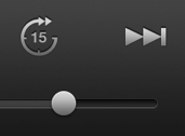
In my last post I talked about the need to find the right balance between skeuomorphic and flat design. I mentioned that Apple had just release an updated version of their Podcasts app which removed the controversial reel-to-reel visual progress animation. Some have concluded that Apple has embraced a flat approach to design. I don't think it has. I think Apple is taking an appropriate balanced approach to design. There are some elements that are essentially flat, such as the fast-forward control. Other elements have subtle but very effective depth, such as the back button and the sliders. These elements don't scream skeuomorphism nor take up huge amount of space with overly crafted real world objects. However, they do still resemble physical controls and very effectively communicate affordance. It is clear what the user can do with these controls, the fact that they can put their finger on small knob and slide it to the left or right along the slightly recessed bezel. This is exactly what I meant when I said that we need a balance. This is not a garish photo realistic use of real world object visualization but rather a suttle but amazingly effective reminder of a physical object sufficient only to communicate affordance and pleasing depth. Of course, much of design is subjective and people differ in what they prefer. And, there are changing trends in design. However, as I pointed out in my previous post, great design comes from true empathy with users and not simply following design trends unthinkingly. As one would expect, Apple again came through, in my view, with an appropriately balanced approach to design.
Great Design Requires Skeuomorphic AND Flat Approaches
I've been thinking about the skeuomorphism versus flat design debate for some time now, seriously considering both sides. For those who may somehow have missed mention of the debate, it is between those who favor designs that look like physical objects (skeuomorphic) versus those who favor digital-based designs (flat) devoid of visualizations of real objects. Although the term skeuomorphism predates computers, it is almost exclusively now used to refer to an approach to visual design of software.
The first software designs that experimented with the use of skeuomorphic techniques that I'm aware of appeared in the mid to late 1990's with Microsoft BoB and IBM's RealThings. These were early experiments designed to make computer software more approachable to novice users. These users tended to be reluctant to use computers because the machines were perceived to be difficult to use and intimidating. The idea was to make the design of the computer program look (and operate to some degree) like their real world physical counterparts. The Microsoft BoB checkbook (and check register) looked just like a paper-based checkbook and the IBM RealPhone looked and somewhat operated like a phone system common at the time. Microsoft released their work as a product whereas the IBM's effort remained an experimental project being worked on in the research labs. Microsoft BoB wasn't very successful as a product, in my view due largely to the poor choice of a cartoon, childish visual design of the overall system and not due to the introduction of skeuomorphism within components like the checkbook. Microsoft BoB had some devoted fans (some of whom I knew at the time) due to the skeuomorphic apps like the checkbook despite the rest of the unfortunate visual design of the rest of the system. Those fans much rather worked with the BoB checkbook app than the complicated Microsoft Access database on which it ran. It was unfortunate that skeuomorphism was deemed to not have been successful during that period due in my view to a very poor choice of visual design (and of course the precursor to clippy as well).
When Steve Jobs and his team at Apple ushered in new mobile hardware form factors that drastically simplified computer technology, they also chose to use skeuomorphic approaches to design to make the software on those devices be perceived as simple, familiar, and approachable. The camera includes a shutter animation, iBooks includes a wooden book shelf and books with pages that flip, the Notes app looks like a physical yellow lined notebook, the Voice Recorder app has a picture of a big microphone and a VU meter, the calendar looks like a physical calendar, the compass looks like a physical compass, maps looks like physical maps, the contacts app looks like the physical counterpart, the Calculator looks like a Braun calculator, Garageband includes visuals of piano keyboards, drums, etc. I believe that the use of skeuomorphism helped to make and continues to make these devices extremely popular, especially given their adoption by many people who aren't in the traditional technical markets for computer technology.
The last few years have seen the introduction of skeuomorphic designs that in my view are completely gratuitous. It is important to note that these came out during the post-Jobs era at Apple. The best (or worst) example of this is the Podcasts app and its use of a reel-to-reel tape recorder visual animation as a progress indicator. This animation only appears if the user swipes up on the podcast album art so it isn't serving the purpose of making the user feel immediately comfortable with an existing object. What makes this the most gratuitous example is that podcasts only came about as a digital medium so there isn't any real world analogue. This is pure eye candy. While it may provide visual interest, it really is over the top in terms of skeuomorphism. In fact, Apple apparently agrees, as evidenced by the version of the app that was just released. They've removed this control completely from the app.
On the other extreme from skeuomorphism is flat design. Proponents of flat design argue that we no longer need to use physical object visuals because digital versions have been around sufficiently long that we can simply use purely digital visual representations. Many designers have adopted this point of view and now scoff at designs that aren't completely flat and purely digital. Many of these designers also believe that Microsoft's Windows 8 is a good exemple of this flat approach to design.
Much of this debate is heated, emotional, and dogmatic in nature. I thought it might be good to get some user input on the question so I asked via social media "If you needed to toggle something on or off in an app, which of the following alternative designs would you prefer, Design A or Design B?" and I then showed the alternatives design illustrated below. While not a huge sample of respondents, 30 people indicated their preference and all 30 preferred Design A. Of course, Design A is skeuomorphic and Design B is flat. This confirmed my believe that we need to balance the interests of purist design models and trends with user preference and behavior. In my view, there is no place for a purely gratuitous use of skeuomorphism like the reel-to-reel tape player visual animation in the original version of Apple's Podcasts app but I equally worry about the use of completely flat controls that show no affordance as to what may be done with them such as Design B which is Microsoft's Windows 8 toggle control.
Great design will come from a deep understanding of the users in the target markets expected to be served by a product, a sincere empathy for the ways they think, feel, and want to interact with the world, analogue and digital. Designers have to use that information to design user experiences with the right balance of controls that have depth, and possbly analogues in the real world, along with purely flat controls that exist only in the digital world. Of course, these approaches need to be part of a meaningful and unified design system but it is clear that an unthinking adherence to an entirely skeuomorphic or flat approach to design is not the best way forward for designers if our goal is great design outcomes. A more naunced approach is required.
The State of Design Practice
I wrote a book some ten years ago with a couple of colleagues (Scott Isensee and Carol Righi) called "User-Centered Design: An Integrated Approach" which outlined a comprehensive system for introducing UCD to an organization and specified the key methods that should be carried out. This work was an elaboration and extension of the pioneering work of Don Norman and colleagues. I followed the book up some years later with an article in the Communications of the ACM entitled "The State of User-Centered Design Practice" which reported the results of some research that some colleagues (Ji-Ye Mao, Paul Smith, and Tom Carey) and I had conducted getting information from UXD practitioners at more than 100 companies and investigating, among other things, the differences between what is known to be best practice and what actually is carried out inside companies. Even though the importance of design was increasing, practitioners in most companies reported a significant difference between the known best practice and their day-to-day experience.
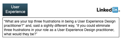
Design is seen as even more important now, as pointed out elsewhere in the blog thanks largely to Steve Jobs and Apple. I thought it would be good to have another look at the state of actual practice so I turned to the LinkedIn "User Experience" discussion group and asked the question shown here.
Although I posted the question some time ago, the responses picked up significantly recently and have been fairly extensive and from a variety of different companies. The discussion is ongoing but I thought it might be good to summarize the key themes at this point here. There were five key themes among the comments which each were mentioned by a substantial number of practitioners.
Management Understanding/Buy-in: An overriding theme mentioned by many concerned the lack of understanding regarding the need for, execution of, and requisite resources required for User Experience Design. This resulted in insufficient importance given to design and inadequate resources being applied to it.
Missing or Vague Requirements: Many practitioners mentioned the challenges they faced in attempting to carry out User Experience Design activities when the projects hadn't been given appropriate business requirements from Project Management. The requirements were either missing entirely or sufficiently vague as to have little value.
Resources to do User Research: Practitioners overwhelmingly reported dissatisfaction with not having the resources to carry out one of the most powerful design methods: user research. This finding is consistent with the results I reported in the Comunications of the ACM article mentioned above. The combination of missing or vague requirements and little nor no user research leads to designers essentially working in the dark.
Everyone Thinks They're a Designer: Another common theme reported by many respondents dealt with the problem of project managers, executives, and developers all thinking that they're capable of doing design themselves. One respondent also astutely observed that designers are often guilty of assuming the developers know nothing about design which is also problem.
Suboptimal Day-to-Day Practices: The above themes were reported about equally by respondents as being substantial major problems. A fifth theme emerged that dealt with a variety of day-to-day frustrations or suboptimal practices. These included the following.
- Being handed a design by development and being asked to "make it usable" or by a project manager and asked to "clean it up".
- Presenting a wireframe when the expectation was the finished, polished design.
- Not being able to iterate on the design based on user feedback and simply being expected to come up with the completed design in one iteration.
- Being told that it is too costly or will take too long to build the design or that it will be addressed in the next release.
- Being expected to adopt designs that are perceived to be industry leading.
- With no audience definition being told to "design for everyone".
- Not addressing the findings from user research when it is carried out.
- Having to deal with everyone on the team thinking that they're the user.
- The difference between UI and UX not being understood.
- Losing sight of the primary objectives of the project and getting distracted by other tangible results.
- Unrealistic deadlines and evolving scope creep.
The experiences of the User Experience Design practitioners that responded to my question clearly articulated the challenges that remain to be addressed in many companies. As I pointed out in my Communications of the ACM article, companies may have the mistaken notion that design is being carried out effectively simply by having hired designers. However, these results reinforce the need for companies to more deeply understand User Experience Design and to address the issues summarized here.
Although some methods and technologies have evolved, the essence of the integrated approach that was outlined in our book ten years ago still applies and my experiences with leadership teams validates it as well. The integrated approach that my coauthors and I published stresses that the commitment to design excellence and the investment in it has to start at the top of the company, clear business objectives must be set by Product Management, user research needs to be carried out to provide the foundation for design informing personas and scenarios, design needs to be carried out by those trained in the disciplines of design and start with low fidelity prototypes evolving through iterations involving regular user feedback and innovation explorations into high fidelity prototypes and code. Product management, design, and development need to work collaboratively and iteratively leveraging each other's skills. The entire team has to share the commitment to achieving the established business objectives with the effective leveraging of User Experience Design. While this isn't easy, it does yield significant dividends when deployed and executed optimally.
I'd like to thank the members of the LinkedIn User Experience discussion group for their experiences and insights.
Innovative Mobile App Designs
The number of mobile devices is increasing exponentially and so is the number of apps being developed for those devices. The design of many of those apps while effective, often isn't exemplary. However, the mobile space is seeing its share of true creativity and innovation. In fact, the introduction of a novel design often sets the direction for other apps to adopt aspects of that design as well.
I try to stay on top of innovative designs myself by following podcasts, reading blogs, and exploring app stores. However, as usual, I thought I'd also leverage the wisdom of the social media crowd. I asked,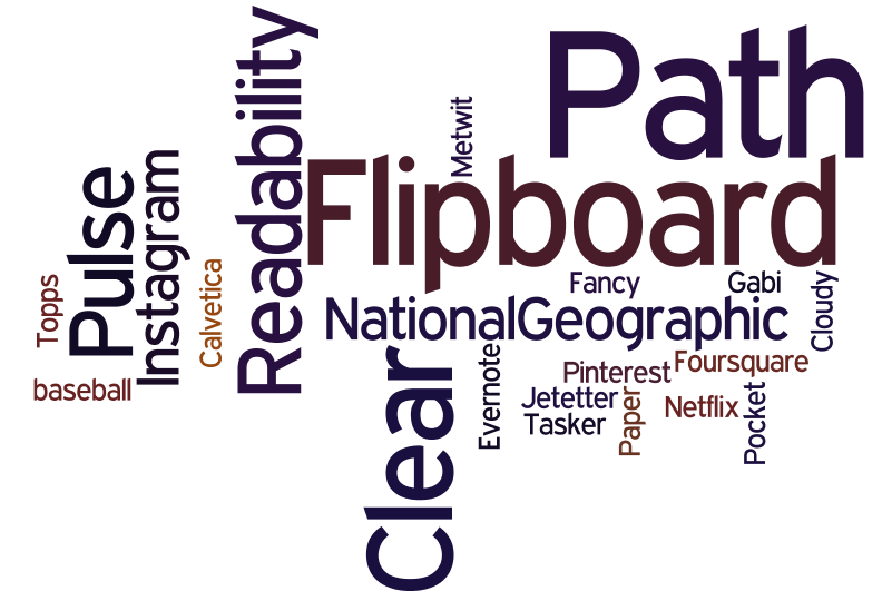 "which mobile app would you say currently has the most creative, innovative, and usable design?" The feedback I received is summarized in the wordle on the right. A larger font size indicates a greater number of people having chosen that app. The results illustrate some clear front runners: Flipboard, Path, and Clear. While the remaining apps have some interesting features, we'll focus here on the apps which were mentioned by the most people. I also followed up with the people who selected particular apps to ask them what aspects of the design of the app they most appreciated.
Flipboard first came out on the iPad and set a design direction there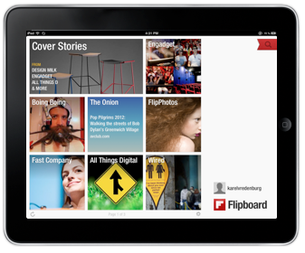 with its novel design patterns and when it came out on the iPhone it did it again but, importantly, with different design patterns. It provides the capability to aggregate content from a growing list of providers but importantly from Facebook and Twitter. The design attributes people mentioned as being exemplary include "a fluid and simple UI", "amazingly beautiful graphics", and "overall ease of use", and "integration". Flipboard truly transformed the aggregation and rendering of content. For example, information from Twitter in most other places is shown as a continuous stream of text which sometimes allows for the inline rendering of photos, visuals, and videos. However, Flipboard turns that content automatically into a beautiful multicolumn magazine style layout which maximizes the rendering of non-textual information and the appropriate clustering of textual and non-textual information together. The navigation model Flipboard uses on the iPad is hand/finger gesture based with horizonal page flipping whereas on the iPhone it is thumb based with vertical page flipping. The page flipping is reinforced with a suble, yet satisfying page turn animation. Both form factor designs have an opening category selection screen which provides the home base that can be returned to with a tap or two. Individual content items can be drilled into by tapping. Flipboard is the app I use on my iPad and iPhone to access social media, news, and blog information. Pulse News is also an information source aggregator and it is instructive here when discussing Flipboard to point out that Pulse is similar in some ways except that it uses a navigable grid with sources being able to be navigated vertically and content items horizontally. Selecting a story in Pulse brings it in as an information card animating from the right and partially overlaying the base content grid in the iPad version and as a full page story on the iPhone. The design patterns used by both Flipboard and Pulse are really effective for the type of content they provide.
Path is another app that was recommended as being among the most creative, innovative, and usable. Those mentioning it used words like "amazing" and "beautiful design". Path is an alternative social media service for just those friends and family with whom you have a close relationship. The number of "friends" you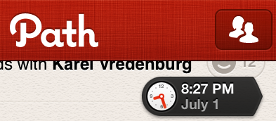 can have on Path I believe is currently about 150. The app is beautiful visually and is fast. However, I find it's controls to be particularly effective. Path has an animated control that appears once you start scrolling down the timeline and shows you the date and the time of the updates being shown. It's nice for the use case when you know there was an update at on a particular day and time that you'd like to access. It's important to point out that it isn't pervasively visable and the dynamically updated clock adds visual interest and relevant information which also appropriately draw your attention to the control even though it is quite small.
 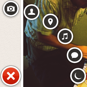 The second control of interest is a menu that appears when the plus sign at the bottom left of the screen is pressed. The menu animates fan-like with a satisfying bounce when opened and includes a rather whimsical spinning and springing back into the plus sign when it is dismissed. The control provides a quick way of indicating what type of update is being created (photo, people, location, music, thought, or sleep/wake). The number of likes are shown with a happy face and a number. Path does a particularly good job of optimizing space for content which is rendered beautifully but it does this by also minimizing the screen real estate that is used by controls. When controls are used, they include animations and visuals that are engaging, informative, and whimsical.
Another innovative app that was mentioned was Clear. ![]() It is essentially a to-do list organizer. Those recommending it particularly liked its "gesture based interface", that it was "simple", and its use of "color". The design pattern that Clear uses is one where virtually everything is accomplished on a single screen via direct manipulation with the content, and only the content, showing on the screen. This app is the ultimate in getting rid of any controls or app-specific chrome. All you see is the content. It is also the ultimate app for doing everything intuitively by direct manipulation. If you'd like to add an item at a particular point in your list, you simply pinch apart the items above and below and then proceed to add your item. You indicate that an item is complete by swiping across it left to right and if you'd like to delete an item, you swipe from right to left. To move an item, you just tap on it and drag it to where you'd like it to go. You can also swipe up and down to access a menu and multiple lists. I actually only use a single list and thus only ever deal with what you see in the photo on the right.
It is essentially a to-do list organizer. Those recommending it particularly liked its "gesture based interface", that it was "simple", and its use of "color". The design pattern that Clear uses is one where virtually everything is accomplished on a single screen via direct manipulation with the content, and only the content, showing on the screen. This app is the ultimate in getting rid of any controls or app-specific chrome. All you see is the content. It is also the ultimate app for doing everything intuitively by direct manipulation. If you'd like to add an item at a particular point in your list, you simply pinch apart the items above and below and then proceed to add your item. You indicate that an item is complete by swiping across it left to right and if you'd like to delete an item, you swipe from right to left. To move an item, you just tap on it and drag it to where you'd like it to go. You can also swipe up and down to access a menu and multiple lists. I actually only use a single list and thus only ever deal with what you see in the photo on the right.
I love how these apps have pushed the design envelope by driving greater engagement through beautiful visuals, effective animation, efficient and natural navigation and actions, and minimal use of controls that are persistent. The mobile design space is an exciting one with new apps like these appearing regularly which raise the bar on innovation, creativity, and usability.
Paradigmatic Change in UIs
In the first wave of computing there was virtually no user interface, comprising little more than instructions written on punch cards which were loaded into a hopper then read by the computer with the results given to the user via a printout. The second wave introduced what we now know to be a user interface, a display with characters and graphics along with a keyboard and mouse. The display evolved from simple monochromatic characters to full color graphics with ever increasing resolution over time and the keyboard and mouse technologies evolved to be smaller and integrated with trackpoints and trackpads. However, the basic elements of a small TV like display, with a keyboard and mouse beneath it, have remained constant for a remarkably long time. What appeared on that display and how a user interacts with it has remained surprisingly constant as well, especially from the time that the concept of programs running in separate windows was introduced.
While there were minor predecessors, the major shift into an entirely new form factor came with the introduction of the iPhone. We're now so used to smartphone UIs that many people forget that we hadn't ever experienced one until Apple introduced its game-changing device. The smartphone form factor existed before the iPhone, but Apple totally redefined it. Once users were used to the iPhone user interface, the adoption of the larger form factor iPad was incredibly easy because it was virtually identical. Like the smartphone, the tablet form factor also existed prior to the iPad but again Apple redefined it dramatically. Key to that redefinition was the perfected use of multi-touch. Interacting via multi-touch is so pervasive now that it isn't uncommon to see people walking up to screens in places like hotels, airports, and stores expecting to be able to interact with them with touch only to be really surprised and disappointed when they turn out not to support touch. That's when you know that we've experienced a paradigm shift as a society. Touch has been in university labs for decades but it took Apple's dedication to design excellence of the entire user experience to perfect the technology to create this paradigm shift. 
Another paradigm shift in interaction modality has just started. This one involves the use of speech. Again, speech technology has been around for decades and has been used commercially successfully as well but mostly in niche markets like voice response systems and dictation systems. Apple's Siri is still in beta, a product designation Apple very rarely uses, but promises to do for speech technology what the iPhone did for touch technology - make it a pervasive and paradigmatic change in society.
There are two major insights to glean from these fairly recent advances. The first concerns how these changes took place. In each case, the basic research and foundational technologies as well as even some commercial applications existed for decades prior to the paradigm shift. It was Apple's approach to design that made the difference. The design of everything, from the industrial design of the physical elements of the device (glass, case, bezel, etc.), the visual and interaction design of the operating system and key apps, the engineering design of the internals (processors, memory, battery, GPS, etc.), the manufacturing design of the production line, the design of the website and app store, the design of the content review process, the design of the payment and app download system, the design of the stores, the design of product support, all the way to the design of the product secrecy and product announce/launch systems. Many people like to jump to simple conclusions that these paradigm changes were brought about by this or that individual element but I believe that it was Apple's focus on the total customer experience and all the elements that impact it that was critical. Designers planning a product that they hope will transform an industry need to focus on all of these aspects of design.
The second major insight to glean from these paradigm shifts is the need to rethink how all future products in any market should fit into these major paradigmatic changes in form factor, device, and interaction modality. Designers now need to understand deeply how users are using these technologies in order to design products optimally leveraging them. This is a challenge for many because, as pointed out above, form factor, device, and interaction modality hadn't changed virtually at all for decades. However, these recent changes are so profound that it really does require designers in any market to sit up and take note and consider how users in their markets may be changing.
Having explored paradigm changes we've already witnessed, let's give some thought to where these may go in the future and what other paradigms we may witness in the future. While the computer, smartphone, and tablet form factors and the touch and speech interaction modalities have mostly developed independently, the emerging trend is for them to become more consistent and a future paradigmatic change may involve them integrating deeply. We're seeing the beginnings of changes being made largely to computer operating systems like Apple's OSX to make them more similar to device operating systems like iOS. Apple is making the change gradually with each update to the OS, which is a wise approach that minimizes the magnitude of the change but still moves drives consistency. We're also seeing the very beginnings of a move to integrate form factors, devices, and interaction modalities. Responsive design is part of this trend, as is the enablement of touch and speech pervasively across devices. We're also seeing some degree of cloud based seamless access integrating content and data across devices. We're also seeing that integration spread to even larger form factors like TVs and digitally enabled physical window panes. Some call this a post-PC era, my sense is that we're witnessing a plethora of form factors which in PCs, ensuring that each of these can suit the wide characteristics and contexts of use into the future.
We're living in exciting times that require designers to be fully aware of, intimately knowledgeable about, and be able to leverage the benefits of these incredible paradigm shifts in technology and people's use of them.
Apple's Post-PC Era
I was just setting up a new iPad for a family member who wanted to use the new device she received as a gift as a stand alone device without needing to connect to a PC. Regular readers of this blog will know that I'm usually pretty positive about Apple's designs and, of course, I'm certainly not alone in that view. Apple is incredibly good at hardware design and the integration of software with its hardware. However, the company to date has had some difficulty with the design of its cloud capabilities.
Apple has recently used the term "post-PC era" as a basis for its mobile and cloud strategies and communication. Recent updates to iTunes and iOS have provided some independence of mobile devices from computers, but only partially. You can now push updates from a PC-based iTunes to an iPod Touch, iPhone, or iPad without using a cable but you still have to use a computer in the mix.
There are other use cases that have absolutely no support on iOS devices. 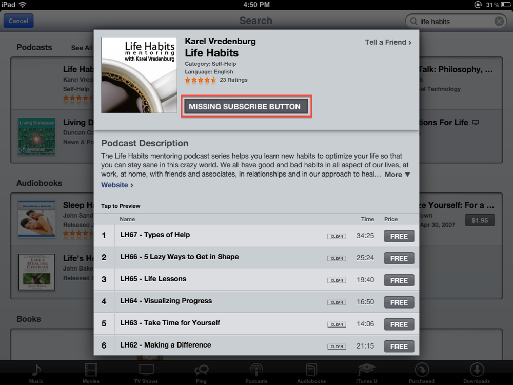 The most annoying and concerning one for me is the inability to subscribe to podcasts on Apple mobile devices. You can download individual episodes but there is no way to actually subscribe within mobile iTunes. With the increasing popularity and use of mobile devices (see last blog post), the inability of podcast listeners to subscribe via mobile devices is not only inconvenient for users, it is also a major problem for those creating podcasts, like me. It is really strange that Apple hasn't provided the capability to subscribe. All it would require is to include the same "subscribe" button to the right of the podcast name and artwork on mobile iTunes as is included on the computer-based version of iTunes (see visual on the right). It was pointed out to me by a friend on Facebook that there are separate apps that provide this capability with one called Downcast that is particularly good and one that he recommends. That's a temporary fix but I still think that this missing function needs to be included in the base mobile version of iTunes. I know that it is a herculean task to develop mobile device operating systems that never need to be connected to a PC and to design that really well. However, leaving off the subscribe button seems to be a rather strange oversight on Apple's part.
To the listeners of my podcast who may be reading this, I'd suggest that you use the iTunes on your PC to subscribe to the podcast or download an app like Downcast to essentially replace the podcast part of mobile iTunes on your iOS device. I do hope that Apple addresses this problem soon in an update to iOS so that we won't see bifurcation of the podast audience on Apple devices and also no longer have a single reliable place to determine podcast popularity and feedback.
Steve Jobs: Contributions to Design
Much has been said and written about Steve Jobs, particularly after his death.  I haven't said much until now because it affected me rather deeply and I also wanted to reflect more comprehensively about his contributions. I have had a professional and personal interest in Steve Jobs and Apple for years. As a result, I was pretty well aware of most things that had been written on the subject which wasn't an awful lot due to Steve and in turn Apple's famous position on privacy and secrecy. However, all that changed with the publication of Walter Isaacson's authorized biography titled simply "Steve Jobs". Having read Issacson's book as soon as it came out filled in the many gaps in our understanding of the man and the company. The book chronicled the brilliant and the bizarre aspects of Steve Jobs. It also helped bring into focus and further hone my perceptions of his contributions more generally as well as his contributions to design in particular.
First of all, Steve wasn't a designer. He was a visionary, a dreamer, a big picture thinker while at the same time being arrogant, passionate, and a fanatic about attention to detail. That's quite a combination, and one that is very rare. He would come up with brilliant new ideas, new combinations of old ideas, and old ideas made new again by doing them right. He had an eye for design and an eye for design talent. He inspired, promoted, enabled, challenged, and elevated designers and the role for design within an engineering company. After looking for design talent externally when he returned to Apple, Jobs discovered that he had an amazing designer inside the company, Jonathan Yve, typically referred to as Jony Yve. Steve promoted Jony to the position of Senior Vice President of Industrial Design and had him report directly to him. It is Jony and his team of industrial and user interface designers who are actually behind the design brilliance of Apple.
There are many very talented designers at many companies. Those companies have produced products that those designers knew weren't the best that they could possibly be. Those designers had to compromise their designs given a variety of common constraints such as time, money, and engineering. What those designers lacked was a design champion like Steve Jobs. A design champion who would generate ideas for the designers to explore, challenge the designers to do their absolute best design work, challenge the engineers to implement designs that seemed technically impossible, drive for perfection in the design and the implementation in the product at all cost literally, and would only deliver a product when it was "insanely great". His evangelism for design permeated outside the company too into his famous product launch performances during which he expounded on the design nuances of the product.
Steve Jobs raised the bar for design at Apple and showed that an engineering company can meet that high bar. He showed that great designers can be insanely great and produce industry transforming products when inspired, championed, challenged, supported, and rewarded. Steve also, in turn, provided a lesson for all other companies who want to achieve what Apple has achieved. I think Steve's legacy will not solely be what he did at Apple but what insight he provided to all others who in turn could learn from his example and could well improve the design of everything we see and touch. Thanks Steve.
Designing for Mobile Sites
Mobile devices are proliferating at an incredible rate. Designers of websites have to decide what experience they'd like to create for users of their sites and factor in what users prefer. SmartPhones are the real challenge given their screen size. Since the iPhone came out with its amazing screen and the ability to resize portions of the screen, I've come to prefer full websites rather than sites optimzed for the smaller screen. I prefer a three column website design with navigation in the left column, the main content in the center column, and additional information in the right column. I then double-tap the center column to enlarge the core content to make it easier to read.
That's my own personal preference but I wanted to learn what other people prefer. 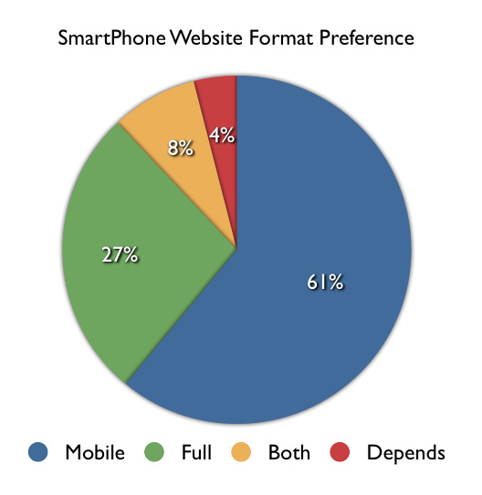 As usual, I consulted the social networks. I asked, "Do you prefer mobile-enabled or full versions of websites on our SmartPhone?" A total of 55 people replied and the results are shown in the visual on the right. A slight majority of respondents (61%) preferred sites to be optimized for the mobile device but a non-trivial number (27%) preferred the full site and a reasonable number wanted both (8%) and a very small number (4%) said that it depends. Given these results and the fact that many respondents felt quite strongly about their responses, it isn't immediately obvious what designers should do in order to provide users what they prefer. Although the majority preferred mobile enabled sites, many people expressed the concern that many sites that are optimized for mobile leave out information that is available on the full version of the site. The best advice therefore would be to provide a mobile version of the site that includes the same information as the full version, to also provide direct access to the full version for those who prefer that, and to save users' preferences for the next time they access the site.
It should be pointed out that the question being addressed here was specific to viewing websites on SmartPhones and didn't go into tablets or apps which we may address in a future set of questions and blog post.
Innovations in Apple's OS X Lion
I downloaded the latest version of the Apple computer operating system - OS X Lion - the day it came out and have used it since. It has a number of unique design elements in it that I think deserve some analysis.
Install: The most dramatic innovation you first experience is that the installation of this version of the operating system isn't done with CD/DVDs, it doesn't involve going to a website, providing a bunch of parameters, downloading it and then trying to find it to start the install. No, Apple has made the purchase and installation of the new OS dead simple by using its Mac App Store. The App Store itself is noteworthy in its own right as an amazing advance in the simplification of human-computer interaction. To install Lion, you simply click on the $29.95 price button which then turns to the install button after which you see the familiar animation indicating that the download has begun. After it downloads, you simply complete the install and you're done. By keeping the price so low and making the installation so simple and painless, Apple also ensures that virtually everyone will upgrade. That, in turn, keeps systems secure, makes it easier for developers to use the latest features knowing that users will be able to use them, and it also makes a lot of money for Apple given the volume of sales.
Features: The Lion release includes a number of enhancements to individual apps and the ways specific aspects of the OS works. I love using FaceTime and really appreciate its ability to use HD, the new ability to flip between landscape and portrait mode, and the full screen view. The experience of having a FaceTime session with someone using HD and full screen is almost like being there. I like the enhancements to the Launchpad and Mission Control but still think they could be even further improved. I use Preview a lot, mostly for working with screen captures. I noticed in Lion that Preview can actually now add digital signatures to PDF documents by holding the signature up to the camera. Cool. Although I haven't use it yet, the ability to simply detect other Macs and send files to them via AirDrop also looks to be useful and efficient.
Pervasive Enhancements: While the individual features are interesting and valuable, it is in the OS wide pervasive enhancements where I see the real innovation. It is clear that Apple is trying to create a simple, natural, intuitive, and consistent user experience for all of its devices. Also noteworthy is the fact that they are designing for the novice user first with the most important and pervasive devices. The iPhone and iPad are computers for all people, not just ones that have been using more traditional computers. Apple is therefore trying to create and is being insanely successful at doing so, a new default user experience for all devices. While it is leading in this with its iOS mobile operating system user interface, the Lion release of its traditional computer brings its user interface in line with the iOS one.
The direction of scrolling is a perfect example. With the Lion release, the default scrolling gesture and action is now consistent with that of iOS. This is jarring at first and must have led to millions of Mac users being pretty clumsy and unproductive for a while after installing Lion. However, once you get used to it, the change makes so much sense. If you aren't yet used to the change, I found simply imagining the screen as a piece of paper that you're moving helped me make the transition. Full screen apps are another Lion enhancement that brings parity with iOS. I don't typically use anything in full screen mode because I also have a large screen but then I'm not the target audience either. I only use this feature if I'm reading a document or something that I'd like to be able to focus and get rid of visual distractions. Auto save is another feature that makes so much sense and is perfect for the notice user. I quite like it but found that I had to change my workflow to prevent losing work. For example, I often create presentations by starting with an existing one and then modifying it. In Lion, you have to explicitly make a duplicate first or else you'll be modifying the original presentation. The multi-touch gestures take a bit of getting used to but once you do, I think they're incredibly useful and efficient.
Interestingly, two of the enhancements I most appreciate in Lion aren't typically talked about in reviews. I work with designers every day and review designs typically in the form of screen shots. When I've tried to hone in on the visual and colors in the screen shots I've always been distracted by what appeared to look like light blue pieces of rope. Of course those gaudy visuals were in fact the OS X scroll bars. I always thought it strange when Apple is so good at design, that they so messed up that aspect of their OS design. I fixed the problem somewhat previously by selecting the grey OS X theme but I was delighted to see that Lion now not only uses a much smaller grey scroll bar as the default, it also has adopted the iOS approach to only showing a scroll bar when the user wants to scroll. These changes have really cleaned up the OS user interface. The last enhancement I'd like to mention is virtually never mentioned or at least explained by Apple at all. However, it has made a significant difference in my productivity. That change has to do with Apple adopting the Microsoft Windows method of resizing windows. After having moved to the Mac, I could never understand why OS X forced users to resize windows by grabbing the bottom right corner only. The Windows world has always had the ability to resize from any corner or side of a window. It's nice to see that Apple is willing to make changes like this even though they don't like talking about them.
Overall, I've been very pleased with OS X Lion both as a user and also as a member of the industry that will benefit from the ways that Apple is driving levels of design never seen previously.
Design Talk - That Looks Pretty!
I've always been interested in the words and phrases people use to describe design. 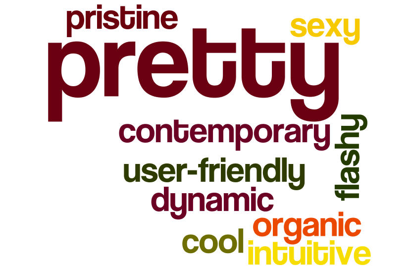 With design becoming increasingly important, people are also discussing it more often too. I listen to a lot of podcasts and some of them also include reviews of apps, websites, and software tools. I'm struck by the range of terms that are used to describe designs and I'm sometimes taken aback at my own negative reaction to the use of particular words usually by non-designers. Of course, everyone should be able to use whatever words they like to describe their impression of a design much like they can regarding anything else, right? Well, when you think about it, many other things are described using language that is quite specific and it is considered booish to use other language. Consider the words used to describe the taste, smell, and look of wine. Words like bouquet, dry, lively, fruity, bull-bodied, legs, robust, and woody. These are terms that are accepted as appropriate to use in describing wine. I decided to check with my Twitter followers and posted the question, "what's your favorite pet peeve about the words that people use to describe design?" The responses I received are shown in the wordle shown above (I created it using Jonathan Feinberg's Wordle creation tool). As you can see, the word that people dislike the most when used to describe design is "pretty". Interestingly, that happens to be my own least favorite word too. I find that it cheapens or demeans the design. Other words that people mentioned included, "sexy, pristine, flashy, contemporary, user-friendly, dynamic, cool, organic, and intuitive."
So, if these are the words that people don't like hearing when they are used to describe design, what words do they like to hear? I wondered that too so again asked my Twitter followers, this time saying, "we previously discussed pet peeves regarding words used to describe design. What words do you prefer people to use to describe design?"
The responses were of three types and incluced the following:
User Utterances:
- I don't have to think
- I know exactly what to do here
Client/Developer Utterances:
- Anything as long as it starts with "you/your" instead of "our"
- None, stop talk about it and actually make something
Design Attributes/Descriptors:
- Transparent
- Efficient
- Uncluttered
- Way
- Expressing form
- Elegant
- Clean
I rather liked those responses and will keep them in mind when I'm talking design and suggest that you consider them too. Thanks so those who provided their input.
Designing Inside Chaos
I've been looking at a lot of screen shots lately that a variety of people have sent me. The design of some of the websites and web apps have been outstanding with just the right subtle balance of muted colors, nuanced typography, and sophisticated rendering of accent visuals. But I'm almost not able to see those designs at times because I'm virtually blinded by the distracting clashing browser themes/personas. All the work that went into the website and app designs seems to be wasted and lost due to the overpowering visual distraction and chaos around it.
That got me thinking about how often that may happen to great designs in the wild. I therefore asked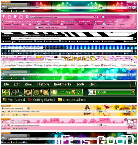 my Twitter followers and Facebook friends to tell me whether they had changed the default theme/look of their primary browser. The results indicated that 69% of them had modified the theme/look settings. Some also indicated they had systems that automatically changed their theme/persona weekly. While I'm sure that my friends and followers have good taste, it got me thinking about what types of themes/personas are in fact available. I checked out what was available and captured them into the collage shown on the right. As you can see, there is virtually every color combination, visual flourish, and even typography. Browser makers are attempting to provide more user choice and allowing users to customize their electronic environment. Designers, however, need to figure out how to design inside all of this visual chaos.
Many designers aren't even aware that their designs are often living within this world of visual chaos because they typically use Macs. And how much can you customize the Safari browser on the Mac? Well, you can't, without getting additional 3rd party tools to hack the system. I would suggest, therefore, that designers come up with designs that take into account the range of browser theme/persona customizations and that they also move over to a PC everyone once in a while to see what their designs will look like in the majority of browsers in use.
I'm an IBMer: Reflections on 100 Years
IBM celebrates its 100th birthday this year. I've been with IBM for almost a quarter of that time and the various anniversary activities around the centential have also led to some reflection on my part regarding my time with the company.
I never intended to work for IBM. It wasn't my career objective. I was targetting a career in music during my highschool years and a career as a Psychologist during my undergraduate and early graduate school years. Toward the end of graduate school I became intriqued by the human-computer interface largely through some experiences I was having in carrying out research in the lab which was controlled by software and hardware devices. My primary focus was on human information processing and in particular on the primacy of affective or emotional reactions to information displayed on the screen. I was looking for designs that optimized positive versus negative emotional reactions. I not only assessed self-report measures of affective reactions but also physiological measures like galvanic skins response and heart rate as well. In addition, I couldn't help but notice a powerful gender difference when I was hiring research assistants. The job simply involved operating a computer which presented different user interface elements and tracked physiolgical measurements. All of the eighteen applicants for the job were men despite the fact that the faculty had more women than men. Further investigation indicated that it was the use of a computer that was preventing many women from applying. This led me to examine the origins of the gender bias, to develop a computer phobia assessment instrument, and to design and comparatively evaluate user interfaces that were effective for even severely computer phobic women. I presented the findings from this research program at a conference and afterwards had several interviews with the press.
An IBMer heard one of the radio interviews, gave me a call, and asked me if I had ever thought of working for IBM. I told him honestly that I hadn't but that I was a huge fan of the company having just read a fascinating book about the history of IBM. I was not only impressed by the company's technical achievements and business success but also by its core principles and values. I recall reading a story in the book about what happened at a big company sales meeting when the CEO learned that one of the salesmen at the meeting had a wife at home about to deliver a baby and how the CEO called for a helicopter to immediately fly that IBMer home to be with his wife. There were many similar stories that painted a picture of a company that cared as much about its employees as its customers and stockholders. Based on that book, I agreed to an interview, accepted the job being offered to me, and privately gave myself a year to try out the company. Well, that year has now turned into twenty-three thus far.
As I reflect on those twenty-three years, I realize that my experience working for IBM has largely involved a realization of the promise of that book I read about the company so many years ago. I've had amazing managers throughout my career who have to a person lived those core IBM principles and values. I hope too that I have lived those principles and values in my role as a manager and employee. I've tried to do great work over the years and believe I've been appropriately rewarded for the work I've done. I've been approached by a number of other companies but have always decided to stay at IBM. There were some tough times and transformations the company had to go through too but throughout it all I'm still convinced that I'm working for the best company in the world. And that makes me proud to say that "I'm an IBMer."
It is with that pride that I've included a video here that tells the story of IBM's 100 year history. Enjoy.
Cultural Influences on Design
I just returned from a two week trip to China. I was a keynote speaker, along with others like Don Norman and Bill Buxton, at the User Friendly 2010 Conference in Nanjing. The theme of this Usability Professionals Association International Conference was "Embracing Asian Culture". A number of the speakers addressed the theme by discussing the various ways they incorporated cultural differences across the globe into their product designs. My presentation also included some material on the ways we go about understanding users in various parts of the world and the ways we address any cultural differences. After the conference, I spent some time in other Chinese cities like Beijing, Shanghai, and Suzhou as well as traveling between them. I observed what people wore, what phones they used, and what was available in their stores.
I used to be of the view that companies should do everything they can to understand cultural preferences and then come up with designs that incorporate these preferences. My experiences in China have led me to think that we need a hybrid approach that involves addressing cultural preferences under certain circumstances and not under other circumstance.
An observation of the mobile phones that are most desired and the clothing fashions that have the greatest influence in China suggests that traditional colors and styles don't much matter with regard to these products. Black iPhones are everywhere as are clothes fashions that originate in Italy. However, store displays and their electronic equivalents exhibit what to Western eyes looks to be overwhelming and chaotic arrangements of products. The results of a fascinating research study that was presented at the conference may provide some insights into why this aspect of design may have a deep-seated basis in culture. The study by Takahiko Masuda et al., (2008) entitled, "Placing a Face in Context: Cultural Differences in the Perception of Facial Emotion" showed different groups the same two sketches of five students with one in the center who's facial expression didn't change but the other four students' expressions where happy in one and sad in the other version of the sketch. When the sketches were shown to North American subjects and asked to say whether the main character was happy or sad in each, the typical response was that there was no difference in the two sketches. Asian subjects, on the other hand, tended to respond that the main character was happy or sad when the others in the sketch were depicted as having these emotions. When I first saw the two pictures I laughed to myself thinking that the pictures were identical. I'm a typical Westerner in this regard. This
 study illustrates the Asian subjects responded based on their perception of the entire sketch involving all the people in it whereas the Western subjects responded based on a single individual and ignored the rest of the sketch and the people in it. There appears to be a difference in the individual versus group dimension but also in the figure versus ground one. As I traveled China, I saw more and more examples of both of these dimensions at work and was more and more convinced of their centrality and their importance to design.
I consider this only the beginning of a quest to understand the meaningful differences between the cultures with regard to design but I do think it points our future work in interesting directions.
Reference:
Masuda, Takahiko; Ellsworth, Phoebe C.; Mesquita, Batja; Leu, Janxin; Tanida, Shigehito; Van de Veerdonk, Ellen; Placing the face in context: Cultural differences in the perception of facial emotion; Journal of Personality and Social Psychology; mars 2008; vol 94(3) 365-381.
A New User Experience Bar for OSs
Much of the discussion regarding the user experience improvements with modern SmartPhones and tablets focuses on the touch interaction with and graphically rich rendering of the user interface. I've also pointed out here the dramatic improvement in installing applications on these devices, typically with a single click on one button. All of these are of course significant improvements. However, I just experienced another phenomenal improvement in these devices (at least those built by Apple) with regard to restoring the system. I was recently advised by Apple to restore my iPhone. It sounded to me like the advice I often hear on tech podcasts and also from PC company support staff. I dreaded having to backup all the data then reinstall the operating system and then reinstall all the apps, copying back the data, changing back settings/passwords, etc.
I pressed the "Restore" button on iTunes to restore my iPhone and waited. After it was done and I looked at my iPhone, I was absolutely shocked. Everything was back to normal, all apps, all data, all settings, all preferences, everything! I was delighted. I think this is the new user experience bar for restoring all operating systems. This is how it should be done everywhere. Period.
Mobile Design Innovation
I heard the buzz about a new iPad app called Flipboard a few days ago so downloaded it to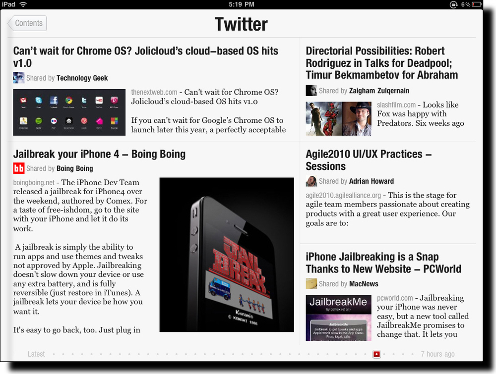 see what all the talk was about. Due to its popularity, the company could only make some of the capability of the app available upon download and the remainder, Twitter and Facebook integration, after a day or two. I knew immediately when the app launched that I was experiencing something entirely different. The splash screen shows full screen photos with a slow animation cross the screen of highlights from the various content sources you've selected. This approach to splash screens is novel and immediately grabs the user's attention with directly relevant content using often stunningly good photographs. Please note we're not even really using the app yet but have been drawn into it in an amazingly engaging way.
After you swipe to the left across the screen, you see the main Flipboard content channels. There is a starter set of content sources but you can select whichever ones you'd like from a fairly long list of candidates, including Wired, The New York Times, Fast Company, The Economist, Nature, Engadget, and The Onion.
Two special sources are Facebook and Twitter. These are the ones that you need to request access to during the early days of the launch of the app. Once you get your copy of Flipboard activated you now get content directly from your Facebook and Twitter streams into Flipboard.
So, what's so new you say, other than the cool photo splashscreen other than the fact that this app aggregates content from a number of different sources into one place? There are other apps that do that already and I've used most if not all of them.
What's truly unique about Flipboard is its design. It seamlessly integrates and visually renders content into in a way that Steve Jobs would call magical. Take a look at the screen shot above. Looks like a magazine layout, doesn't it? A layout that a designer would have manually crafted with photos included for appropriate emphasis of certain aspects of stories, etc. What you're actually looking at in that screen shot is my Twitter stream. Twitter is usually quite stark with textual tweets, links, and the occasional image. Flipboard has designed and coded algorithms to handle the layout and rendering of content dynamically and automatically. And the results are amazing. The user also has the option to tap on a story (actually a Tweet but it feels like a story) to see more detail as well as to be able to tap on any images to see them in full screen mode. You've never seen the images in your Twitter stream, Facebook updates, or from your online news sources look better! The subtle animation effects are also very effective.
It is often said that the spreadsheet program Lotus 1-2-3 was the "killer app" that drove the early success of the PC industry. I believe that Flipboard will do the same for the iPad and like devices. It shows was it possible with the device and its user interface patterns will likely (and should) be used widely in mobile apps like this. The app isn't without controversy, however, due to the way it pulls content from sources but I hope that this won't hamper the success of this amazing app. I should give you one caution, though. The app is so engaging to use that you'll find yourself spending much more time with it than you planned. It's like the experience you have with games except that in this case you're actually learning a ton during that extra time.
Apple Design vs. User Error
I've been thoroughly enjoying the use of my iPhone as regular readers of this blog will know from my previous posts. The importance placed on design at Apple and the design decisions made up until recently have been exemplary. Something appears to have changed however. I haven't used an iPhone 4 so can't really comment much on the problems with using the antennas as the actual bezel but it appears that it was an amazing industrial design masterpiece but a failure with users. If you haven't heard, there are pervasive reports of dropped phone calls when the iPhone 4 is held in certain ways particularly by left-handed users. Apple has essentially said that the problem is due to user error and that users should simply hold the phone differently or add a case. I'll leave the rest of that discussion to those who have first-hand experience with the device.
I do have first-hand experience with the new version of the operating system, iOS4, running on my iPhone 3GS. Since installing the new OS, my phone had been operating strangely: it would die even though it had a full battery charge, spontaneously reboot, and crash apps while I was using them. I was heart-broken that my wonderful iPhone had now developed some fatal flaw and the device that I could trust to always work now would be as unreliable as previous devices I'd used were.
A friend suggested I take it into an Apple store to have a Genius check it out. I did that. What I learned absolutely shocked me. The Genius ran a diagnostic program which reported a lack of available RAM. On further investigation it was determined that the lack of available RAM was due to multitasking. I haven't used multitasking much but was surprised to learn that many of the 100 or so apps I have on my iPhone were still running, albeit in suspended mode in most cases. Turns out that I didn't have the appropriate user model for the way multitasking works on the iPhone. I wonder how many users share my confusion. Here's actually how Apple designed multitasking to work. Every app you launch until you reboot is running in multitasking mode - and taking up memory! Guess how you're expected to stop apps from multitasking and taking up memory? You have to get into delete mode and delete by press the minus sign on every app in the multitasking tray! (see the screen capture above) Apparently, Steve Jobs when announcing iOS4 said something to the effect of companies who's multitasking operating systems require a task manager (meaning Microsoft's Windows) has failed to do its job. Well then, Apple has failed to do its job because not only is the multitasking tray on the iPhone a task manager, it requires you to manually delete every app you want to stop running on your device! If I could disable multitasking I would. Now I have to spend time manually deleting apps or reboot regularly both of which are a waste of time. I sure hope that the maintenance release of iOS4 fixes this problem and the one that iPhone 4 users are experiencing.
Apple is known for brilliant design but due to its intensely secretive culture, it doesn't do much user testing. It seems to me that the problems with the iPhone 4 and the problem I've identified here with the design of iOS4 may have been a casualty of this culture. I'd appreciate any thoughts you may have on this.
Design Guidelines and Trade-offs
Design guidelines and design trade-offs are often hotly debated in design circles. However, very little is know about them in actual practice. Now a doctoral student, Steve Szigeti, is doing research on this very topic. Steve is a doctoral candidate at the Faculty of Information (iSchool) at the University of Toronto, as well as a graduate fellow in the Knowledge Media Design collaborative program at the university. I'd like to share Steve's invitation for you to participate in his study here. Here are his words:
I'm seeking your help in a research study which looks at the role of design guidelines and design trade-offs in the process of web interface design. I would be grateful if you could share your opinions and experiences in a web based questionnaire. The questionnaire takes roughly 15-20 minutes to complete. All of your responses will remain confidential. This study is part of doctoral research in the Faculty of Information (iSchool) at the University of Toronto. I am interested in the experiences you and other web interface designers have with aspects of the design process, such as the use of guidelines and your experiences (if any) with design trade-offs. In appreciation for your participation, aggregate results of the survey will be posted at http://www.szigeti.ca after September 1, 2010. If you would like more information about this study, please don’t hesitate to contact me.
Please contribute to Steve's study by taking this questionnaire. Thanks.
Apple's New iOS4
I just upgraded my iPhone to the new version of the operating system. Apple renamed what used to be the iPhone OS to the more generic iOS because it is the system that powers the iPhone, iPad, and iPod Touch. The latest version, iOS4, comes with the new iPhone 4 but it is also being made available for free for previous iPhone models. I have an iPhone GS so the upgrade was a really nice surprise, especially for free!
The major enhancements that come with iOS4 include multitasking, folders, integrated and threaded mail, and camera zooming. Let's explore each of these in turn.
Multitasking is a welcomed addition to the iPhone. The method of switching between apps once you know that you have to double-press the button is pretty intuitive and convenient. What isn't so intuitive is what this control actually does. The tray of running apps is obvious enough but what is confusing is the fact that that tray just keeps filling up with apps even if you closed them down by single pressing the button. The only way to remove apps from the actively running tray appears to be to explicitly delete them, which is weird. Apparently, only a few apps are able to actually keep running whereas others simply suspend their state while not in focus. Any difference between these two types of apps in terms of their multitasking ability isn't apparent in the user interface itself.
Folders are not only a nice to have but a necessity if you have a reasonably large collection of apps. The user interface action in this case isn't intuitive but once you've done it once, it does feel natural. You have to simply drag one app icon onto another and a folder is created with the default name of the category of the apps. You can then add up to 12 apps per folder. Rather than having to scroll to the right and left through many pages of apps, the new folders allow you to simply tap on a folder which reveals all the apps within it without having to do any scrolling. I've found this a perfect way of cleaning up the apps on my iPhone and being able to access them in a much more efficient manner.
Mail has been enhanced with the addition of an integrated inbox and threaded conversations. I'm not crazy about the integrated inbox because I personally don't want my work and personal email in a single inbox. I find it jarring. However, others may think it is a great feature. As for the threaded conversations, I can't find them. I don't know if you have to somehow turn this feature on through another hidden user interface action but I don't see any threading in my inboxes. I'm assuming that the feature is essentially the approach that Google introduced into its GMail system where all replies to an initial email are nested together. I use that all the time in GMail and in Lotus Notes but I don't see it in my iPhone inboxes. When I find it, I'll report back here what I think of it.
Camera zooming is an incredibly important addition to the iPhone. I take pretty well all my pictures with the iPhone and the other day I was taking pictures of my daughter and her friends at a pre-prom party we hosted at our house. For some of the pictures, we had the group of friends all line up on the other side of the swimming pool from the parents taking pictures. The parents with actual cameras were able to zoom in to capture the group of friends across the pool but I wasn't able to zoom at all and, as a result, missed some of the detail. I now can with the updates made to the camera which allows you to move a slider on the camera view to set the right level of zoom. Pretty sweet!
While my very early experiences with the enhancements made to iOS4 weren't unqualifiedly positive, I am still very pleased with the update and especially so given the price - free.