
Designing Inside Chaos
I've been looking at a lot of screen shots lately that a variety of people have sent me. The design of some of the websites and web apps have been outstanding with just the right subtle balance of muted colors, nuanced typography, and sophisticated rendering of accent visuals. But I'm almost not able to see those designs at times because I'm virtually blinded by the distracting clashing browser themes/personas. All the work that went into the website and app designs seems to be wasted and lost due to the overpowering visual distraction and chaos around it.
That got me thinking about how often that may happen to great designs in the wild. I therefore asked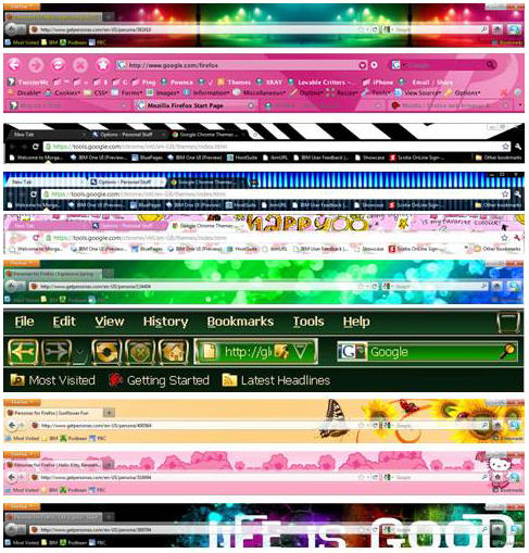 my Twitter followers and Facebook friends to tell me whether they had changed the default theme/look of their primary browser. The results indicated that 69% of them had modified the theme/look settings. Some also indicated they had systems that automatically changed their theme/persona weekly. While I'm sure that my friends and followers have good taste, it got me thinking about what types of themes/personas are in fact available. I checked out what was available and captured them into the collage shown on the right. As you can see, there is virtually every color combination, visual flourish, and even typography. Browser makers are attempting to provide more user choice and allowing users to customize their electronic environment. Designers, however, need to figure out how to design inside all of this visual chaos.
Many designers aren't even aware that their designs are often living within this world of visual chaos because they typically use Macs. And how much can you customize the Safari browser on the Mac? Well, you can't, without getting additional 3rd party tools to hack the system. I would suggest, therefore, that designers come up with designs that take into account the range of browser theme/persona customizations and that they also move over to a PC everyone once in a while to see what their designs will look like in the majority of browsers in use.
Designing the Perceptual Experience
I've been of the view for many years that visual design of software and industrial design of hardware have a much more powerful effect on us than virtually any other aspect of design. I've made that point in print and in presentations and workshops I've given at industry conferences over the years. However, this point of view has typically not been well-received by professionals who are not visual or industrial designers. In fact, some go to great pains to point out that ease of use is the most important attribute of design and that visual and industrial design are unnecessary or superfluous "eye candy" and others of course point out that function and speed are the most important attributes.
I believe that the experience of the past few years has reinforced the view that visual and industrial design trump virtually any other aspect of design. Our goal should be to optimize all aspects of design but never compromise visual and industrial design because these impact attributes of products and systems that directly effect our perception. Our perceptual experience with products and systems, in turn, drives satisfaction, purchase intent, and overall brand loyalty.
A great case study on this topic is Apple. While Apple does a reasonably good job in all aspects of design of it's products and systems, it really excels in visual and industrial design. It's market success is largely due to a maniacle focus on these attributes of design. I'd like to suggest that the halo effect that has been created for the company with it's focus on these aspects of design has made people much more forgiving of problems in other aspects of their products. Many of their products, for example, are not easier to use than those of competitors, people just perceive their products as easier to use. I regularly use a number of Apple products and, like most others, love using them. However, I've been more attentive recently to the ease of use problems I've been experiencing. There are many of these problems but, despite the fact that some are quite serious, I still on balance enjoy using these products. Interestingly, Apple products have recently experienced problems so serious as to make some products unoperational but the brand loyality they have built up still serves to keep customers coming back. The power and business value of designing the perceptual experience is amazingly strong.
I'd like to reiterate that our goal should be to optimize all aspects of design -- ease of learning, ease of use, usefulness, efficiency, user assistance, accessibility, globalization, etc. -- but we should never compromise visual and industrial design because these impact attributes of products and systems that directly effect our perception and color our perception of all of these other aspects of design.
Visual Design Characteristics of Web 2.0
Web 2.0 is many things. In fact, some would argue that it is too many things and, as a result, people have a difficult time figuring out what it encompasses. I won't go into that here. However, one key element of Web 2.0 is its unique visual design trend. Reflections, clean, simple, and wordmarks without the final consonant. The link below includes a summary of over 65 tutorials, references, and related resources, which have been designed to help you to create graphics in Web 2.0-Look. Have a look and start Web 2.0izing your designs.