Increasing Trend in Digital Interactions
We all have a sense that our world is getting more pervasively digital. However, I wanted to get a sense of the degree to which that change is happening with regard to our day-to-day communication. As I often do, I turned to my friends and followers on the social networks to get a reading. I did a survey three years ago asking questions on a variety of topics including this one. So, I thought it would be good to ask the key question again and see what change, if any, there has been in the use of electronic communication. I asked the following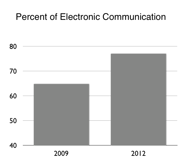 question on Twitter and Facebook: What percent of your interactions with others during a typical day would you say are via electronic means versus face-to-face? The results were pretty dramatic. In 2009, people responded that 65.7 percent of their interactions were via electronic means and the corresponding number in 2012 was shown to be 77.0 percent. A 11.3 percent increase in three years is quite amazing. Although this isn't a particularly scientific survey, it reinforces a pretty substantial trend toward more and more of our communication and interaction being experienced digitally. I'll follow up further to investigate additional factors underlying this trend, such as work versus personal interactions, the degree to which the communication leverages mobile devices, etc., and will report those results here as well.
Design Guidelines and Trade-offs
Design guidelines and design trade-offs are often hotly debated in design circles. However, very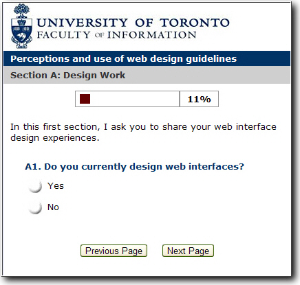 little is know about them in actual practice. Now a doctoral student, Steve Szigeti, is doing research on this very topic. Steve is a doctoral candidate at the Faculty of Information (iSchool) at the University of Toronto, as well as a graduate fellow in the Knowledge Media Design collaborative program at the university. I'd like to share Steve's invitation for you to participate in his study here. Here are his words:
I'm seeking your help in a research study which looks at the role of design guidelines and design trade-offs in the process of web interface design. I would be grateful if you could share your opinions and experiences in a web based questionnaire. The questionnaire takes roughly 15-20 minutes to complete. All of your responses will remain confidential. This study is part of doctoral research in the Faculty of Information (iSchool) at the University of Toronto. I am interested in the experiences you and other web interface designers have with aspects of the design process, such as the use of guidelines and your experiences (if any) with design trade-offs. In appreciation for your participation, aggregate results of the survey will be posted at http://www.szigeti.ca after September 1, 2010. If you would like more information about this study, please don’t hesitate to contact me.
Please contribute to Steve's study by taking this questionnaire. Thanks.
Websites for SmartPhones
As I mentioned in a previous post, we're witnessing a dramatic increase in the use of SmartPhones in doing core daily tasks. Couple that with the increase in the use of the browser as the mechanism for accessing information, and we see the need for addressing the question of what default user interface should be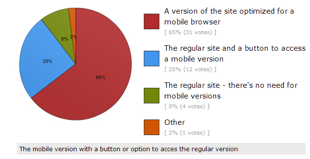 shown when access a website using a SmartPhone. To determine what people prefer in this regard, I created a poll and asked followers of my Twitter accounts to respond to it. The poll asked, "What should come up when you access a website with a SmartPhone?" The responses were interesting. As shown in the pie chart on the right, 65 percent preferred "a version of the site optimized for a mobile browser", 25 percent wanted "the regular site and a button to access a mobile version", while only 8 percent wanted "the regular site - there's no need to for mobile versions". A write-in comment preferred, "the mobile version with a button or option to access the regular version" so the opposite of option two above. These results indicate a clear strong preference for some type of support for a mobile version of sites with 90 percent of respondents wanting a site tailored for SmartPhones. The vast majority of those respondents preferred a special mobile optimized version of a site to appear by default when a site is visited by a SmartPhone. Interestingly, most websites don't do that today but will have to in the future to satisfy users' preferences. The number of respondents to this poll is 48 thus far and I'd like to see a substantially bigger number given the importance of this question so if you'd like to contribute to the poll you still can and I'd really appreciate it if you would take the poll.
Design Impact on Purchase Decisions
Most people involved in user experience design spend the majority of their effort on honing their skills and applying them in creating a great look and feel for the offerings on which they work. However, it is often necessary to clearly communicate the business value of that desi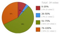 gn work. The most important business metric is often the impact of the design on purchase decisions. Similar to the surveys I've conducted in the past on this, I recently decided to poll the followers I have on my @ibmdesign Twitter account. I asked them the question, "what percentage of your product purchase decisions are typically based on the look and feel of the user interface?" and received the responses visualized in this pie chart. A total of 88% of respondents reported that look and feel was the basis of the purchase decision more than half of the time and 32% reported that it was the basis of their decision 76-100% of the time. These results corroborate and further extend previous findings which indicated that half of purchase decisions are based solely on the look and feel of the user interface.
As usual, please feel free to provide any thoughts you may have on this using the comment mechanism provided.
Influential Books on Design
I've been interested for some time in getting other people's perspectives on a number of topics but most recently on the topic of the most influential books on design. So, I asked the foll owers of my @ibmdesign and @karelvredenburg Twitter accounts the question, "What's the most influential book you've read on design that you'd recommend to others?" I received a number of really good responses so thought I'd share them here. I've decided to include the additional words people used in describing their books. It is interesting to note that five people mentioned books by Donald Norman with the first four recommending "The Design of Everyday Things" and the fifth recommending his more recent "Emotional Design". The rest of the list includes some pretty interesting books some of which I know I haven't read but now will.
- Donald Norman's "The Design of Everyday Things".
- "The Design of Everyday Things" by Donald Norman, perhaps the best and most foundational design book.
- I think Don Norman's "Design of Everyday Things" is a must-read for anyone who designs anything!
- "Design of Everyday Things"
- Most influential book: "Emotional Design" by Donald Norman
- "Set Phasers on Stun" has great case studies of design gone awry.
- "Dreaming in code" is an interesting guide to software development.
- The most influential book on design that I have read is "Goodnight Moon" by Margaret Wise Brown. The audience is enormous.
- "Computers and democracy: a scandinavian challenge" (1987) - first major participatory design publication in english
- "Dont make me think" is the best design book. At least for me. Principals discussed applied any where.
- "Now You See It: Simple Visualization Techniques for Quantitative Analysis" by Stephen Few
- Jeff Johnson's "GUI Bloopers" is the most practical useable desktop reference for companies that don't have standards or UX staff.
- "The Illusion of Life"; "Design is multidisciplinary", so I don't think we've only 1 most influential book
- "Sketching User Experiences"
- "Reflective Practitioner"
- "A primer of visual literacy"
If you have any books to add to the list or have any comments on the books already listed, please leave a comment below.
Twitter Insights

Who would have thought that an application that provided users the ability to input 140 characters of text, have others see it, and be able to see what others write would have become such a success. I've pointed out previously in this blog that I attribute the success of Twitter to the ability to connect with other human beings very efficiently with a minimum of technology in between.
There is a lot we can learn from this phenomenon if we collect and analyze relevant information. I did that via my two Twitter accounts (@ibmdesign and @karelvredenburg) and a polling tool. I've summarized below some of the key findings.
Twitter Use:
A total of 68% of followers have Twitter visible to them most of the day. That's a lot of people keeping track of what is on Twitter for a good portion of the day. Interestingly, Twitterers are not the same as Facebookers. Followers reported using Twitter 80% of the time and Facebook 20% but when I polled my Facebook friends the opposite was true.
Electronic Communication:
Followers responded that 65.7% of the time they interact with others during a typical day is via electronic means. Of course, this isn't just Twitter but is still astounding that two out of every three interactions people have during a typical day are via electronic means and only one out of the three is face-to-face in person communication.
Percent of Tweets Read:
You wonder what percentage of tweets people actually read on Twitter. I asked that too. Followers reported reading 47% of tweets on average but there was a low group which read 5% and high group which read 90%. The low group typically followed a lot of people making it difficult to read a significant proportion of the tweets coming through.
Website or Clients:
On average, users reported accessing the twitter.com site only 7.6% of the time they use Twitter. The vast majority use desktop or mobile Twitter clients. The percentage is interesting because the only statistics that are ever provided for the total number of Twitter users are those of the number of people who use the Twitter.com site. If the 7.6% is at all in the ball-park, this suggests that the total number of users of Twitter exceeds that of Facebook. It would seem possible to accurately count the total number of users since the source client information is included in each tweet but nobody to my knowledge has reported those numbers.
Time to Start Tweeting:
A recent report questioned whether people who join Twitter are serious about  using it since it appeared that 60% didn't continue tweeting for the first month. I ran a poll on this one and found that 33% started reading and tweeting immediately, 18% took a week to start, 14% took more than a month, 21% took several months, and 11% took more than a year before that started. I'm actually in the several months group myself. It took me a while to figure Twitter out and friends of mine have the same experience. From these data, it would appear that 49% of people do not tweet during the first month that they've signed up for Twitter but they do after a month or much later. This itself is interesting. While the basic concepts behind Twitter is fairly straight-forward, the actual use if it with all of its conventions isn't.
Conventions:
In a previous post on this blog I wrote the Twitter Authoring Guidelines to help people getting started with Twitter. I'd suggest that anyone still unclear about aspects of the Twitterversse to read that post. It is interesting that most of the conventions in Twitter simply involved someone starting to use a particular practice and then others following their lead. After that, the conventions are incorporated into the various Twitter clients. I've been involved with an  effort to improve the design of one of the most important elements of Twitter--the retweet. Most people use the standard "RT @name" to retweet content that someone else has written. The assumption is that this format indicates attribution of the source but virtually no change in the content. Another format "via @name" is supposed to be for retweeting with paraphasing or additional content. Everyone is aware of the former format but fewer are aware of the latter one. One of my followers proposed a new much more efficient format "~@name" which takes one in the place of three or four characters of the precious 140. It is also quite simple and elegant. Of course, I ran a poll on this too and the results showed that 69% of preferred to use the "~@name" format in place of at least some of the other formats. A full 37% want to replace both other retweeting formats with the tilde, 17% think that only the RT format should be replaced, and 14% believe that tilde should replace the "via" format. I'm now using "~@name" for all of my retweeting and encourage you to do as well.
I'm quite amazed at the ability to very quickly collect this type of information using Twitter itself. Of course, it is simply self-report and thus doesn't necessarily reflect reality perfectly. However, I believe this information provides interesting insights into key aspects of the Twitterverse. As always, I'd appreciate any thoughts you may have on any of this by using the commenting feature of this blog.
Design Mentoring
I've served as a mentor to many people over my career and have also learned a lot from the people who have mentored me. In fact, it was my mentees and mentors who inspired me to start the UXDesignCast and Life Habits podcasts. My experience of late communicating regularly with the more that 3,000 people who follow my two Twitter accounts gave me the idea to collect some mentoring wisdom from this crowd that I could share with everyone. I asked two questions that yielded some great responses.
What's the one thing you didn't learn in design (or other) school that you now believe is key to success?
- How to play nicely with others -- art of influence versus trying to solo
- Entrepreneurship, client communication, proper valuation of work
- On the job there are way more people involved in the iterative process than there were in school; things aren't as flexible
- Trusting your gut, "liking" the people you hire, and always standing up for what you believe in
- Working with people across differences in discipline, background, and power - design as a social practice emphasizing diversity
- How to listen -substantially underestimated
- Speed is key to iteration. Trial & error trumps genius. Perfect is enemy of the good
- Soft skills like persuasion, communication to marketing, developers, sales, CEO's, negotiating
What's the most insightful, interesting, or valuable thing anyone ever told you about design?
- Best advice re design "simplicity, less is more, balance, specialist generalist, implicit communication, realign, define problem, iterate, reflect".
- That you don't have to be "a designer" to be a designer
- All Display Is No Display” From newspaper editor on art of balancing headlines (display) art & text.
- (Industrial) Designers are "Specialists Generalists"; they need to know something about everything in order to do their jobs.
- Design = implicit communication
- Realign not redesign
- Clearly define the problem, iterate often and step away regularly in order to reflect.
- It was in London, during a lecture, someone told me : "every morning you are a designer" because of clothing.
- "That is painful to look at."
I'd like to thank all those who provided input on this via Twitter and would like to invite you to contribute any additional thoughts you may have on either of these questions using the commenting capability of this blog.
Well-Designed UIs Critical in Enterprise Software Buying
An article on Wallstreet Online reports on a recent study conducted by Forrester Consulting on the importance of user interface design on enterprise purchase decisions. The study found that 82 percent of those who make purchase decisions consider an enterprise software application's user interface a determining factor when deciding to replace their enterprise software and 90 percent indicated the user interface as a priority when purchasing additional new software. This corroborates recent conversations I've had with people in large enterprises as well. I think this indicates two things. First, that user interface design is becoming much more important and we're starting to see actual numeric validation of it.
I would argue that users have seen the importance of good user interface design for a long time and this has resulted in us seeing better and better designed products for the consumer market. Remember that the user and the purchase decision-maker are typically one and the same in the consumer market. However, that is not typically the case in the enterprise market where users are not normally the decision-makers too. It has therefore taken longer for the importance of good design to be realized by enterprise decision-makers. However, this study and recent experiences I've had indicate that the importance of good UI design is now not only realized by enterprise purchase decision-makers but it is also seen as critical to them in making their decisions.
The substantive findings here are important but also the fact that they exist at all. Studies like this that examine the importance of design to business have in the past been all too few. We need more applied research like this investigating and quantifying the business importance of design.
Web 2.0's Built-in Customer Input & Collaboration
 During Web 1.0 and before that, companies had to go out of their way to collect feedback from their customers and when they did, it was in the form of customers communicating directly with the company. Web 2.0 changes all of that. Now customer feedback is an integral component of most social computing sites. And, the feedback is public. This provides great benefits to companies by getting more direct and regular feedback but it also changes the nature of the feedback process in that customers can also use the feedback from other customers directly as well. An article by Vicky Burger on Web 2.0 transformation addresses this topic.
However, things are not quite the way you may think they are in the world of social computing. Very few people are aware of a recent study which shows that less than one percent of visitors to social computing sites contribute in any way including providing feedback whether comments or ratings. So, the challenge here is that companies are now able to get additional feedback directly from customers but they may run in to two problems. The first is that unless the site gets a huge number of hits, the amount of feedback the site may collect will likely be very small (remember less than 1% contribute). The second, and perhaps even more difficult to deal with, problem concerns the likelihood of the sample being unrepresentative in some way. I haven't seen any research on characteristics of users who tend to contribute to sites versus those who don't and without that type of information it is difficult to determine whether the feedback a company gets in this way is representative or biased in some way.
Companies that are serious about making strategic decisions on the bases of direct customer feedback coming from Web 2.0 sites would be wise to adopt the best practice from market research of directly testing the non-response bias. The way that's done is to solicit input on the same questions from people who didn't contribute the information unsolicited and then comparing the results to test for a systematic bias. Without a specific focus on this aspect of Web 2.0 user feedback, companies could find themselves honing the designs of their sites based on the feedback of the small group of people who contribute feedback and these changes may not be optimal for the entire population of users who the company is trying to satisfy.
