Websites for SmartPhones
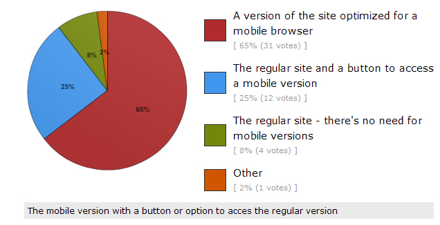
As I mentioned in a previous post, we're witnessing a dramatic increase in the use of SmartPhones in doing core daily tasks. Couple that with the increase in the use of the browser as the mechanism for accessing information, and we see the need for addressing the question of what default user interface should be shown when access a website using a SmartPhone. To determine what people prefer in this regard, I created a poll and asked followers of my Twitter accounts to respond to it. The poll asked, "What should come up when you access a website with a SmartPhone?" The responses were interesting. As shown in the pie chart on the right, 65 percent preferred "a version of the site optimized for a mobile browser", 25 percent wanted "the regular site and a button to access a mobile version", while only 8 percent wanted "the regular site - there's no need to for mobile versions". A write-in comment preferred, "the mobile version with a button or option to access the regular version" so the opposite of option two above. These results indicate a clear strong preference for some type of support for a mobile version of sites with 90 percent of respondents wanting a site tailored for SmartPhones. The vast majority of those respondents preferred a special mobile optimized version of a site to appear by default when a site is visited by a SmartPhone. Interestingly, most websites don't do that today but will have to in the future to satisfy users' preferences. The number of respondents to this poll is 48 thus far and I'd like to see a substantially bigger number given the importance of this question so if you'd like to contribute to the poll you still can and I'd really appreciate it if you would take the poll.
