
Websites for SmartPhones
As I mentioned in a previous post, we're witnessing a dramatic increase in the use of SmartPhones in doing core daily tasks. Couple that with the increase in the use of the browser as the mechanism for accessing information, and we see the need for addressing the question of what default user interface should be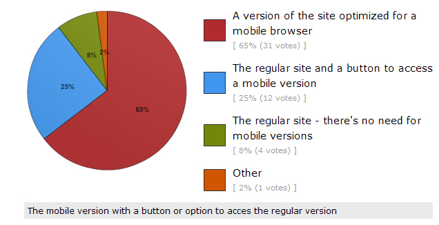 shown when access a website using a SmartPhone. To determine what people prefer in this regard, I created a poll and asked followers of my Twitter accounts to respond to it. The poll asked, "What should come up when you access a website with a SmartPhone?" The responses were interesting. As shown in the pie chart on the right, 65 percent preferred "a version of the site optimized for a mobile browser", 25 percent wanted "the regular site and a button to access a mobile version", while only 8 percent wanted "the regular site - there's no need to for mobile versions". A write-in comment preferred, "the mobile version with a button or option to access the regular version" so the opposite of option two above. These results indicate a clear strong preference for some type of support for a mobile version of sites with 90 percent of respondents wanting a site tailored for SmartPhones. The vast majority of those respondents preferred a special mobile optimized version of a site to appear by default when a site is visited by a SmartPhone. Interestingly, most websites don't do that today but will have to in the future to satisfy users' preferences. The number of respondents to this poll is 48 thus far and I'd like to see a substantially bigger number given the importance of this question so if you'd like to contribute to the poll you still can and I'd really appreciate it if you would take the poll.
Mobile Optimized Sites
I did a poll a while ago addressing the question of what devices people used during a typical day to do their e-mail. The results were reported here and showed that 38.2 percent used their SmartPhones. Given the dramatic increase in the use of SmartPhones, it becomes important to address the issue of website design. Websites are normally designed to be accessed with a computer, a notebook, netbook, or desktop computer. However, SmartPhones now have browsers that are capable of rendering full websites albeit in a rather reduced space. It is pretty easy using touch gestures to increase the size of a part of the site that you're interested in and, in fact, you can also use a double-tap on the screen to resize a particular column for better viewing. I normally do the latter on multi-column sites so that I can read the substantive column.
The issue arises then of whether developers of websites should provide mobile optimized versions of their sites and, if so, should the mobile version come up automatically when the site is accessed by a mobile device or should the user be given a choice by bringing up the normal site and including a button for accessing the mobile version? I've changed my mind several times myself as to which of these I prefer. If you're accessing this site with a mobile device, you'll know that I've already implemented the automatic launching of a mobile optimized version of the site.
Please let me know whether you prefer sites to automatically launch a mobile version of the site, whether they should launch the normal site and give the user the option via a button of launching the mobile optimized version, or do you think sites are fine as they are and don't need mobile optimized versions? I'd greatly appreciate it if you would leave a comment describing your preferences.