Apple's Post-PC Era
I was just setting up a new iPad for a family member who wanted to use the new device she received as a gift as a stand alone device without needing to connect to a PC. Regular readers of this blog will know that I'm usually pretty positive about Apple's designs and, of course, I'm certainly not alone in that view. Apple is incredibly good at hardware design and the integration of software with its hardware. However, the company to date has had some difficulty with the design of its cloud capabilities.
Apple has recently used the term "post-PC era" as a basis for its mobile and cloud strategies and communication. Recent updates to iTunes and iOS have provided some independence of mobile devices from computers, but only partially. You can now push updates from a PC-based iTunes to an iPod Touch, iPhone, or iPad without using a cable but you still have to use a computer in the mix.
There are other use cases that have absolutely no support on iOS devices. 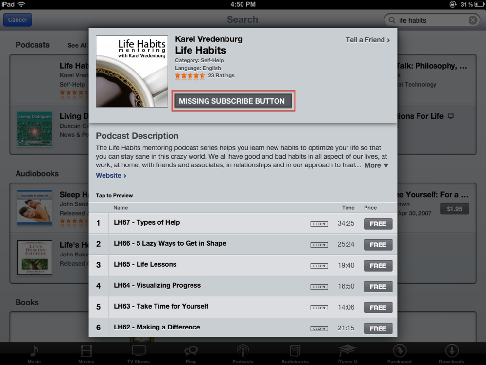 The most annoying and concerning one for me is the inability to subscribe to podcasts on Apple mobile devices. You can download individual episodes but there is no way to actually subscribe within mobile iTunes. With the increasing popularity and use of mobile devices (see last blog post), the inability of podcast listeners to subscribe via mobile devices is not only inconvenient for users, it is also a major problem for those creating podcasts, like me. It is really strange that Apple hasn't provided the capability to subscribe. All it would require is to include the same "subscribe" button to the right of the podcast name and artwork on mobile iTunes as is included on the computer-based version of iTunes (see visual on the right). It was pointed out to me by a friend on Facebook that there are separate apps that provide this capability with one called Downcast that is particularly good and one that he recommends. That's a temporary fix but I still think that this missing function needs to be included in the base mobile version of iTunes. I know that it is a herculean task to develop mobile device operating systems that never need to be connected to a PC and to design that really well. However, leaving off the subscribe button seems to be a rather strange oversight on Apple's part.
To the listeners of my podcast who may be reading this, I'd suggest that you use the iTunes on your PC to subscribe to the podcast or download an app like Downcast to essentially replace the podcast part of mobile iTunes on your iOS device. I do hope that Apple addresses this problem soon in an update to iOS so that we won't see bifurcation of the podast audience on Apple devices and also no longer have a single reliable place to determine podcast popularity and feedback.
Designing for Mobile Sites
Mobile devices are proliferating at an incredible rate. Designers of websites have to decide what experience they'd like to create for users of their sites and factor in what users prefer. SmartPhones are the real challenge given their screen size. Since the iPhone came out with its amazing screen and the ability to resize portions of the screen, I've come to prefer full websites rather than sites optimzed for the smaller screen. I prefer a three column website design with navigation in the left column, the main content in the center column, and additional information in the right column. I then double-tap the center column to enlarge the core content to make it easier to read.
That's my own personal preference but I wanted to learn what other people prefer. 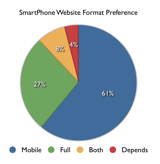 As usual, I consulted the social networks. I asked, "Do you prefer mobile-enabled or full versions of websites on our SmartPhone?" A total of 55 people replied and the results are shown in the visual on the right. A slight majority of respondents (61%) preferred sites to be optimized for the mobile device but a non-trivial number (27%) preferred the full site and a reasonable number wanted both (8%) and a very small number (4%) said that it depends. Given these results and the fact that many respondents felt quite strongly about their responses, it isn't immediately obvious what designers should do in order to provide users what they prefer. Although the majority preferred mobile enabled sites, many people expressed the concern that many sites that are optimized for mobile leave out information that is available on the full version of the site. The best advice therefore would be to provide a mobile version of the site that includes the same information as the full version, to also provide direct access to the full version for those who prefer that, and to save users' preferences for the next time they access the site.
It should be pointed out that the question being addressed here was specific to viewing websites on SmartPhones and didn't go into tablets or apps which we may address in a future set of questions and blog post.
Mobile Blogging App Review
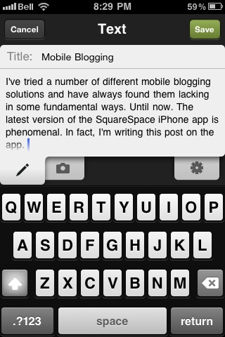
I've tried a number of different mobile blogging solutions and have always found them lacking in some fundamental ways. Until now. The latest version of the SquareSpace iPhone app looks really promising. In fact, I'm writing this post on the app. I just took a screen shot of the editing user interface and added it as image to this post. I also just entered the image editing mode but all I could do with the picture is to delete it. The text editing tab is great as are the post saving options (save to the iPhone, save as draft to the site, and save and publish to the site).
One other really valuable feature of the new version is comment management. The app also has a notification feature for comments which is incredibly useful for a blogger like me who has turned on comment moderation which requires me to explicitly approve comments. You may recall that I had to turn that on given the number of spam comments I was getting.
All in all, a really promising app, assuming of course that the post I just wrote here publishes properly with the image imbedded.
<Please note that I had to fix the size and the positioning of the image outside of the mobile app so the app a really good but not yet perfect>
Mobile Design Innovation
I heard the buzz about a new iPad app called Flipboard a few days ago so downloaded it to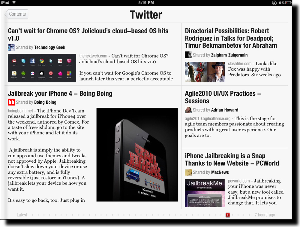 see what all the talk was about. Due to its popularity, the company could only make some of the capability of the app available upon download and the remainder, Twitter and Facebook integration, after a day or two. I knew immediately when the app launched that I was experiencing something entirely different. The splash screen shows full screen photos with a slow animation cross the screen of highlights from the various content sources you've selected. This approach to splash screens is novel and immediately grabs the user's attention with directly relevant content using often stunningly good photographs. Please note we're not even really using the app yet but have been drawn into it in an amazingly engaging way.
After you swipe to the left across the screen, you see the main Flipboard content channels. There is a starter set of content sources but you can select whichever ones you'd like from a fairly long list of candidates, including Wired, The New York Times, Fast Company, The Economist, Nature, Engadget, and The Onion.
Two special sources are Facebook and Twitter. These are the ones that you need to request access to during the early days of the launch of the app. Once you get your copy of Flipboard activated you now get content directly from your Facebook and Twitter streams into Flipboard.
So, what's so new you say, other than the cool photo splashscreen other than the fact that this app aggregates content from a number of different sources into one place? There are other apps that do that already and I've used most if not all of them.
What's truly unique about Flipboard is its design. It seamlessly integrates and visually renders content into in a way that Steve Jobs would call magical. Take a look at the screen shot above. Looks like a magazine layout, doesn't it? A layout that a designer would have manually crafted with photos included for appropriate emphasis of certain aspects of stories, etc. What you're actually looking at in that screen shot is my Twitter stream. Twitter is usually quite stark with textual tweets, links, and the occasional image. Flipboard has designed and coded algorithms to handle the layout and rendering of content dynamically and automatically. And the results are amazing. The user also has the option to tap on a story (actually a Tweet but it feels like a story) to see more detail as well as to be able to tap on any images to see them in full screen mode. You've never seen the images in your Twitter stream, Facebook updates, or from your online news sources look better! The subtle animation effects are also very effective.
It is often said that the spreadsheet program Lotus 1-2-3 was the "killer app" that drove the early success of the PC industry. I believe that Flipboard will do the same for the iPad and like devices. It shows was it possible with the device and its user interface patterns will likely (and should) be used widely in mobile apps like this. The app isn't without controversy, however, due to the way it pulls content from sources but I hope that this won't hamper the success of this amazing app. I should give you one caution, though. The app is so engaging to use that you'll find yourself spending much more time with it than you planned. It's like the experience you have with games except that in this case you're actually learning a ton during that extra time.
Mobile Optimized Sites
I did a poll a while ago addressing the question of what devices people used during a typical day to do their e-mail. The results were reported here and showed that 38.2 percent used their SmartPhones. Given the dramatic increase in the use of SmartPhones, it becomes important to address the issue of website design. Websites are normally designed to be accessed with a computer, a notebook, netbook, or desktop computer. However, SmartPhones now have browsers that are capable of rendering full websites albeit in a rather reduced space. It is pretty easy using touch gestures to increase the size of a part of the site that you're interested in and, in fact, you can also use a double-tap on the screen to resize a particular column for better viewing. I normally do the latter on multi-column sites so that I can read the substantive column.
The issue arises then of whether developers of websites should provide mobile optimized versions of their sites and, if so, should the mobile version come up automatically when the site is accessed by a mobile device or should the user be given a choice by bringing up the normal site and including a button for accessing the mobile version? I've changed my mind several times myself as to which of these I prefer. If you're accessing this site with a mobile device, you'll know that I've already implemented the automatic launching of a mobile optimized version of the site.
Please let me know whether you prefer sites to automatically launch a mobile version of the site, whether they should launch the normal site and give the user the option via a button of launching the mobile optimized version, or do you think sites are fine as they are and don't need mobile optimized versions? I'd greatly appreciate it if you would leave a comment describing your preferences.
Mobile Usage Trends
I've noticed a dramatic change in how I use technology. I used to have a desktop computer many years ago but then switched to a notebook computer exclusively (mostly a ThinkPad). Over the past few years I've increasingly used a hand-held device as well (first an iPod Touch and then an iPhone). In addition to these changes, most of the data I work with is now stored in the "cloud". All of this has resulted in my being able to do certain types of tasks on either of my devices while some are still done better on one or the other device. I find this amazingly liberating.
Most of the tech pundits I read and listen to also talk about this type of transition in their use of technology. However, I wondered how pervasive or representative this change in usage was. As I often do, I decided to turn to Twitter to ask the followers of my @ibmdesign account to take a brief poll answering the question, "Please indicate the devices you use to do your e-mail during a typical day (check all that apply)" and giving the options of "Desktop Computer, Notebook Computer, Smartphone, and Other". I chose e-mail given that it can be done reasonably well on any of these devices.
The poll was completed by 228 people (thanks to those who responded!) and the results showed that 39.5 percent of e-mail was done using a Notebook Computer, 38.2 percent was done using a Smartphone, and only 22.4 percent was done on a Desktop Computer. Although there was an "Other" category, most of the responses could have been placed into the other cat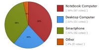 egories so I did that to simplify the analysis. So it appears that Notebook Computers and Smartphones are used almost equally and Desktop Computers are used relatively little. Who would have thought just a few years ago that we'd be doing half of our e-mail using our phones? It's important to point out that the poll asked respondents to "check all that apply" so the results shouldn't be interpreted as indicating that 38.2 percent of respondents exclusively use their Smartphones for doing e-mail. In reality, most people likely do some of their e-mail on a Smartphone and leave a certain portion of it to a time when they have a Notebook or Desktop Computer at their disposal. I find that I don't deal with e-mails that are more involved, have extensive attachments, or require me to write a lengthy reply on the iPhone but leave those to deal with on my ThinkPad.
It'll be interesting to see what will happen to these trends when Apple's iPad is introduced into the mix. How do you think these trends will change as a result? Please use the comment mechanism to provide your thoughts on this.
Mobile Work
I've observed colleagues for years walking around with their Blackberries staying connected with their work. While I've stayed connected with work via cellphone and texting, I haven't until very recently used a smartphone to connect to work e-mail, intranet, and other work applications. I've just installed IBM Lotus Notes Traveler and I absolutely love it. I now have my work e-mail, calendar, contacts, to do lists all directly integrated seamlessly into the relevant apps and services on my iPhone. Through VPN on the iPhone, I also now have access to the company intranet and services like chat messaging.
I find it amazingly convenient to be able to quickly check my work e-mail while in line at the coffee shop and to look up where my first meeting of the day is when I'm running late and don't have time to take out and open up my notebook computer. It's an amazing time saver and uses the form factor I so love.
When I think about the convenience of having work information available like this on the device that's always in my podcast, I can imagine the utility of having it available on the somewhat larger but equally enjoyable iPad. I'm looking forward to that. There is one feature that I haven't heard anyone mention with regard to these devices that I think is critical for accessing work systems and that's fingerprint recognition. That would be so useful and Apple cool.
As always, I'd appreciate any thoughts you may have on my thoughts. By the way, I also wrote this post on my iPhone.
Multi-sense and Multi-tasking Experience
There was a time not that long ago when people would use a single sense and carry out a single task in a single place. We now tend to use multiple senses and carry out multiple tasks while moving from place to place.
There are advantages and disadvantages of the technologies that make this possible. Fans of technology, like myself, tend to focus on the huge benefits of essentially doing more and having a wider sensory experience while doing it. Critics of technology focus on the negatives involving safety, health, and overall quality of work and life. The fans and critics are both right and we as users of technology (and some of us as designers of technology) should periodically take stock of whether the right balance has been struck given the particular context of use.
For example, I started writing this post on the treadmill while listening to a podcast. The ability to do three things at once when we all have so little time in a day is so tempting thanks to these technologies. I find that listening to music, podcasts, or audiobooks while on the treadmill or driving is the perfect combination. Listening to podcasts or audiobooks while answering email or tweeting also works but I typically have to switch to instrumental music while writing something more substantial that requires more thought and attention. For certain types of work, I have to turn off all sound and instant messaging/texting clients and focus on a single-task. I got off the treadmill and switched to instrumental music to finish this post.
We all have different thresholds when it comes to what we desire as a minimum level of multi-sense and multi-tasking as well as what the maximum level of these that we can handle. In addition, certain situations and types of work should further determine the optimal level. I think we need to find those thresholds and consider contexts to determine the right level in a particular situation.
Of course, then we all also need to take the occasional sabbatical from technology entirely to think freely and fully experience the world and people around us. I worry that we don't do that enough with the ready availability of all this technology all the time.
As always, I'd greatly appreciate your thoughts on this via the commenting mechanism.
Mobile Blogging
I have a mobile device with me at all time and a computer only some of the time. I therefore thought I should try out writing and uploading blog posts remotely. I'm writing this post using my iPod Touch while I'm on vacation.
I'm finding that I'm doing more and more using a mobile device. I do the majority of my tweeting, a significant amount of my e-mail, as well as rss reading, facebooking, and even checking my Google Analytics on a mobile device. So, blogging makes sense too.
I'd love to hear about your experiences in using mobile platforms via the commenting mechansim below.
A Mobile UI Innovation
Input and output on mobile hand held devices have been a challenge for years. Recent advances in these devices have dramatically increased the resolution of the output to the screen. Direct manipulation via multi-touch has also vastly improved the ability to interact with content on the screen. However, getting input into these devices has seen little improvement other than trying to get to parity with desktop and laptop devices. Apple's iPhone and iPod Touch introduced the software-based keyboard. Although this was novel in many ways, it didn't fundamentally address the problem of trying to type on a very small keyboard with fingers larger than the surface of the keyboard.
 I recently came across a true innovation that cleverly addresses this problem. Shumin Zhai and his team at IBM Research have created WritingPad, a free app for the iPhone. The innovation here is that you don't simply tap out individual letters and correct each one as is the case with the default iPhone keyboard but, instead, you simply drag your finger across the WritingPad software keyboard contiguously and the system infers the words. Corrections are done at an individual word level rather than letters.
The other innovation here is how this research team is gathering user feedback on the design of the app. They provided it as a free app in the iTunes Store and with it's built in rating and commenting system, the team has been able to rapidly collect huge amounts of very valuable feedback. A quick read through the feedback indicates that this direction as a new method of providing input into a mobile hand-held device is a real hit and deserves more focus.
So, hats off to the IBM Research team for this design innovation and for an innovative way of collecting feedback on it. If you have an iPhone or iPod Touch and would like to try WritingPad for yourself, here's where to find it in the iTunes Store.
