Mobile Design Innovation
I heard the buzz about a new iPad app called Flipboard a few days ago so downloaded it to see what all the talk was about. Due to its popularity, the company could only make some of the capability of the app available upon download and the remainder, Twitter and Facebook integration, after a day or two. I knew immediately when the app launched that I was experiencing something entirely different. The splash screen shows full screen photos with a slow animation cross the screen of highlights from the various content sources you've selected. This approach to splash screens is novel and immediately grabs the user's attention with directly relevant content using often stunningly good photographs. Please note we're not even really using the app yet but have been drawn into it in an amazingly engaging way.
After you swipe to the left across the screen, you see the main Flipboard content channels. There is a starter set of content sources but you can select whichever ones you'd like from a fairly long list of candidates, including Wired, The New York Times, Fast Company, The Economist, Nature, Engadget, and The Onion.
Two special sources are Facebook and Twitter. These are the ones that you need to request access to during the early days of the launch of the app. Once you get your copy of Flipboard activated you now get content directly from your Facebook and Twitter streams into Flipboard.
So, what's so new you say, other than the cool photo splashscreen other than the fact that this app aggregates content from a number of different sources into one place? There are other apps that do that already and I've used most if not all of them.
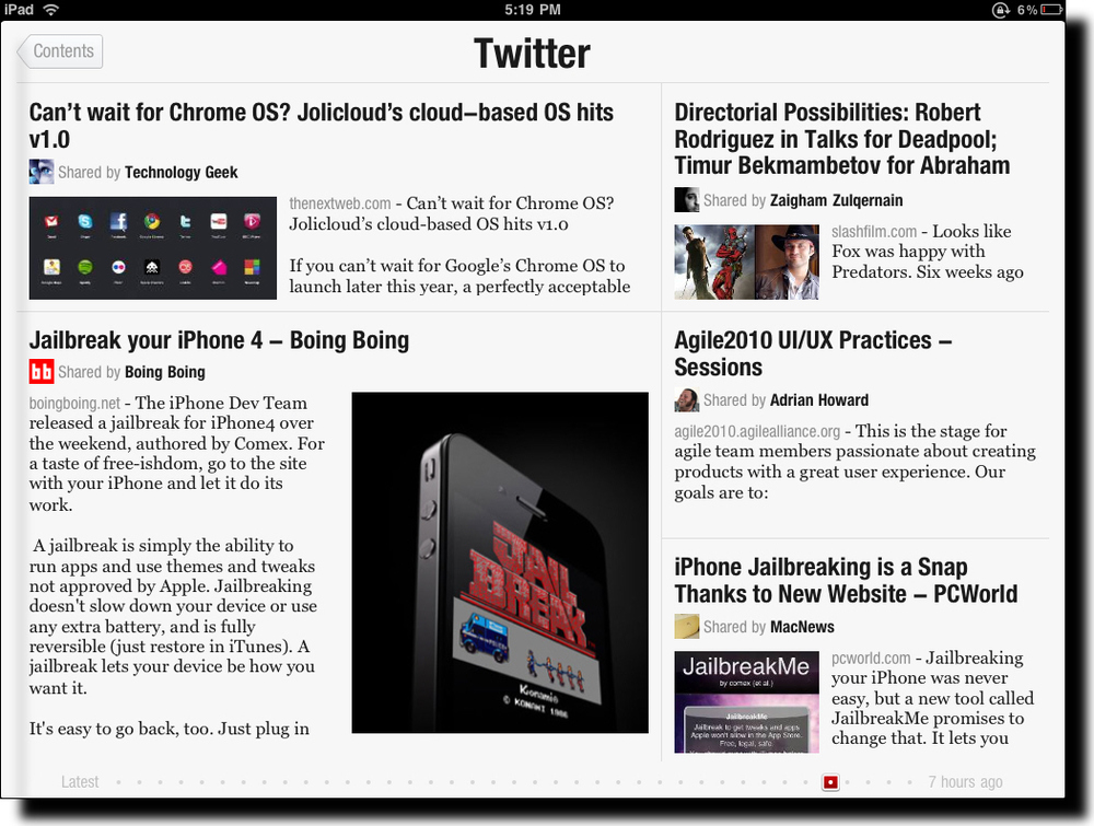
What's truly unique about Flipboard is its design. It seamlessly integrates and visually renders content into in a way that Steve Jobs would call magical. Take a look at the screen shot above. Looks like a magazine layout, doesn't it? A layout that a designer would have manually crafted with photos included for appropriate emphasis of certain aspects of stories, etc. What you're actually looking at in that screen shot is my Twitter stream. Twitter is usually quite stark with textual tweets, links, and the occasional image. Flipboard has designed and coded algorithms to handle the layout and rendering of content dynamically and automatically. And the results are amazing. The user also has the option to tap on a story (actually a Tweet but it feels like a story) to see more detail as well as to be able to tap on any images to see them in full screen mode. You've never seen the images in your Twitter stream, Facebook updates, or from your online news sources look better! The subtle animation effects are also very effective.
It is often said that the spreadsheet program Lotus 1-2-3 was the "killer app" that drove the early success of the PC industry. I believe that Flipboard will do the same for the iPad and like devices. It shows was it possible with the device and its user interface patterns will likely (and should) be used widely in mobile apps like this. The app isn't without controversy, however, due to the way it pulls content from sources but I hope that this won't hamper the success of this amazing app. I should give you one caution, though. The app is so engaging to use that you'll find yourself spending much more time with it than you planned. It's like the experience you have with games except that in this case you're actually learning a ton during that extra time.
