
Innovative Mobile App Designs
The number of mobile devices is increasing exponentially and so is the number of apps being developed for those devices. The design of many of those apps while effective, often isn't exemplary. However, the mobile space is seeing its share of true creativity and innovation. In fact, the introduction of a novel design often sets the direction for other apps to adopt aspects of that design as well.
I try to stay on top of innovative designs myself by following podcasts, reading blogs, and exploring app stores. However, as usual, I thought I'd also leverage the wisdom of the social media crowd. I asked,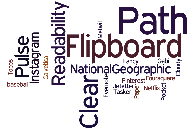 "which mobile app would you say currently has the most creative, innovative, and usable design?" The feedback I received is summarized in the wordle on the right. A larger font size indicates a greater number of people having chosen that app. The results illustrate some clear front runners: Flipboard, Path, and Clear. While the remaining apps have some interesting features, we'll focus here on the apps which were mentioned by the most people. I also followed up with the people who selected particular apps to ask them what aspects of the design of the app they most appreciated.
Flipboard first came out on the iPad and set a design direction there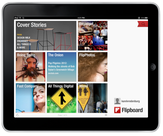 with its novel design patterns and when it came out on the iPhone it did it again but, importantly, with different design patterns. It provides the capability to aggregate content from a growing list of providers but importantly from Facebook and Twitter. The design attributes people mentioned as being exemplary include "a fluid and simple UI", "amazingly beautiful graphics", and "overall ease of use", and "integration". Flipboard truly transformed the aggregation and rendering of content. For example, information from Twitter in most other places is shown as a continuous stream of text which sometimes allows for the inline rendering of photos, visuals, and videos. However, Flipboard turns that content automatically into a beautiful multicolumn magazine style layout which maximizes the rendering of non-textual information and the appropriate clustering of textual and non-textual information together. The navigation model Flipboard uses on the iPad is hand/finger gesture based with horizonal page flipping whereas on the iPhone it is thumb based with vertical page flipping. The page flipping is reinforced with a suble, yet satisfying page turn animation. Both form factor designs have an opening category selection screen which provides the home base that can be returned to with a tap or two. Individual content items can be drilled into by tapping. Flipboard is the app I use on my iPad and iPhone to access social media, news, and blog information. Pulse News is also an information source aggregator and it is instructive here when discussing Flipboard to point out that Pulse is similar in some ways except that it uses a navigable grid with sources being able to be navigated vertically and content items horizontally. Selecting a story in Pulse brings it in as an information card animating from the right and partially overlaying the base content grid in the iPad version and as a full page story on the iPhone. The design patterns used by both Flipboard and Pulse are really effective for the type of content they provide.
Path is another app that was recommended as being among the most creative, innovative, and usable. Those mentioning it used words like "amazing" and "beautiful design". Path is an alternative social media service for just those friends and family with whom you have a close relationship. The number of "friends" you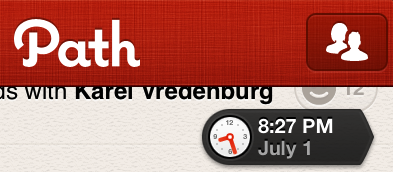 can have on Path I believe is currently about 150. The app is beautiful visually and is fast. However, I find it's controls to be particularly effective. Path has an animated control that appears once you start scrolling down the timeline and shows you the date and the time of the updates being shown. It's nice for the use case when you know there was an update at on a particular day and time that you'd like to access. It's important to point out that it isn't pervasively visable and the dynamically updated clock adds visual interest and relevant information which also appropriately draw your attention to the control even though it is quite small.
 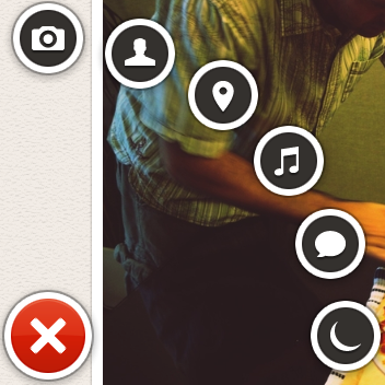 The second control of interest is a menu that appears when the plus sign at the bottom left of the screen is pressed. The menu animates fan-like with a satisfying bounce when opened and includes a rather whimsical spinning and springing back into the plus sign when it is dismissed. The control provides a quick way of indicating what type of update is being created (photo, people, location, music, thought, or sleep/wake). The number of likes are shown with a happy face and a number. Path does a particularly good job of optimizing space for content which is rendered beautifully but it does this by also minimizing the screen real estate that is used by controls. When controls are used, they include animations and visuals that are engaging, informative, and whimsical.
Another innovative app that was mentioned was Clear. ![]() It is essentially a to-do list organizer. Those recommending it particularly liked its "gesture based interface", that it was "simple", and its use of "color". The design pattern that Clear uses is one where virtually everything is accomplished on a single screen via direct manipulation with the content, and only the content, showing on the screen. This app is the ultimate in getting rid of any controls or app-specific chrome. All you see is the content. It is also the ultimate app for doing everything intuitively by direct manipulation. If you'd like to add an item at a particular point in your list, you simply pinch apart the items above and below and then proceed to add your item. You indicate that an item is complete by swiping across it left to right and if you'd like to delete an item, you swipe from right to left. To move an item, you just tap on it and drag it to where you'd like it to go. You can also swipe up and down to access a menu and multiple lists. I actually only use a single list and thus only ever deal with what you see in the photo on the right.
It is essentially a to-do list organizer. Those recommending it particularly liked its "gesture based interface", that it was "simple", and its use of "color". The design pattern that Clear uses is one where virtually everything is accomplished on a single screen via direct manipulation with the content, and only the content, showing on the screen. This app is the ultimate in getting rid of any controls or app-specific chrome. All you see is the content. It is also the ultimate app for doing everything intuitively by direct manipulation. If you'd like to add an item at a particular point in your list, you simply pinch apart the items above and below and then proceed to add your item. You indicate that an item is complete by swiping across it left to right and if you'd like to delete an item, you swipe from right to left. To move an item, you just tap on it and drag it to where you'd like it to go. You can also swipe up and down to access a menu and multiple lists. I actually only use a single list and thus only ever deal with what you see in the photo on the right.
I love how these apps have pushed the design envelope by driving greater engagement through beautiful visuals, effective animation, efficient and natural navigation and actions, and minimal use of controls that are persistent. The mobile design space is an exciting one with new apps like these appearing regularly which raise the bar on innovation, creativity, and usability.
Innovations in Apple's OS X Lion
I downloaded the latest version of the Apple computer operating system - OS X Lion - the day it came out and have used it since. It has a number of unique design elements in it that I think deserve some analysis.
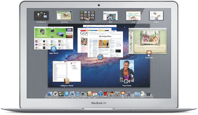
Install: The most dramatic innovation you first experience is that the installation of this version of the operating system isn't done with CD/DVDs, it doesn't involve going to a website, providing a bunch of parameters, downloading it and then trying to find it to start the install. No, Apple has made the purchase and installation of the new OS dead simple by using its Mac App Store. The App Store itself is noteworthy in its own right as an amazing advance in the simplification of human-computer interaction. To install Lion, you simply click on the $29.95 price button which then turns to the install button after which you see the familiar animation indicating that the download has begun. After it downloads, you simply complete the install and you're done. By keeping the price so low and making the installation so simple and painless, Apple also ensures that virtually everyone will upgrade. That, in turn, keeps systems secure, makes it easier for developers to use the latest features knowing that users will be able to use them, and it also makes a lot of money for Apple given the volume of sales.
Features: The Lion release includes a number of enhancements to individual apps and the ways specific aspects of the OS works. I love using FaceTime and really appreciate its ability to use HD, the new ability to flip between landscape and portrait mode, and the full screen view. The experience of having a FaceTime session with someone using HD and full screen is almost like being there. I like the enhancements to the Launchpad and Mission Control but still think they could be even further improved. I use Preview a lot, mostly for working with screen captures. I noticed in Lion that Preview can actually now add digital signatures to PDF documents by holding the signature up to the camera. Cool. Although I haven't use it yet, the ability to simply detect other Macs and send files to them via AirDrop also looks to be useful and efficient.
Pervasive Enhancements: While the individual features are interesting and valuable, it is in the OS wide pervasive enhancements where I see the real innovation. It is clear that Apple is trying to create a simple, natural, intuitive, and consistent user experience for all of its devices. Also noteworthy is the fact that they are designing for the novice user first with the most important and pervasive devices. The iPhone and iPad are computers for all people, not just ones that have been using more traditional computers. Apple is therefore trying to create and is being insanely successful at doing so, a new default user experience for all devices. While it is leading in this with its iOS mobile operating system user interface, the Lion release of its traditional computer brings its user interface in line with the iOS one.
The direction of scrolling is a perfect example. With the Lion release, the default scrolling gesture and action is now consistent with that of iOS. This is jarring at first and must have led to millions of Mac users being pretty clumsy and unproductive for a while after installing Lion. However, once you get used to it, the change makes so much sense. If you aren't yet used to the change, I found simply imagining the screen as a piece of paper that you're moving helped me make the transition. Full screen apps are another Lion enhancement that brings parity with iOS. I don't typically use anything in full screen mode because I also have a large screen but then I'm not the target audience either. I only use this feature if I'm reading a document or something that I'd like to be able to focus and get rid of visual distractions. Auto save is another feature that makes so much sense and is perfect for the notice user. I quite like it but found that I had to change my workflow to prevent losing work. For example, I often create presentations by starting with an existing one and then modifying it. In Lion, you have to explicitly make a duplicate first or else you'll be modifying the original presentation. The multi-touch gestures take a bit of getting used to but once you do, I think they're incredibly useful and efficient.
Interestingly, two of the enhancements I most appreciate in Lion aren't typically talked about in reviews. I work with designers every day and review designs typically in the form of screen shots. When I've tried to hone in on the visual and colors in the screen shots I've always been distracted by what appeared to look like light blue pieces of rope. Of course those gaudy visuals were in fact the OS X scroll bars. I always thought it strange when Apple is so good at design, that they so messed up that aspect of their OS design. I fixed the problem somewhat previously by selecting the grey OS X theme but I was delighted to see that Lion now not only uses a much smaller grey scroll bar as the default, it also has adopted the iOS approach to only showing a scroll bar when the user wants to scroll. These changes have really cleaned up the OS user interface. The last enhancement I'd like to mention is virtually never mentioned or at least explained by Apple at all. However, it has made a significant difference in my productivity. That change has to do with Apple adopting the Microsoft Windows method of resizing windows. After having moved to the Mac, I could never understand why OS X forced users to resize windows by grabbing the bottom right corner only. The Windows world has always had the ability to resize from any corner or side of a window. It's nice to see that Apple is willing to make changes like this even though they don't like talking about them.
Overall, I've been very pleased with OS X Lion both as a user and also as a member of the industry that will benefit from the ways that Apple is driving levels of design never seen previously.
Mobile Design Innovation
I heard the buzz about a new iPad app called Flipboard a few days ago so downloaded it to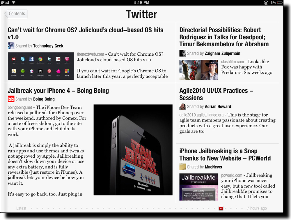 see what all the talk was about. Due to its popularity, the company could only make some of the capability of the app available upon download and the remainder, Twitter and Facebook integration, after a day or two. I knew immediately when the app launched that I was experiencing something entirely different. The splash screen shows full screen photos with a slow animation cross the screen of highlights from the various content sources you've selected. This approach to splash screens is novel and immediately grabs the user's attention with directly relevant content using often stunningly good photographs. Please note we're not even really using the app yet but have been drawn into it in an amazingly engaging way.
After you swipe to the left across the screen, you see the main Flipboard content channels. There is a starter set of content sources but you can select whichever ones you'd like from a fairly long list of candidates, including Wired, The New York Times, Fast Company, The Economist, Nature, Engadget, and The Onion.
Two special sources are Facebook and Twitter. These are the ones that you need to request access to during the early days of the launch of the app. Once you get your copy of Flipboard activated you now get content directly from your Facebook and Twitter streams into Flipboard.
So, what's so new you say, other than the cool photo splashscreen other than the fact that this app aggregates content from a number of different sources into one place? There are other apps that do that already and I've used most if not all of them.
What's truly unique about Flipboard is its design. It seamlessly integrates and visually renders content into in a way that Steve Jobs would call magical. Take a look at the screen shot above. Looks like a magazine layout, doesn't it? A layout that a designer would have manually crafted with photos included for appropriate emphasis of certain aspects of stories, etc. What you're actually looking at in that screen shot is my Twitter stream. Twitter is usually quite stark with textual tweets, links, and the occasional image. Flipboard has designed and coded algorithms to handle the layout and rendering of content dynamically and automatically. And the results are amazing. The user also has the option to tap on a story (actually a Tweet but it feels like a story) to see more detail as well as to be able to tap on any images to see them in full screen mode. You've never seen the images in your Twitter stream, Facebook updates, or from your online news sources look better! The subtle animation effects are also very effective.
It is often said that the spreadsheet program Lotus 1-2-3 was the "killer app" that drove the early success of the PC industry. I believe that Flipboard will do the same for the iPad and like devices. It shows was it possible with the device and its user interface patterns will likely (and should) be used widely in mobile apps like this. The app isn't without controversy, however, due to the way it pulls content from sources but I hope that this won't hamper the success of this amazing app. I should give you one caution, though. The app is so engaging to use that you'll find yourself spending much more time with it than you planned. It's like the experience you have with games except that in this case you're actually learning a ton during that extra time.
iPad - A New Paradigm in Computing
I was tempted to write a post shortly after I got my iPad but thought better of it. I wanted to use the iPad everyday for several weeks before summarizing my experience. My overall conclusion is that the iPad truly represents a new paradigm in computing. It's a game changer. I've written on this blog for years that advances in operating systems that were touted by others as being significant, like Windows 7 and OSX Snow Leopard, were really tweaks on a decades old system. The iPad is a true departure from this operating system heritage. It's a resetting of the dial. It's what's called "clean-sheet" design in the industry - not worrying about backward compatibility and consistency with prior systems.
I believe that Apple had a vision for the iPad when they designed the iPod Touch and the iPhone. By the way, I don't think they planned the evolution of the non-touch iPods as carefully since the information architecture broke several times throughout that product family transition. It was different with the touch line of products. I think they were planned as a transition. Introducing a phone with touch capability was revolutionary but it also set the stage for the later introduction of the iPad so that everyone was already comfortable interacting with a touch device. You can use the iPad the moment you turn it on partly because you've experienced an iPhone or iPod Touch before (or any of the other manufacturer's products that have copied the interaction design). Interestingly, though, the iPad feels quite natural to those who haven't had experience with a touch device previously. The actions are generally so natural and obvious that it leads truly to a walk up and use experience.
Here are the things that I think are key to the new computing paradigm that the iPad is introducing.
- Instant On - while other computers need to boot up even if they're coming off a sleep state, the iPad comes on as fast as you can swipe your finger to unlock the screen. It's amazingly fast - essentially instant. This is a game changer because the iPad becomes the device of choice when you want to quickly check your e-mail, an app, or a website.
- Convenient Portability - while notebook computers and netbooks are portable in that you can carry them around, you still have to use them like a computer; similarly, smartphones are portable too but are too small to do any number of activities that require a larger screen and keyboard. The iPad has the ideal form factor to conveniently access and interact with information.
- Simplicity - while other operating systems make a user figure out a file system, the concept of an application that works with files in the file system, left and right mouse clicks, click and drag, and such esoteric things as drivers, settings, and the need to download, install, and configure applications, the iPad simply has apps which you can get by pressing a button called "Install App" and an interface that mostly works like you would expect it would if you were using an analogue version of the thing (flip the page in a book by placing your finger on the page and pushing it.)
The iPad at my house is used by anyone who needs quick access to content, for watching movies personally, and for using doing school projects. I should point out that since I got the iPad in Canada before it was available in Canada, my access to the App Store has been problematic. Initially, the App Store wouldn't load at all and it would after I created a US account but then I could only download free apps because I needed a US credit card in order to buy paid apps. I now know about the latest fix to even be able to buy apps in the US store but haven't gone through the laborious steps to do that. It has been frustrating working with the iPad given these conditions and it has also meant that I haven't been able to use higher-end productivity apps to further test the iPad experience.
There are some limitations that I've experienced. The glare of the screen is problematic in bright light conditions but I use mine indoors mostly so this isn't a problem very often. The lack of printing support may become a problem once I use higher-end apps. The lack of a camera is a problem in trying to use the iPad for Skype calls but a recent Camera for the iPad app appears to have partially solved the camera problem. I find the lack of multitasking a problem in only certain situations and I suspect the 4.0 version of the OS will address this issue. The major problem I've experienced thus far has actually been the inconsistency in the user interface design of the apps on the iPad. Apple appears to have approved some of these apps too quickly in order to fill out the App Store for the launch and I hope they'll review apps more carefully in the future.
I'll provide another review in time when I get direct access to my country's App Store and then use more sophisticated apps. All in all, my impression from a few weeks of using the iPad is that it represents the first in a new paradigm of computing.
Mobile & Real-Team Web Innovation Podcast
Joining me on this episode are Val Fox (Director, Innovative Technology Solutions, Ryerson University), Keith Instone (Information Architecture Lead, IBM CIO’s Office, IBM.c om), Eliane Tozman (User Interface Designer, IBM Media Design Studio), and our newest member of the panel Jay Trimble (Group Lead for the User Centered Technology Group, NASA Ames Research Center). The panel discusses the Palm Pre and Palm's new WebOS, an update on the Usability Professionals Association (UPA) including an innovative perspective on design called Evil by Design, a summary of the trend toward what has recently called the real-time web including design features of Google Wave and recent experiences regarding Twitter. The interesting website of the month that was discussed is spezify.com and the community news concerned the IxDA organization. The Mozilla Labs design challenge together with IxDA was also discussed.
As always, please use the comment capability of this blog to provide any feedback you may have on this podcast episode.
A Mobile UI Innovation
Input and output on mobile hand held devices have been a challenge for years. Recent advances in these devices have dramatically increased the resolution of the output to the screen. Direct manipulation via multi-touch has also vastly improved the ability to interact with content on the screen. However, getting input into these devices has seen little improvement other than trying to get to parity with desktop and laptop devices. Apple's iPhone and iPod Touch introduced the software-based keyboard. Although this was novel in many ways, it didn't fundamentally address the problem of trying to type on a very small keyboard with fingers larger than the surface of the keyboard.
 I recently came across a true innovation that cleverly addresses this problem. Shumin Zhai and his team at IBM Research have created WritingPad, a free app for the iPhone. The innovation here is that you don't simply tap out individual letters and correct each one as is the case with the default iPhone keyboard but, instead, you simply drag your finger across the WritingPad software keyboard contiguously and the system infers the words. Corrections are done at an individual word level rather than letters.
The other innovation here is how this research team is gathering user feedback on the design of the app. They provided it as a free app in the iTunes Store and with it's built in rating and commenting system, the team has been able to rapidly collect huge amounts of very valuable feedback. A quick read through the feedback indicates that this direction as a new method of providing input into a mobile hand-held device is a real hit and deserves more focus.
So, hats off to the IBM Research team for this design innovation and for an innovative way of collecting feedback on it. If you have an iPhone or iPod Touch and would like to try WritingPad for yourself, here's where to find it in the iTunes Store.
Dawn of a New UI
Many years ago, designers at Xerox, Apple, Microsoft, and IBM each contributed to what became the user interface standard for personal computers. Back then, issues like whether individual windows should overlap were hotly debated. Of course, all of that is now behind us and the basic elements of the user interface of personal computers are amazingly consistent. Sure there are some differences between OSX, Windows, and Linux systems but there are vastly more similarities than differences. Enhancements to these systems are also not dramatic. Such should be the case so that users can have a mental model of how these systems work and that mental model shouldn't change very often. Of course, there are some basic problems with each of these systems that nobody is willing to fix at this point because the standard is so ubiquitous. A number of details could have been changed quite dramatically in those very early days because users hadn't yet built up a mental model.
We're witnessing another major wave of this type of phenomenon right now. The introduction of the Apple iPhone and iPod Touch 2.0 represent the beginnings of a new user interface standard for multi-touch mobile devices, and likely, multi-touch devices of all sorts in the future. It is therefore wise for all designers to explore and experience this new user interface for themselves. I've spent significant time with the new user interface and am of the view, consistent with many others, that the design is exemplary. It should be pointed out that the design is appropriate for the device it was designed for - the iPhone/Touch. I'm less sure that the design will be appropriate for other non-mobile devices that it may well be used for in the future. And remember that Apple has had difficulty in the past with successfully adapting and evolving designs such as was the case with the iPod when it started to include content in addition to music. If the experience with personal computer user interfaces is any indication, flaws in the designs of this new mobile user interface standard may have already been introduced and we have to live with them for a couple of decades.
Advances in User Interfaces
Many of us have been going to professional conferences like CHI for many years and seeing technology demos and other research into novel new advanced user interfaces. However, we typically go back to computers with their screens, keyboards, and mice. Although that environment is likely to be the optimal one for many people doing many of the things they do with computers now, it doesn't have to be the case for some edge type uses. I, like others, have been delighted to finally see some of that university research technology getting into products recently. The best examples are the Nintendo Wii and Apple's iPhone. Both use gesture as a primary input mechanism and do it really well. You know that a paradigm shift is happening when you can't just read about or watch someone else using one of these devices; you have to experience it for yourself. The first game you play on the Wii and the first time you flick your way through stuff on an iPhone, you've got it. Its a different experience entirely. I think this is an exciting development in the area of advanced user interfaces and one worthy of following - and one worth following first hand yourselves!
Read more in an interesting article Coming Soon: Nothing Between You and Your Machine in the New York Times.