
Paradigmatic Change in UIs
In the first wave of computing there was virtually no user interface, comprising little more than instructions written on punch cards which were loaded into a hopper then read by the computer with the results given to the user via a printout. The second wave introduced what we now know to be a user interface, a display with characters and graphics along with a keyboard and mouse. The display evolved from simple monochromatic characters to full color graphics with ever increasing resolution over time and the keyboard and mouse technologies evolved to be smaller and integrated with trackpoints and trackpads. However, the basic elements of a small TV like display, with a keyboard and mouse beneath it, have remained constant for a remarkably long time. What appeared on that display and how a user interacts with it has remained surprisingly constant as well, especially from the time that the concept of programs running in separate windows was introduced.
While there were minor predecessors, the major shift into an entirely new form factor came with the introduction of the iPhone. We're now so used to smartphone UIs that many people forget that we hadn't ever experienced one until Apple introduced its game-changing device. The smartphone form factor existed before the iPhone, but Apple totally redefined it. Once users were used to the iPhone user interface, the adoption of the larger form factor iPad was incredibly easy because it was virtually identical. Like the smartphone, the tablet form factor also existed prior to the iPad but again Apple redefined it dramatically. Key to that redefinition was the perfected use of multi-touch. Interacting via multi-touch is so pervasive now that it isn't uncommon to see people walking up to screens in places like hotels, airports, and stores expecting to be able to interact with them with touch only to be really surprised and disappointed when they turn out not to support touch. That's when you know that we've experienced a paradigm shift as a society. Touch has been in university labs for decades but it took Apple's dedication to design excellence of the entire user experience to perfect the technology to create this paradigm shift. 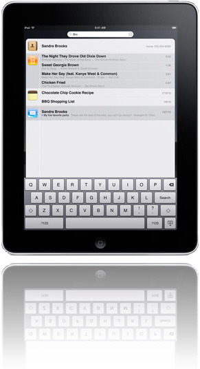
Another paradigm shift in interaction modality has just started. This one involves the use of speech. Again, speech technology has been around for decades and has been used commercially successfully as well but mostly in niche markets like voice response systems and dictation systems. Apple's Siri is still in beta, a product designation Apple very rarely uses, but promises to do for speech technology what the iPhone did for touch technology - make it a pervasive and paradigmatic change in society.
There are two major insights to glean from these fairly recent advances. The first concerns how these changes took place. In each case, the basic research and foundational technologies as well as even some commercial applications existed for decades prior to the paradigm shift. It was Apple's approach to design that made the difference. The design of everything, from the industrial design of the physical elements of the device (glass, case, bezel, etc.), the visual and interaction design of the operating system and key apps, the engineering design of the internals (processors, memory, battery, GPS, etc.), the manufacturing design of the production line, the design of the website and app store, the design of the content review process, the design of the payment and app download system, the design of the stores, the design of product support, all the way to the design of the product secrecy and product announce/launch systems. Many people like to jump to simple conclusions that these paradigm changes were brought about by this or that individual element but I believe that it was Apple's focus on the total customer experience and all the elements that impact it that was critical. Designers planning a product that they hope will transform an industry need to focus on all of these aspects of design.
The second major insight to glean from these paradigm shifts is the need to rethink how all future products in any market should fit into these major paradigmatic changes in form factor, device, and interaction modality. Designers now need to understand deeply how users are using these technologies in order to design products optimally leveraging them. This is a challenge for many because, as pointed out above, form factor, device, and interaction modality hadn't changed virtually at all for decades. However, these recent changes are so profound that it really does require designers in any market to sit up and take note and consider how users in their markets may be changing.
Having explored paradigm changes we've already witnessed, let's give some thought to where these may go in the future and what other paradigms we may witness in the future. While the computer, smartphone, and tablet form factors and the touch and speech interaction modalities have mostly developed independently, the emerging trend is for them to become more consistent and a future paradigmatic change may involve them integrating deeply. We're seeing the beginnings of changes being made largely to computer operating systems like Apple's OSX to make them more similar to device operating systems like iOS. Apple is making the change gradually with each update to the OS, which is a wise approach that minimizes the magnitude of the change but still moves drives consistency. We're also seeing the very beginnings of a move to integrate form factors, devices, and interaction modalities. Responsive design is part of this trend, as is the enablement of touch and speech pervasively across devices. We're also seeing some degree of cloud based seamless access integrating content and data across devices. We're also seeing that integration spread to even larger form factors like TVs and digitally enabled physical window panes. Some call this a post-PC era, my sense is that we're witnessing a plethora of form factors which in PCs, ensuring that each of these can suit the wide characteristics and contexts of use into the future.
We're living in exciting times that require designers to be fully aware of, intimately knowledgeable about, and be able to leverage the benefits of these incredible paradigm shifts in technology and people's use of them.
Apple's Post-PC Era
I was just setting up a new iPad for a family member who wanted to use the new device she received as a gift as a stand alone device without needing to connect to a PC. Regular readers of this blog will know that I'm usually pretty positive about Apple's designs and, of course, I'm certainly not alone in that view. Apple is incredibly good at hardware design and the integration of software with its hardware. However, the company to date has had some difficulty with the design of its cloud capabilities.
Apple has recently used the term "post-PC era" as a basis for its mobile and cloud strategies and communication. Recent updates to iTunes and iOS have provided some independence of mobile devices from computers, but only partially. You can now push updates from a PC-based iTunes to an iPod Touch, iPhone, or iPad without using a cable but you still have to use a computer in the mix.
There are other use cases that have absolutely no support on iOS devices.  The most annoying and concerning one for me is the inability to subscribe to podcasts on Apple mobile devices. You can download individual episodes but there is no way to actually subscribe within mobile iTunes. With the increasing popularity and use of mobile devices (see last blog post), the inability of podcast listeners to subscribe via mobile devices is not only inconvenient for users, it is also a major problem for those creating podcasts, like me. It is really strange that Apple hasn't provided the capability to subscribe. All it would require is to include the same "subscribe" button to the right of the podcast name and artwork on mobile iTunes as is included on the computer-based version of iTunes (see visual on the right). It was pointed out to me by a friend on Facebook that there are separate apps that provide this capability with one called Downcast that is particularly good and one that he recommends. That's a temporary fix but I still think that this missing function needs to be included in the base mobile version of iTunes. I know that it is a herculean task to develop mobile device operating systems that never need to be connected to a PC and to design that really well. However, leaving off the subscribe button seems to be a rather strange oversight on Apple's part.
To the listeners of my podcast who may be reading this, I'd suggest that you use the iTunes on your PC to subscribe to the podcast or download an app like Downcast to essentially replace the podcast part of mobile iTunes on your iOS device. I do hope that Apple addresses this problem soon in an update to iOS so that we won't see bifurcation of the podast audience on Apple devices and also no longer have a single reliable place to determine podcast popularity and feedback.
Designing for Mobile Sites
Mobile devices are proliferating at an incredible rate. Designers of websites have to decide what experience they'd like to create for users of their sites and factor in what users prefer. SmartPhones are the real challenge given their screen size. Since the iPhone came out with its amazing screen and the ability to resize portions of the screen, I've come to prefer full websites rather than sites optimzed for the smaller screen. I prefer a three column website design with navigation in the left column, the main content in the center column, and additional information in the right column. I then double-tap the center column to enlarge the core content to make it easier to read.
That's my own personal preference but I wanted to learn what other people prefer. 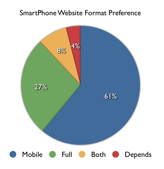 As usual, I consulted the social networks. I asked, "Do you prefer mobile-enabled or full versions of websites on our SmartPhone?" A total of 55 people replied and the results are shown in the visual on the right. A slight majority of respondents (61%) preferred sites to be optimized for the mobile device but a non-trivial number (27%) preferred the full site and a reasonable number wanted both (8%) and a very small number (4%) said that it depends. Given these results and the fact that many respondents felt quite strongly about their responses, it isn't immediately obvious what designers should do in order to provide users what they prefer. Although the majority preferred mobile enabled sites, many people expressed the concern that many sites that are optimized for mobile leave out information that is available on the full version of the site. The best advice therefore would be to provide a mobile version of the site that includes the same information as the full version, to also provide direct access to the full version for those who prefer that, and to save users' preferences for the next time they access the site.
It should be pointed out that the question being addressed here was specific to viewing websites on SmartPhones and didn't go into tablets or apps which we may address in a future set of questions and blog post.
Getting Healthy
I've been thinking lately about the importance of being healthy. The impact on longevity, quality of life, and even the planet. The feedback I've been getting on my Life Habits podcast reinforces that a lot of other people are thinking about their health and improving it too. I had created podcast episodes some time ago on health topics but decided in response to listener questions to put together a few deeper sessions on the topic. I did a session with Marie-Josee Shaar on Sleep, Mood, Food, and Exercise (iTunes, website), and a further drill-down on Sleep (iTunes, website) and other on Exercise (iTunes, website) with Marie-Josee. I recorded a self-guided audio instruction session on progressive muscle relaxation (iTunes, website) and recently published an episode on adopting a plant-based diet and lifestyle with Dilip Barman (iTunes, website). I'd also like to recommend some iPhone apps that are particularly good at promoting health including MyFitnessPal (iTunes) and Get Running (iTunes). As John F Kennedy said, “Physical fitness is not only one of the most important keys to a healthy body, it is the basis of dynamic and creative intellectual activity.” And as Julius Erving rightly pointed out, "If you don't do what's best for your body, you're the one who comes up on the short end."
Apple Design vs. User Error
I've been thoroughly enjoying the use of my iPhone as regular readers of this blog will know from my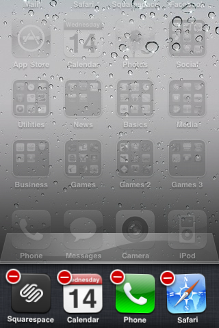 previous posts. The importance placed on design at Apple and the design decisions made up until recently have been exemplary. Something appears to have changed however. I haven't used an iPhone 4 so can't really comment much on the problems with using the antennas as the actual bezel but it appears that it was an amazing industrial design masterpiece but a failure with users. If you haven't heard, there are pervasive reports of dropped phone calls when the iPhone 4 is held in certain ways particularly by left-handed users. Apple has essentially said that the problem is due to user error and that users should simply hold the phone differently or add a case. I'll leave the rest of that discussion to those who have first-hand experience with the device.
I do have first-hand experience with the new version of the operating system, iOS4, running on my iPhone 3GS. Since installing the new OS, my phone had been operating strangely: it would die even though it had a full battery charge, spontaneously reboot, and crash apps while I was using them. I was heart-broken that my wonderful iPhone had now developed some fatal flaw and the device that I could trust to always work now would be as unreliable as previous devices I'd used were.
A friend suggested I take it into an Apple store to have a Genius check it out. I did that. What I learned absolutely shocked me. The Genius ran a diagnostic program which reported a lack of available RAM. On further investigation it was determined that the lack of available RAM was due to multitasking. I haven't used multitasking much but was surprised to learn that many of the 100 or so apps I have on my iPhone were still running, albeit in suspended mode in most cases. Turns out that I didn't have the appropriate user model for the way multitasking works on the iPhone. I wonder how many users share my confusion. Here's actually how Apple designed multitasking to work. Every app you launch until you reboot is running in multitasking mode - and taking up memory! Guess how you're expected to stop apps from multitasking and taking up memory? You have to get into delete mode and delete by press the minus sign on every app in the multitasking tray! (see the screen capture above) Apparently, Steve Jobs when announcing iOS4 said something to the effect of companies who's multitasking operating systems require a task manager (meaning Microsoft's Windows) has failed to do its job. Well then, Apple has failed to do its job because not only is the multitasking tray on the iPhone a task manager, it requires you to manually delete every app you want to stop running on your device! If I could disable multitasking I would. Now I have to spend time manually deleting apps or reboot regularly both of which are a waste of time. I sure hope that the maintenance release of iOS4 fixes this problem and the one that iPhone 4 users are experiencing.
Apple is known for brilliant design but due to its intensely secretive culture, it doesn't do much user testing. It seems to me that the problems with the iPhone 4 and the problem I've identified here with the design of iOS4 may have been a casualty of this culture. I'd appreciate any thoughts you may have on this.
Going Digital for Free
Many aspects of our lives have been going digital over the past few years. A typical knee-jerk response to a question is to simply Google it. I consider Google an appliance for my brain given how often I use it in this way. The majority of people now listen to music in the form of MP3s using an iPod, iPhone, or some other personal audio device. Many also watch digital movies on their computer screens or increasingly on their TV screens too. News is increasingly consumed in digital form via websites, blogs, Twitter, Facebook, or podcasts. Books are now often read on dedicated devices such as a Kindle or directly on devices like iPhones and iPads and alternatively listened to as audio books in the way that music is listened to.
I'm an early adopter of most things digital and have consumed content almost exclusively in digital form for the past few years. I've been paying for much of this digital content though whether through iTunes for music and movies, audible.com for audio books, and amazon.com for eBooks. I was reflecting the other day on the fact that I used to borrow books, music, and movies from the public library, the physical versions of these things. I thought it was an amazing tax-supported way of simply borrowing media for the time period you needed it. I remember checking periodically with the library to see if they were moving into the digital world and was routinely disappointed to learn that they weren't. In fact, I found it extremely frustrating that I couldn't even access the online catalog because all the computers were being used by people accessing their email!
You can imagine my delight when I recently checked with my public library website and found that they now provide digital media and the ability to download and transfer it directly to your media device (an iPhone in my case). The media stays on your device for the loan period and automatically disappears after that leaving you extra space on your device. They offer music, movies, ebooks, and audio books. Since finding this new free resource about a couple of weeks ago, I've already listened to four audio books. I'd recommend that you check out your local public library website to see if yours has digital content for download as well.
Apple's New iOS4
I just upgraded my iPhone to the new version of the operating system. Apple renamed what used to be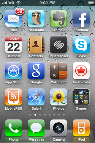 the iPhone OS to the more generic iOS because it is the system that powers the iPhone, iPad, and iPod Touch. The latest version, iOS4, comes with the new iPhone 4 but it is also being made available for free for previous iPhone models. I have an iPhone GS so the upgrade was a really nice surprise, especially for free!
The major enhancements that come with iOS4 include multitasking, folders, integrated and threaded mail, and camera zooming. Let's explore each of these in turn.
Multitasking is a welcomed addition to the iPhone. The method of switching between apps once you know that you have to double-press the button is pretty intuitive and convenient. What isn't so intuitive is what this control actually does. The tray of running apps is obvious enough but what is confusing is the fact that that tray just keeps filling up with apps even if you closed them down by single pressing the button. The only way to remove apps from the actively running tray appears to be to explicitly delete them, which is weird. Apparently, only a few apps are able to actually keep running whereas others simply suspend their state while not in focus. Any difference between these two types of apps in terms of their multitasking ability isn't apparent in the user interface itself.
Folders are not only a nice to have but a necessity if you have a reasonably large collection of apps. The user interface action in this case isn't intuitive but once you've done it once, it does feel natural. You have to simply drag one app icon onto another and a folder is created with the default name of the category of the apps. You can then add up to 12 apps per folder. Rather than having to scroll to the right and left through many pages of apps, the new folders allow you to simply tap on a folder which reveals all the apps within it without having to do any scrolling. I've found this a perfect way of cleaning up the apps on my iPhone and being able to access them in a much more efficient manner.
Mail has been enhanced with the addition of an integrated inbox and threaded conversations. I'm not crazy about the integrated inbox because I personally don't want my work and personal email in a single inbox. I find it jarring. However, others may think it is a great feature. As for the threaded conversations, I can't find them. I don't know if you have to somehow turn this feature on through another hidden user interface action but I don't see any threading in my inboxes. I'm assuming that the feature is essentially the approach that Google introduced into its GMail system where all replies to an initial email are nested together. I use that all the time in GMail and in Lotus Notes but I don't see it in my iPhone inboxes. When I find it, I'll report back here what I think of it.
Camera zooming is an incredibly important addition to the iPhone. I take pretty well all my pictures with the iPhone and the other day I was taking pictures of my daughter and her friends at a pre-prom party we hosted at our house. For some of the pictures, we had the group of friends all line up on the other side of the swimming pool from the parents taking pictures. The parents with actual cameras were able to zoom in to capture the group of friends across the pool but I wasn't able to zoom at all and, as a result, missed some of the detail. I now can with the updates made to the camera which allows you to move a slider on the camera view to set the right level of zoom. Pretty sweet!
While my very early experiences with the enhancements made to iOS4 weren't unqualifiedly positive, I am still very pleased with the update and especially so given the price - free.
iPad - Design without Affordance
I've now had a lot more experience with the iPad. I continue to thoroughly enjoy using it. However, I'm going through a similar experience that I went through (and blogged about here) with my iPhone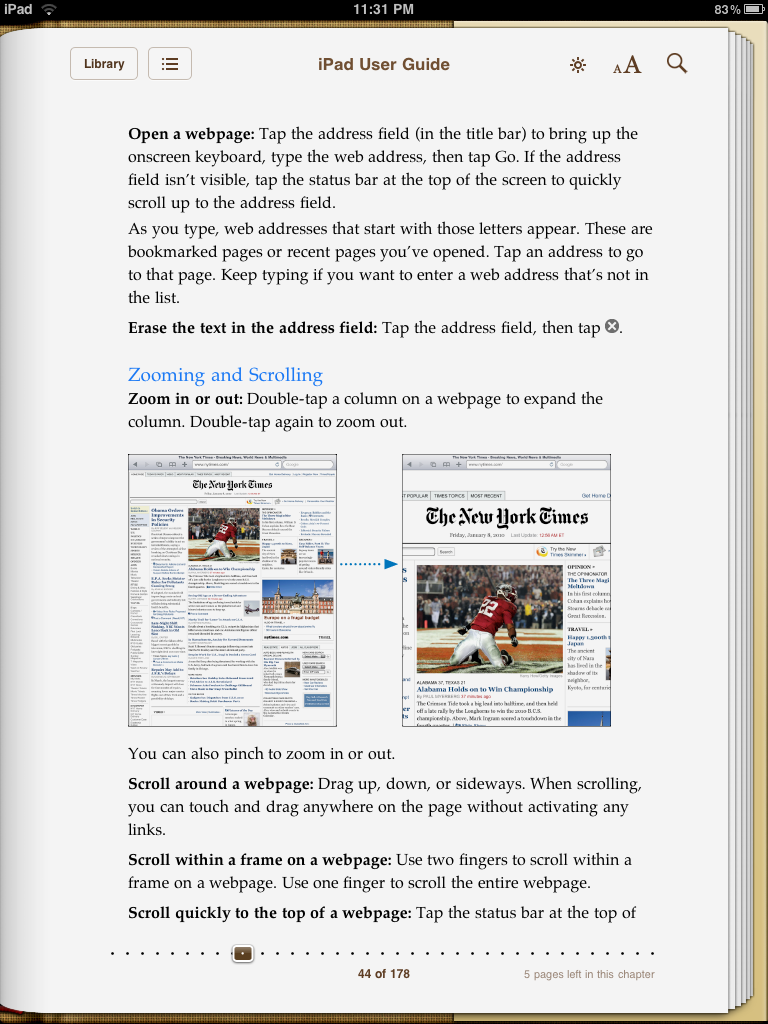 initially. The experience is one of thinking that certain things just don't work only to learn later that there was a hidden user interface feature to carry out some action that the user had no way of knowing about. I had concluded that certain websites were simply not enabled for the iPad and I thought it weird that they hadn't done anything about the problems given the popularity of the iPad. For example, several parts of Facebook simply didn't work such as the list of friends. The problem was scrolling the list of friends. When I tried to swipe down on the list, the way you scroll down everywhere else on the device, the page would move slightly but the pop-up layer would move with it but the list of friends would stay put. Regular users of MacBooks would have a clue as to what to try to get this type of list to scroll but everyone else is left in the dark. I asked a number of other people about this and nobody that I found knew a way of scrolling lists like the ones on Facebook and we just assumed the site was not appropriately enabled for the iPad.
It was colleague of mine that finally clued me into the solution - the two finger swipe. I just tried it tonight and it worked! While I'm glad that I now know how to do something that is pretty basic on the iPad, it got me thinking about Apple's overall strategy of designing without affordances. The overall assumption is that the various touch actions are intuitive and, as a result, it is so much more efficient to not clutter screens with affordances like scroll bars. To Apple's credit, most of the touch actions are intuitive. However, the problem is the set of touch actions that are not intuitive and how users are supposed to find out about them. I admire Apple's commitment to its design principles for virtually all other aspects of the design of this device but that purity of adherence to the principles does have its costs and this is one of them.
Is Web Media Ready for Prime Time?
I've been listening to podcasts for years and currently subscribe to a total of 32 podcast series. As you know, I also create two podcasts myself. I think that I'm hooked on this type of media. As most people do, I prefer my podcasts in audio format because I'm usually doing something else with my eyes while listening to podcasts like driving, running, or doing the dishes. I still subscribe to video podcasts but mostly listen to the audio track only. I occasionally find that I need to turn on my iPhone to view the video when video is critical to the subject matter. This usually happens on TED.com Talks and sometimes on GeekBrief.TV. I listen to practically all of the podcasts on Leo Laporte's This Week in Tech (TWIT) podcast network but rarely even feel the need to watch the video. I occasionally turn on the video to see what a new guest looks like but that's about it. Leo is a real pioneer and tends to push the technology envelop and is usually successful with it. He's one of only a few professional podcasters making good money in the field. His latest push is into streaming video and making video podcasts and YouTube replays available. Others that have done this have adopted the a studio model and while still relatively informal, still making the video content look professional. Leo, on the other hand, makes video available but up until the last week hasn't paid any attention to the professionalism of the video stream content. Shown in the picture here is a regular guest on the flagship TWIT show. Having a massive microphone dangling right in front of the guest's face isn't perhaps the best way to produce web-based video content. Leo and his other guests also usually wear large headphones. So, my vote thus far is that although it is technically possible to create video content on the web, those producing it aren't quite ready for prime time. The last episode of the TWIT show did include a discussion of smaller microphones but there wasn't any mention of not having them cover the guest's face nor any discussion of getting rid of the headphones in favor of the discrete ear buds used on TV which I also use when I use video conferencing at work. I should point out that there are video podcasts that have good production values and, thus, are ready for prime time. However, the most popular tech podcast network doesn't yet appear to be.
The Rush to HTML5 Video
Anyone who ever questioned the market power of Apple and specifically, Steve Jobs, just has to have a look at large websites right now. Most web-based video and audio used to be delivered with the use of Adobe's Flash player or some other Flash-based control. However, Steve Jobs has never allowed Flash on the iPhone or the iPod Touch and, of course, it also doesn't appear on the iPad either. In fact, Jobs recently confirmed that it will never appear on these devices. What effect has this had? The realization that they may be excluding this large and increasing market with their sites, has led most sites to implement alternatives. The alternative is, in fact, to use the draft html5 standard. What's interesting about this trend is that some sites that aren't quite there yet with their html5 implementation are essentially apologizing for it. I just wanted to watch something on Ustream on my iPhone and was greeted with the message that "Currently this video is only viewable in Flash :( We're working hard to make all content viewable on both the iPad and iPhone, please check back later!" Now, that's market power.
Are iPad Apps too Expensive?
We used to pay hundreds of dollars for games and other consumer software. Apple changed all that with the introduction of apps in iTunes for the iPhone, iPod Touch, and now the iPad. The typical price of an app was in fact free and paid apps had prices of $0.99 and apps going for $4.99 and $6.99 were considered expensive. I hear complaints now that iPad apps are way too expensive at $10 and this from people who make good money and think nothing of buying a coffee or a drink for that amount. Is this a case of Apple having been too successful at resetting our perception of price? With the announcement of iPhone OS 4.0 with its iAd platform, is Apple trying to reset the app price back to free and have app developers and Apple itself make money solely from advertising? Is everyone thinking that advertising is the only monetization strategy based on Google's success with it? Twitter even thinks so with their recent announcement, right? I prefer to buy my apps and think that I'm getting really good value if I get a really good game for $10. Remember that games on any other platform cost several fold that amount at least. What's your experience with this? I'd appreciate any thoughts you may have on this.
Mobile Work
I've observed colleagues for years walking around with their Blackberries staying connected with their work. While I've stayed connected with work via cellphone and texting, I haven't until very recently used a smartphone to connect to work e-mail, intranet, and other work applications. I've just installed IBM Lotus Notes Traveler and I absolutely love it. I now have my work e-mail, calendar, contacts, to do lists all directly integrated seamlessly into the relevant apps and services on my iPhone. Through VPN on the iPhone, I also now have access to the company intranet and services like chat messaging.
I find it amazingly convenient to be able to quickly check my work e-mail while in line at the coffee shop and to look up where my first meeting of the day is when I'm running late and don't have time to take out and open up my notebook computer. It's an amazing time saver and uses the form factor I so love.
When I think about the convenience of having work information available like this on the device that's always in my podcast, I can imagine the utility of having it available on the somewhat larger but equally enjoyable iPad. I'm looking forward to that. There is one feature that I haven't heard anyone mention with regard to these devices that I think is critical for accessing work systems and that's fingerprint recognition. That would be so useful and Apple cool.
As always, I'd appreciate any thoughts you may have on my thoughts. By the way, I also wrote this post on my iPhone.
Hidden iPhone UI Features

Even though we all love using our iPhone and iPod Touch devices, I'm struck by how many features in the user interface aren't readily apparent. Let say you wanted to delete some app icons or to move them around - you're stuck - unless of course you consult the manual (only one of the people I polled on Twitter used this method) or you somehow happen to hold your finger on an icon a bit longer than usual and see the the screen changes to the look like the one you see on the right. If the latter happened, you then have a clue that pressing the icons with the Xs on them might delete them and if you also happen to touch the icons and notice that they move, you have a clue as to how to move icons. Of course, you won't know how to get out of this delete/move state with the icons wiggling unless you happen to press the home button and notice that the wiggling stops. If you also happen to press the home button twice in quick succession, you'll see music controls come up in a beautiful transparent pop-up window no matter where you are in the system. Similarly, if you'd like to move rapidly to the top of a scrollable list, you might randomly hit the status bar at the top of the screen and notice that the list was reset to the top. Amazingly useful features but none of them, I would suggest, obvious to find in the user interface, nor all that easily discoverable either (unless you consult the manual, Google or Twitter it).
When we rave about the beauty of the design and the exemplary user experience of the iPhone/Touch, we often forget the difficulty we initially had in learning how to do some basic tasks. In fact, some of you may not have been aware of some of the features that I pointed out above. We've likely forgotten those difficulties for the same reason as I pointed out in my last post, we're more forgiving of designs that are otherwise really engaging and enjoyable.
It does make me think though that we need to find better ways of familiarizing users with hidden user interface features. As the iPhone/Touch type user interface becomes more commonplace, users will again raise the user experience expectation bar and likely won't be as forgiving as they struggle in finding out how to carry out the most basic tasks.
iPhone Designs that Suck

The more I use the iPhone/Touch user interface with various apps, the more I appreciate the well-designed apps and get frustrated with the ones that are poorly designed. I get the impression that some people think that the superior design of the device itself makes it impossible to create bad designs. They're wrong. There are numerous instances of problematic designs. The example I'd like to provide here is one poor design within an app which I find to be otherwise fairly well designed. See the image to the right. It is the status update screen within the Facebook app. The problem with it is the placement of the primary action buttons "Cancel", "Clear", and most seriously "Post" which submits the update. The problem is that the button is placed right above the "O" and "P" keys, making it all too easy to hit the "Post" button in error. When you do hit it in error, you've then submitted your status update and it is sent out to everyone of your Facebook friends. The design that works much better is to have the primary action buttons placed above the entry field. This is just one of many instances like this where designers need to take into account the fact that users have to use their fingers which differ quite significantly in size from one user to another. Making an error such as hitting one alpha key instead of another while annoying can be easily corrected and often is by the software itself. However, the placement of buttons that yield direct actions which can't be undone should be examined very carefully. Only designers that have experience with Kiosks have had to deal with these types of problems in the past whereas now all designers of mobile apps have to take these sorts of issues into account.
Dawn of a New UI
Many years ago, designers at Xerox, Apple, Microsoft, and IBM each contributed to what became the user interface standard for personal computers. Back then, issues like whether individual windows should overlap were hotly debated. Of course, all of that is now behind us and the basic elements of the user interface of personal computers are amazingly consistent. Sure there are some differences between OSX, Windows, and Linux systems but there are vastly more similarities than differences. Enhancements to these systems are also not dramatic. Such should be the case so that users can have a mental model of how these systems work and that mental model shouldn't change very often. Of course, there are some basic problems with each of these systems that nobody is willing to fix at this point because the standard is so ubiquitous. A number of details could have been changed quite dramatically in those very early days because users hadn't yet built up a mental model.
We're witnessing another major wave of this type of phenomenon right now. The introduction of the Apple iPhone and iPod Touch 2.0 represent the beginnings of a new user interface standard for multi-touch mobile devices, and likely, multi-touch devices of all sorts in the future. It is therefore wise for all designers to explore and experience this new user interface for themselves. I've spent significant time with the new user interface and am of the view, consistent with many others, that the design is exemplary. It should be pointed out that the design is appropriate for the device it was designed for - the iPhone/Touch. I'm less sure that the design will be appropriate for other non-mobile devices that it may well be used for in the future. And remember that Apple has had difficulty in the past with successfully adapting and evolving designs such as was the case with the iPod when it started to include content in addition to music. If the experience with personal computer user interfaces is any indication, flaws in the designs of this new mobile user interface standard may have already been introduced and we have to live with them for a couple of decades.
Palm Hires iPhone Designer
I find it interesting and heartening that designers are seen as critical and central to a company's future success. The article below reports that the key iPhone designer was hired by competitor Palm in the hopes that Palm may be able to come up with a design as good or perhaps better than the amazing iPhone one. Quite apart from the details of this particular story, it is interesting how important design has become.
read more | digg story