iPad - Design without Affordance
I've now had a lot more experience with the iPad. I continue to thoroughly enjoy using it. However, I'm going through a similar experience that I went through (and blogged about here) with my iPhone
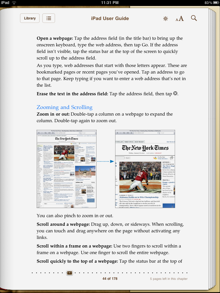
It was colleague of mine that finally clued me into the solution - the two finger swipe. I just tried it tonight and it worked! While I'm glad that I now know how to do something that is pretty basic on the iPad, it got me thinking about Apple's overall strategy of designing without affordances. The overall assumption is that the various touch actions are intuitive and, as a result, it is so much more efficient to not clutter screens with affordances like scroll bars. To Apple's credit, most of the touch actions are intuitive. However, the problem is the set of touch actions that are not intuitive and how users are supposed to find out about them. I admire Apple's commitment to its design principles for virtually all other aspects of the design of this device but that purity of adherence to the principles does have its costs and this is one of them.
Hidden iPhone UI Features

Even though we all love using our iPhone and iPod Touch devices, I'm struck by how many features in the user interface aren't readily apparent. Let say you wanted to delete some app icons or to move them around - you're stuck - unless of course you consult the manual (only one of the people I polled on Twitter used this method) or you somehow happen to hold your finger on an icon a bit longer than usual and see the the screen changes to the look like the one you see on the right. If the latter happened, you then have a clue that pressing the icons with the Xs on them might delete them and if you also happen to touch the icons and notice that they move, you have a clue as to how to move icons. Of course, you won't know how to get out of this delete/move state with the icons wiggling unless you happen to press the home button and notice that the wiggling stops. If you also happen to press the home button twice in quick succession, you'll see music controls come up in a beautiful transparent pop-up window no matter where you are in the system. Similarly, if you'd like to move rapidly to the top of a scrollable list, you might randomly hit the status bar at the top of the screen and notice that the list was reset to the top. Amazingly useful features but none of them, I would suggest, obvious to find in the user interface, nor all that easily discoverable either (unless you consult the manual, Google or Twitter it).
When we rave about the beauty of the design and the exemplary user experience of the iPhone/Touch, we often forget the difficulty we initially had in learning how to do some basic tasks. In fact, some of you may not have been aware of some of the features that I pointed out above. We've likely forgotten those difficulties for the same reason as I pointed out in my last post, we're more forgiving of designs that are otherwise really engaging and enjoyable.
It does make me think though that we need to find better ways of familiarizing users with hidden user interface features. As the iPhone/Touch type user interface becomes more commonplace, users will again raise the user experience expectation bar and likely won't be as forgiving as they struggle in finding out how to carry out the most basic tasks.
