Cultural Influences on Design
I just returned from a two week trip to China. I was a keynote speaker, along with others like Don Norman and Bill Buxton, at the User Friendly 2010 Conference in Nanjing. The theme of this Usability Professionals Association International Conference was "Embracing Asian Culture". A number of the speakers addressed the theme by discussing the various ways they incorporated cultural differences across the globe into their product designs. My presentation also included some material on the ways we go about understanding users in various parts of the world and the ways we address any cultural differences. After the conference, I spent some time in other Chinese cities like Beijing, Shanghai, and Suzhou as well as traveling between them. I observed what people wore, what phones they used, and what was available in their stores.
I used to be of the view that companies should do everything they can to understand cultural preferences and then come up with designs that incorporate these preferences. My experiences in China have led me to think that we need a hybrid approach that involves addressing cultural preferences under certain circumstances and not under other circumstance.
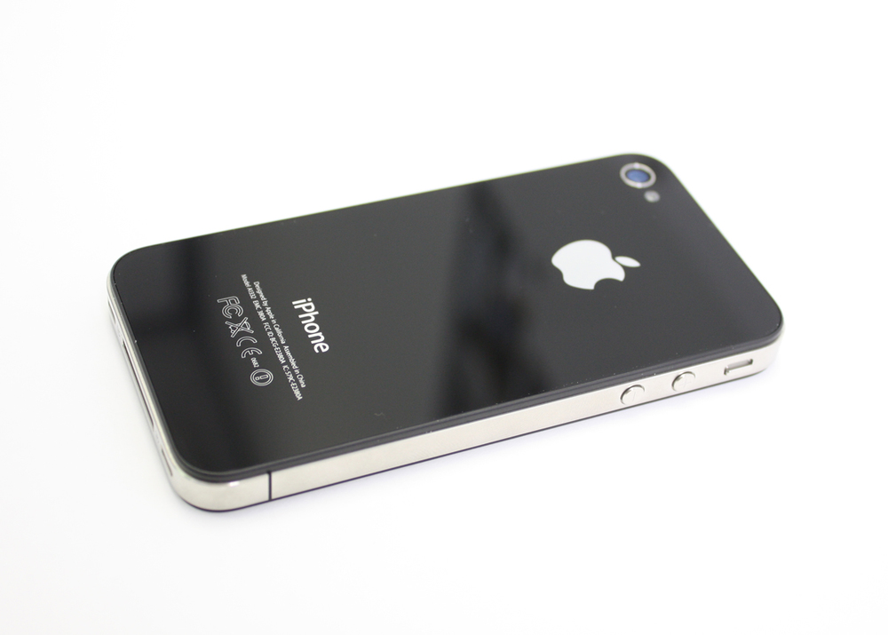
An observation of the mobile phones that are most desired and the clothing fashions that have the greatest influence in China suggests that traditional colors and styles don't much matter with regard to these products. Black iPhones are everywhere as are clothes fashions that originate in Italy. However, store displays and their electronic equivalents exhibit what to Western eyes looks to be overwhelming and chaotic arrangements of products. The results of a fascinating research study that was presented at the conference may provide some insights into why this aspect of design may have a deep-seated basis in culture. The study by Takahiko Masuda et al., (2008) entitled, "Placing a Face in Context: Cultural Differences in the Perception of Facial Emotion" showed different groups the same two sketches of five students with one in the center who's facial expression didn't change but the other four students' expressions where happy in one and sad in the other version of the sketch. When the sketches were shown to North American subjects and asked to say whether the main character was happy or sad in each, the typical response was that there was no difference in the two sketches. Asian subjects, on the other hand, tended to respond that the main character was happy or sad when the others in the sketch were depicted as having these emotions. When I first saw the two pictures I laughed to myself thinking that the pictures were identical. I'm a typical Westerner in this regard. This
 study illustrates the Asian subjects responded based on their perception of the entire sketch involving all the people in it whereas the Western subjects responded based on a single individual and ignored the rest of the sketch and the people in it. There appears to be a difference in the individual versus group dimension but also in the figure versus ground one. As I traveled China, I saw more and more examples of both of these dimensions at work and was more and more convinced of their centrality and their importance to design.
I consider this only the beginning of a quest to understand the meaningful differences between the cultures with regard to design but I do think it points our future work in interesting directions.
Reference:
Masuda, Takahiko; Ellsworth, Phoebe C.; Mesquita, Batja; Leu, Janxin; Tanida, Shigehito; Van de Veerdonk, Ellen; Placing the face in context: Cultural differences in the perception of facial emotion; Journal of Personality and Social Psychology; mars 2008; vol 94(3) 365-381.
