Cloud User Experience
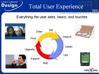
I first wrote about the concept of the Total User Experience some fifteen years ago. B ack then it was all about finding out about a product, going to a store to buy it, actually buying it, unboxing it, installing it, using it, getting help with using it, getting additional support when the help didn't help, and upgrading or uninstalling it. During this time virtually all applications ran right on your computer and the resulting files created were saved there as well. We've witnessed a gradual evolution of that total user experience with more and more of it involving the web. Advertising went online, then buying and directly downloading products. Increasingly, help and support have been available over the web too. The last aspect of the user experience to move to the web is the application itself and its data.
The move of all aspects of what used to comprise the total user experience to the web has, interestingly, created a new total user experience focussed on the online experience itself. Perhaps the most important aspect of that experience in staying connected online.
Most people's concerns regarding so-called cloud computing center on the uptime of the cloud vender's service. While this is important, the service interuptions from the major vendors have been very infrequent and relatively brief. However, an often overlooked aspect of the cloud user experience is the uptime of ISPs and company and home networking systems.
I had a disruption of service from my ISP yesterday for about five hours. This prevented me from doing my work and anything else online. The support staff, while friendly, didn't seem to understand or appreciate how serious a problem like this is when you're using cloud computing. ISPs have to realize their importance in the total cloud user experience for it to work effectively. This is an aspect of cloud computing that is often disregarded. I believe it is critically important and may well turn out to be the weak link in the cloud computing strategy unless ISPs come to understand their new role in the total cloud computing user experience.
As always, I'd appreciate your thoughts on this topic via the comment mechanism.
Designing for the Cloud

I've been taking note of my experiences in working with applications running in the cloud. For me this includes applications like Gmail, Facebook, Podbean, Delicious, Blogger, Twitter, Skype, and Google Docs. Overall, I'm really impressed with the convenience of accessing them from anywhere on virtually any device and not having to worry about where my data are. With only a few exceptions, I'm also really pleased with the functionality of these in-the-cloud apps. In fact, I rather like the approach of providing only the base functionality first and then adding just the few additional capabilities over and above the base. This is in constrast to many traditional apps that are so function rich that they end up being unusable.
The challenges often cited in working with these apps can be summed up as relating to availability, speed, and design. While most of these apps have pretty good availability, there are the rare times when they're not available. In fact, availability is so good for most of these that it makes the news when one isn't. To be fair, though, these apps have better availability than the power to our homes. In other words, I've had more power outages to my home than Gmail being down. However, the smaller companies, like Podbean, don't do as well on this score.
Speed is another challenge often mentioned. However, again, I'd argue that with only the odd exception, the apps I use are pretty nimble. Of course, the speed of these apps is determined largely by the speed of your broadband connection. I haven't experienced any speed problems again other than with the apps from the smaller vendors.
That brings us to design. This is where I believe the greatest challenge is at the moment. Many of these apps have not based their designs on well-proven user interface design patterns. As a result, they are quirky and often lead to user errors. They appear to mix up website design with application design when the latter is clearly required. Functions are often hidden or included in too many places. Often a user interface element is available but then moves on the p age since the full page hadn't painted yet. And, perhaps the most annoying of the design challenges - the lack of autosave. The Google apps excel in this regard. As I write this using Google's Blogger, it is regularly performing an autosave operation every three minutes. That gives me peace of mind and allows me to recover if for some reason my connection was lost or something else happened to my session. I've had horrible experiences with apps that do not autosave recently including Facebook and Podbean.
These applications are clearly the future and with enough focus from designers, these apps will continue to get better and better. I'd appreciate it if you have any experiences to share regarding these apps, please provide a comment using the capability provided. You may want to comment on Blogger's commenting design as well.
Chrome: The Browser that Isn't
