Fingers and Thumbs

Mobile devices have transformed the way we deal with computer technology. We now have amazingly powerful computers that fit into the palms of our hands making it possible to have them with us at all times and be able to do many of the tasks we used to only be able to do on computers and more.  

The miniturization of this technology has given us amazingly high quality displays and the integration of multiple capabilities such as cameras, GPS, accelerometers, and the like. However, getting information into these tiny devices, while improving, still has a ways to go. Even though speech technologies are improving, most people still use software keyboards. The use of software keyboards isn't uniform either though with some people using their thumbs, others using their fingers, and yet others preferring the swipe type keyboard alternatives. As usual, I thought I would ask my social media networks what they do. I asked "Do you use your thumb(s), finger(s), or voice when entering information into you Smartphone?" The results are shown to the right. Voice input was predictably low at 8 percent and alternative keyboard input technologies that involve swiping across the keys yielded an even smaller number (but then I didn't specifically list this as an alternative).  The majority of respondents indicated that they use their thumbs but, surprising to me and to others on Twitter who commented on this, fingers were preferred by fully 34 percent of respondents. Of note as well is that 2 percent of those who use thumbs actually only use one thumb and 4 percent of those who use fingers, just use one.

I rarely use Siri now and use both thumbs when entering information into my iPhone.  I thought that most people were roughly the same and was surprised to see people using their fingers. However, these results indicate that I was wrong and I suspect that others may be surprised by these results too. 

What implications does this have for designers of mobile apps? First, absolutely minimize the information that a user has to enter into your app given that it is still a suboptimal input mechanism. And second, don't assume that users are using their thumbs. The designers of Flipboard (an app that I love and many, many others do too) decided to adopt an entirely new interaction pattern when they moved their app from the iPad to the iPhone with the former optimized for fingers and the latter optimized for thumbs. These results call into question the assumption that Smartphone users use their thumbs. Of course the majority of Smartphone users use their thumbs, according to my unscientific study, but a sizable percentage of users actually use their fingers.

Lastly, we smug thumb Smartphone users should stop snickering at the occasional friend or family member who uses their fingers on their Smartphone and realize that there are more of them than we initially realized.

The State of Design Practice

I wrote a book some ten years ago with a couple of colleagues (Scott Isensee and Carol Righi) called "User-Centered Design: An Integrated Approach" which outlined a comprehensive system for introducing UCD to an organization and specified the key methods that should be carried out. This work was an elaboration and extension of the pioneering work of Don Norman and colleagues. I followed the book up some years later with an article in the Communications of the ACM entitled "The State of User-Centered Design Practice" which reported the results of some research that some colleagues (Ji-Ye Mao, Paul Smith, and Tom Carey) and I had conducted getting information from UXD practitioners at more than 100 companies and investigating, among other things, the differences between what is known to be best practice and what actually is carried out inside companies. Even though the importance of design was increasing, practitioners in most companies reported a significant difference between the known best practice and their day-to-day experience.

Design is seen as even more important now, as pointed out elsewhere in the blog thanks largely to Steve Jobs and Apple. I thought it would be good to have another look at the state of actual practice so I turned to the LinkedIn "User Experience" discussion group and asked the question shown here.

Although I posted the question some time ago, the responses picked up significantly recently and have been fairly extensive and from a variety of different companies. The discussion is ongoing but I thought it might be good to summarize the key themes at this point here. There were five key themes among the comments which each were mentioned by a substantial number of practitioners.

Management Understanding/Buy-in: An overriding theme mentioned by many concerned the lack of understanding regarding the need for, execution of, and requisite resources required for User Experience Design. This resulted in insufficient importance given to design and inadequate resources being applied to it. 

Missing or Vague Requirements: Many practitioners mentioned the challenges they faced in attempting to carry out User Experience Design activities when the projects hadn't been given appropriate business requirements from Project Management. The requirements were either missing entirely or sufficiently vague as to have little value.   

Resources to do User Research: Practitioners overwhelmingly reported dissatisfaction with not having the resources to carry out one of the most powerful design methods: user research. This finding is consistent with the results I reported in the Comunications of the ACM article mentioned above. The combination of missing or vague requirements and little nor no user research leads to designers essentially working in the dark.

Everyone Thinks They're a Designer: Another common theme reported by many respondents dealt with the problem of project managers, executives, and developers all thinking that they're capable of doing design themselves. One respondent also astutely observed that designers are often guilty of assuming the developers know nothing about design which is also problem.

Suboptimal Day-to-Day Practices: The above themes were reported about equally by respondents as being substantial major problems. A fifth theme emerged that dealt with a variety of day-to-day frustrations or suboptimal practices. These included the following. 

  • Being handed a design by development and being asked to "make it usable" or by a project manager and asked to "clean it up". 
  • Presenting a wireframe when the expectation was the finished, polished design. 
  • Not being able to iterate on the design based on user feedback and simply being expected to come up with the completed design in one iteration. 
  • Being told that it is too costly or will take too long to build the design or that it will be addressed in the next release. 
  • Being expected to adopt designs that are perceived to be industry leading. 
  • With no audience definition being told to "design for everyone". 
  • Not addressing the findings from user research when it is carried out.
  • Having to deal with everyone on the team thinking that they're the user. 
  • The difference between UI and UX not being understood. 
  • Losing sight of the primary objectives of the project and getting distracted by other tangible results.
  • Unrealistic deadlines and evolving scope creep. 

The experiences of the User Experience Design practitioners that responded to my question clearly articulated the challenges that remain to be addressed in many companies. As I pointed out in my Communications of the ACM article, companies may have the mistaken notion that design is being carried out effectively simply by having hired designers. However, these results reinforce the need for companies to more deeply understand User Experience Design and to address the issues summarized here.

Although some methods and technologies have evolved, the essence of the integrated approach that was outlined in our book ten years ago still applies and my experiences with leadership teams validates it as well. The integrated approach that my coauthors and I published stresses that the commitment to design excellence and the investment in it has to start at the top of the company, clear business objectives must be set by Product Management, user research needs to be carried out to provide the foundation for design informing personas and scenarios, design needs to be carried out by those trained in the disciplines of design and start with low fidelity prototypes evolving through iterations involving regular user feedback and innovation explorations into high fidelity prototypes and code. Product management, design, and development need to work collaboratively and iteratively leveraging each other's skills. The entire team has to share the commitment to achieving the established business objectives with the effective leveraging of User Experience Design. While this isn't easy, it does yield significant dividends when deployed and executed optimally.  

I'd like to thank the members of the LinkedIn User Experience discussion group for their experiences and insights. 

Innovative Mobile App Designs

The number of mobile devices is increasing exponentially and so is the number of apps being developed for those devices. The design of many of those apps while effective, often isn't exemplary. However, the mobile space is seeing its share of true creativity and innovation. In fact, the introduction of a novel design often sets the direction for other apps to adopt aspects of that design as well. 

I try to stay on top of innovative designs myself by following podcasts, reading blogs, and exploring app stores. However, as usual, I thought I'd also leverage the wisdom of the social media crowd. I asked, "which mobile app would you say currently has the most creative, innovative, and usable design?" The feedback I received is summarized in the wordle on the right. A larger font size indicates a greater number of people having chosen that app. The results illustrate some clear front runners: Flipboard, Path, and Clear. While the remaining apps have some interesting features, we'll focus here on the apps which were mentioned by the most people. I also followed up with the people who selected particular apps to ask them what aspects of the design of the app they most appreciated.

Flipboard first came out on the iPad and set a design direction there with its novel design patterns and when it came out on the iPhone it did it again but, importantly, with different design patterns. It provides the capability to aggregate content from a growing list of providers but importantly from Facebook and Twitter. The design attributes people mentioned as being exemplary include "a fluid and simple UI", "amazingly beautiful graphics", and "overall ease of use", and "integration". Flipboard truly transformed the aggregation and rendering of content. For example, information from Twitter in most other places is shown as a continuous stream of text which sometimes allows for the inline rendering of photos, visuals, and videos. However, Flipboard turns that content automatically into a beautiful multicolumn magazine style layout which maximizes the rendering of non-textual information and the appropriate clustering of textual and non-textual information together. The navigation model Flipboard uses on the iPad is hand/finger gesture based with horizonal page flipping whereas on the iPhone it is thumb based with vertical page flipping.  The page flipping is reinforced with a suble, yet satisfying page turn animation.  Both form factor designs have an opening category selection screen which provides the home base that can be returned to with a tap or two. Individual content items can be drilled into by tapping.  Flipboard is the app I use on my iPad and iPhone to access social media, news, and blog information. Pulse News is also an information source aggregator and it is instructive here when discussing Flipboard to point out that Pulse is similar in some ways except that it uses a navigable grid with sources being able to be navigated vertically and content items horizontally. Selecting a story in Pulse brings it in as an information card animating from the right and partially overlaying the base content grid in the iPad version and as a full page story on the iPhone. The design patterns used by both Flipboard and Pulse are really effective for the type of content they provide.

Path is another app that was recommended as being among the most creative, innovative, and usable.  Those mentioning it used words like "amazing" and "beautiful design".  Path is an alternative social media service for just those friends and family with whom you have a close relationship.  The number of "friends" you can have on Path I believe is currently about 150. The app is beautiful visually and is fast. However, I find it's controls to be particularly effective. Path has an animated control that appears once you start scrolling down the timeline and shows you the date and the time of the updates being shown. It's nice for the use case when you know there was an update at on a particular day and time that you'd like to access. It's important to point out that it isn't pervasively visable and the dynamically updated clock adds visual interest and relevant information which also appropriately draw your attention to the control even though it is quite small.  The second control of interest is a menu that appears when the plus sign at the bottom left of the screen is pressed. The menu animates fan-like with a satisfying bounce when opened and includes a rather whimsical spinning and springing back into the plus sign when it is dismissed. The control provides a quick way of indicating what type of update is being created (photo, people, location, music, thought, or sleep/wake). The number of likes are shown with a happy face and a number. Path does a particularly good job of optimizing space for content which is rendered beautifully but it does this by also minimizing the screen real estate that is used by controls. When controls are used, they include animations and visuals that are engaging, informative, and whimsical.  

Another innovative app that was mentioned was Clear.  It is essentially a to-do list organizer. Those recommending it particularly liked its "gesture based interface", that it was "simple", and its use of "color". The design pattern that Clear uses is one where virtually everything is accomplished on a single screen via direct manipulation with the content, and only the content, showing on the screen. This app is the ultimate in getting rid of any controls or app-specific chrome. All you see is the content. It is also the ultimate app for doing everything intuitively by direct manipulation. If you'd like to add an item at a particular point in your list, you simply pinch apart the items above and below and then proceed to add your item. You indicate that an item is complete by swiping across it left to right and if you'd like to delete an item, you swipe from right to left. To move an item, you just tap on it and drag it to where you'd like it to go. You can also swipe up and down to access a menu and multiple lists. I actually only use a single list and thus only ever deal with what you see in the photo on the right. 

I love how these apps have pushed the design envelope by driving greater engagement through beautiful visuals, effective animation, efficient and natural navigation and actions, and minimal use of controls that are persistent. The mobile design space is an exciting one with new apps like these appearing regularly which raise the bar on innovation, creativity, and usability. 


Experiences with Speech Technology

Many technologies are introduced well before they're ready for regular use. It also often takes a combination of factors to come together to enable the successful adoption of a technology. The alternative interaction technologies - touch, gesture, and speech - have all gone through this transition. They started off in research labs with demonstration experiments shown regularly at academic conferences. Then the technologies moved into product development labs and eventually into early products. Touch is now well establshed pervasively across many markets by being very successfully used in smartphones and tablets. Gesture was introduced in the casual game market with consoles. It represents a novel and interesting interaction technology but doesn't appear to be compelling enough to be heavily used even in that market although it does still show significant promise. Speech technology has been around the longest in some commercial form, probably has the greatest promise, and yet it has been the one that has proven to be the toughest one to move into widespread adoption and use.

Speech dictation especially in specialized domains has been successfully used for many years. However, it was the development of smartphones, high bandwidth connections, and cloud technologies that provided the environment for speech technologies to be adopted more widely and generally. I now use speech technology to select the person to dial, execute some searches, and for some dictation. I find that it works quite well but I'd like to use it more pervasively than I do now. I also wondered what other people's experiences have been with speech technology so, as usual, I turned to the social networks and asked "Do you use speech technology? If so, how and for what? If not, why not?"

A total of 53% of those who responded said that they used speech technology.  The themes regarding use of the technology stressed hands-free contexts like driving, riding a bike, running, as well as simply "laziness and convenience". Most appeared to be quite happy with it.  Those who didn't use the technology gave the following reasons why they didn't.

  • Slower than a keyboard
  • Too error-prone
  • Too easy for others to listen in
  • Not good in noisy environments
  • Too much effort
  • Not accurate enough
  • Too inconvenient
  • Doesn't work everywhere that a keyboard does
  • Doesn't recognize Indian accents very well
  • Doesn't recognize French accents very well
  • Have to repeat too often
  • Needs to be more readily accessible

It would appear, therefore, that speech technology is coming of age and successfully used by some people quite regularly typically when they can't or don't want to use their hands. However, the technology still has to improve in a number of ways including speed, accuracy, pervasiveness, and globalization to be used by an even greater number of people. I think we're on the cusp of the effective pervasive use of speech as an important interaction technology. 


Increasing Trend in Digital Interactions

We all have a sense that our world is getting more pervasively digital. However, I wanted to get a sense of the degree to which that change is happening with regard to our day-to-day communication. As I often do, I turned to my friends and followers on the social networks to get a reading. I did a survey three years ago asking questions on a variety of topics including this one. So, I thought it would be good to ask the key question again and see what change, if any, there has been in the use of electronic communication. I asked the following question on Twitter and Facebook: What percent of your interactions with others during a typical day would you say are via electronic means versus face-to-face? The results were pretty dramatic. In 2009, people responded that 65.7 percent of their interactions were via electronic means and the corresponding number in 2012 was shown to be 77.0 percent. A 11.3 percent increase in three years is quite amazing. Although this isn't a particularly scientific survey, it reinforces a pretty substantial trend toward more and more of our communication and interaction being experienced digitally. I'll follow up further to investigate additional factors underlying this trend, such as work versus personal interactions, the degree to which the communication leverages mobile devices, etc., and will report those results here as well.       

Design of the Web's Perceived Value

The earliest version of the commercial internet had a business model which required users to pay for its use and its services. Companies like CompuServe, Prodigy, and America Online sold customers these products.  An integral part of the design of those products was the fact that you had to pay for them and that, in turn, led to their perceived value to users. Google and Facebook as well as a host of other contemporary companies have designed their products to be free services which has resulted in a perception by their users of the services having a very low monetary value to them.  Many often balk at the use of the term "products" when referring to what these companies provide. Of course, these companies are supported through advertising revenue or venture capitalist funding with the promise of future advertising revenue based solely on the number of eye balls staring at those services and the resulting potential ad impressions. In its most recent earnings statement, Google reported that $10.2 of its total $10.65 billion in revenue for the quarter came from advertising. It is also expected that Facebook has even greater ad revenue potential given its greater reach.  Of course, the value in this advertising is in its ability to target advertising for particular products with laser precision at potential buyers of that product based on the advertiser's detailed knowledge of the receiver of that advertising. The way the advertiser is able to get that detailed knowledge is by Google and Facebook making more and more of that information about their users available.  

Users are upset about the constant changes to the services that they use everyday with every change targetted at making more of their information available to advertisers.  However, they're not upset enough to not want to give up the free nature of the service.  In a recent discussion on my Facebook account showed that fully 75 percent of my friends wouldn't pay $5 per month for an ad free version of Facebook.  Given the initial design of these services as being free, it isn't possible now to introduce even a small fee for their use.  What I find strange and unfortunate about this is that I can think of no other industry that relies exclusively on advertising revenue because its customers aren't willing to pay even a small amount of their own money for the products of that industry.  I worry how sustainable such a nondiversified business model is for the industry as a whole.

There are portions of the industry that are trying to design offerings that include payment. Apps are a good example. However, as I've written about elsewhere in this blog previously, the monetary value designed into those products is also incredibly low. Most apps are free and an app that costs $9.99 or even $4.99 is perceived as expensive.  

It is unfortunate, in my view, that web services and "products" were designed by contemporary companies as free and that the only real business model with any presence and success is one that is almost exclusively based on advertising revenue.  While I lament the app-ification of the web, its introduction of some level of payment may be the only way to diversify the business model of what is an incredibly important industry.   

Paradigmatic Change in UIs

In the first wave of computing there was virtually no user interface, comprising little more than instructions 
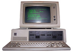
written on punch cards which were loaded into a hopper then read by the computer with the results given to the user via a printout. The second wave introduced what we now know to be a user interface, a display with characters and graphics along with a keyboard and mouse. The display evolved from simple monochromatic characters to full color graphics with ever increasing resolution over time and the keyboard and mouse technologies evolved to be smaller and integrated with trackpoints and trackpads. However, the basic elements of a small TV like display, with a keyboard and mouse beneath it, have remained constant for a remarkably long time. What appeared on that display and how a user interacts with it has remained surprisingly constant as well, especially from the time that the concept of programs running in separate windows was introduced.

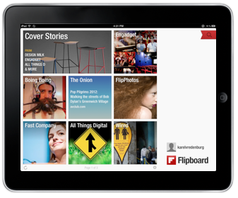
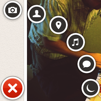
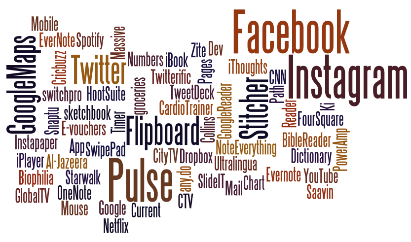
While there were minor predecessors, the major shift into an entirely new form factor came with the introduction of the iPhone. We're now so used to smartphone UIs that many people forget that we hadn't ever experienced one until Apple introduced its game-changing device. The smartphone form factor existed before the iPhone, but Apple totally redefined it. Once users were used to the iPhone user interface, the adoption of the larger form factor iPad was incredibly easy because it was virtually identical. Like the smartphone, the tablet form factor also existed prior to the iPad but again Apple redefined it dramatically. Key to that redefinition was the perfected use of multi-touch. Interacting via multi-touch is so pervasive now that it isn't uncommon to see people walking up to screens in places like hotels, airports, and stores expecting to be able to interact with them with touch only to be really surprised and disappointed when they turn out not to support touch. That's when you know that we've experienced a paradigm shift as a society. Touch has been in university labs for decades but it took Apple's dedication to design excellence of the entire user experience to perfect the technology to create this paradigm shift.

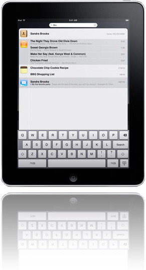
Another paradigm shift in interaction modality has just started. This one involves the use of speech. Again, speech technology has been around for decades and has been used commercially successfully as well but mostly in niche markets like voice response systems and dictation systems. Apple's Siri is still in beta, a product designation Apple very rarely uses, but promises to do for speech technology what the iPhone did for touch technology - make it a pervasive and paradigmatic change in society.

There are two major insights to glean from these fairly recent advances. The first concerns how these changes took place. In each case, the basic research and foundational technologies as well as even some commercial applications existed for decades prior to the paradigm shift. It was Apple's approach to design that made the difference. The design of everything, from the industrial design of the physical elements of the device (glass, case, bezel, etc.), the visual and interaction design of the operating system and key apps, the engineering design of the internals (processors, memory, battery, GPS, etc.), the manufacturing design of the production line, the design of the website and app store, the design of the content review process, the design of the payment and app download system, the design of the stores, the design of product support, all the way to the design of the product secrecy and product announce/launch systems. Many people like to jump to simple conclusions that these paradigm changes were brought about by this or that individual element but I believe that it was Apple's focus on the total customer experience and all the elements that impact it that was critical. Designers planning a product that they hope will transform an industry need to focus on all of these aspects of design.

The second major insight to glean from these paradigm shifts is the need to rethink how all future products in any market should fit into these major paradigmatic changes in form factor, device, and interaction modality. Designers now need to understand deeply how users are using these technologies in order to design products optimally leveraging them. This is a challenge for many because, as pointed out above, form factor, device, and interaction modality hadn't changed virtually at all for decades. However, these recent changes are so profound that it really does require designers in any market to sit up and take note and consider how users in their markets may be changing.

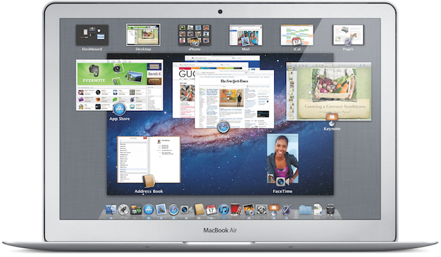
Having explored paradigm changes we've already witnessed, let's give some thought to where these may go in the future and what other paradigms we may witness in the future. While the computer, smartphone, and tablet form factors and the touch and speech interaction modalities have mostly developed independently, the emerging trend is for them to become more consistent and a future paradigmatic change may involve them integrating deeply. We're seeing the beginnings of changes being made largely to computer operating systems like Apple's OSX to make them more similar to device operating systems like iOS. Apple is making the change gradually with each update to the OS, which is a wise approach that minimizes the magnitude of the change but still moves drives consistency. We're also seeing the very beginnings of a move to integrate form factors, devices, and interaction modalities. Responsive design is part of this trend, as is the enablement of touch and speech pervasively across devices. We're also seeing some degree of cloud based seamless access integrating content and data across devices. We're also seeing that integration spread to even larger form factors like TVs and digitally enabled physical window panes. Some call this a post-PC era, my sense is that we're witnessing a plethora of form factors which in PCs, ensuring that each of these can suit the wide characteristics and contexts of use into the future.  

We're living in exciting times that require designers to be fully aware of, intimately knowledgeable about, and be able to leverage the benefits of these incredible paradigm shifts in technology and people's use of them.

Top 10 Life Habits Podcast Episodes

I've been reflecting on all the top ten this and top ten that I've seen on blogs and the social networks toward the end of the year. That got me thinking about what the top ten Life Habits podcast episodes would be.  I had a look and aggregated the results from several of the top countries and found some pretty interesting results.  They reflect the top ten episodes being listened to right now. The list may also be interesting to you if you haven't listened to the full 67 episodes produced to date and would like to listen to ones that other listeners are particularly interested in. This list may also be of interest to people who just got a device for Christmas and want to get into podcast listening too.

So, here's the list (the numbers in parentheses indicate the episode number):


  1. Types of Help (LH67)
  2. Assertiveness (LH49)
  3. Managing Stress (LH24)
  4. Visualizing Progress (LH64)
  5. 5 Lazy Ways to Get in Shape (LH66)
  6. Life Lessons (LH65)
  7. Stop Procrastinating (LH46)
  8. Time Management (LH2)
  9. Staying Positive (LH3)
  10. The Power of the Mind (LH4)


Many podcasts that deal with news or technology developments are time sensitive and listeners typically only listen to the most recent episode and past episodes have very little value because they're essentially old news. In contrast, my Life Habits episodes are essentially timeless and people regularly listen to the full list of epsides. Many listeners subscribe and listen to every episode as it comes out but others selectly listen to podcast topics that specifically interest them.

The most listened to episode right now is the most recent one that I did with UK Psychologist Mandy Kloppers. In addition to being the most recent, it is a topic that I would think would be of particular interest to many of the listeners and Mandy also does a really good job of outlining the types of situations and challenges that would be appropriate for which to seek some professional help, the types of help that are available, and also what to expect and how to get the most out of the various types of professional help. Many people also have difficulty being appropriately assertive so that comes in as the second more popular episode. The session provides information on how to avoid being to unassertive but also very importantly to avoid being too aggressive too. We live in a rather stressful world so managing stress comes in at position three. Visualization of your goals and visualizing progress toward them is important and the episode on that topic came in at position four. The session with my regular guest Marie-Josée Shar on five lazy ways to get into shape is especially of interest at the moment when many people have resolved to get into better shape so this episode came in at position five. Steve Jobs's life lessons came in at the sixth position. The common challenges of procrastination, time management, and staying positive took positions seven, eight, and nine. The tenth slot was taken by my session on the power of the mind during which I describe the various biases we have and often don't know we have.  If you'd like to check out these episodes, you can do so by going to the podcast page on iTunes or the show notes site.  

Apple's Post-PC Era

I was just setting up a new iPad for a family member who wanted to use the new device she received as a gift as a stand alone device without needing to connect to a PC. Regular readers of this blog will know that I'm usually pretty positive about Apple's designs and, of course, I'm certainly not alone in that view. Apple is incredibly good at hardware design and the integration of software with its hardware. However, the company to date has had some difficulty with the design of its cloud capabilities.

Apple has recently used the term "post-PC era" as a basis for its mobile and cloud strategies and communication. Recent updates to iTunes and iOS have provided some independence of mobile devices from computers, but only partially. You can now push updates from a PC-based iTunes to an iPod Touch, iPhone, or iPad without using a cable but you still have to use a computer in the mix.

There are other use cases that have absolutely no support on iOS devices. The most annoying and concerning one for me is the inability to subscribe to podcasts on Apple mobile devices. You can download individual episodes but there is no way to actually subscribe within mobile iTunes. With the increasing popularity and use of mobile devices (see last blog post), the inability of podcast listeners to subscribe via mobile devices is not only inconvenient for users, it is also a major problem for those creating podcasts, like me. It is really strange that Apple hasn't provided the capability to subscribe. All it would require is to include the same "subscribe" button to the right of the podcast name and artwork on mobile iTunes as is included on the computer-based version of iTunes (see visual on the right). It was pointed out to me by a friend on Facebook that there are separate apps that provide this capability with one called Downcast that is particularly good and one that he recommends. That's a temporary fix but I still think that this missing function needs to be included in the base mobile version of iTunes. I know that it is a herculean task to develop mobile device operating systems that never need to be connected to a PC and to design that really well. However, leaving off the subscribe button seems to be a rather strange oversight on Apple's part. 

To the listeners of my podcast who may be reading this, I'd suggest that you use the iTunes on your PC to subscribe to the podcast or download an app like Downcast to essentially replace the podcast part of mobile iTunes on your iOS device. I do hope that Apple addresses this problem soon in an update to iOS so that we won't see bifurcation of the podast audience on Apple devices and also no longer have a single reliable place to determine podcast popularity and feedback.

Mobile Device Use, Activities, & Apps

We all know that the use of mobile devices is increasing but what isn't as clear is how much and what sorts of things people are doing on mobile devices. As I often do, I decided to turn to my social network and I asked my followers "what percent of your daily use of technology would you say is on mobile devices versus non-mobile?" The results were rather interesting. The mean for mobile use was 41.4 percent. That would suggest that we're approaching using mobile devices for nearly half of all our use of technology. I did notice that the range of percentages was also rather high so I checked the median which was 35 percent. That finding reinforced my suspicion that a subset of people use mobile almost exclusively.

Given the significant proportion of our technology use that is mobile, I wanted to next find out what people are doing with their devices, particularly work-related use. I then asked "what are the top three work-related things that you do on your smartphone and/or tablet?" The results are shown in the Wordle on the right with the font size indicating greater prevalence of the activity. The most frequent work-related activities carried out on mobile devices include doing email, accessing social-media services, working with the calendar, and using a web browser. The prevalence of social-media as a work-related activity may appear to some as surprising. It must be realized however that I surveyed people via social-media services so the sample may be biased in that regard but nonetheless it is also likely the case that these services are increasingly being used for work-related purposes.   

Lastly, I wanted to get a sense of what apps people use on their mobile devices and would recommend to others. In this case, I didn't restrict the question to work-related use but instead left it open to all apps. I asked "what are your favorite apps on your mobile devices that you would recommend to others?" The results are again shown using a Wordle on the right. The first observation that is immediately obvious from looking at the Wordle is the sheer diversity of apps with only a few standing out as used and recommended by many people. This perhaps shouldn't be surprising given the vast number of apps in the various app stores. It is interesting too that the most popular apps included Facebook, Instagram, Twitter, Pulse, Flipboard, and Google Maps. Respondents likely use the built-in apps for email, calendar, etc. so didn't report those. The vast majority of the apps they did mention are essentially apps for accessing social-media services and information aggregating services.

I didn't differentiate here between smartphone and tablet mobile devices. It may well be the case that the majority of these results are based on smartphone use predominantly and that additional types of use and types of apps would be found if we looked specifically at tablets. I plan to examine the use of tablets in a future blog post. 

Back from the Life Habits Hiatus

Life sometimes gets busy. Mine got a lot busier than my normal busy over the past while which also resulted in an unplanned hiatus from my Life Habits podcast series. The podcast is my hobby and a particularly enjoyable passion of mine. However, when things get busy, our hobbies get squeezed and this one of mine did.

A staycation during the US Thanksgiving break allowed me to get caught up. I recorded an episode titled Life Lessons which was a companion to the previous blog post on this site about Steve Jobs. The blog post focused specifically on Steve's contributions to design while the podcast episode dealt more broadly with the advice and lessons we can glean from Steve's life.

I also just completed an interview episode titled "5 Lazy Ways to Get in Shape" with Marie-Josée Shaar. She and Kathryn Britton recently published a great new book "Smarts and Stamina: The Busy Person's Guide to Optimal Health and Performance". My intereview with Marie-Josée covers a subset of the material in the book and includes advice to sleep all you need, to eat by design, to "do a mini", to not make it a big production, and to exercise on company time. I love how practical the advice is that she shares, the way she explains foundational concepts, the examples she provides, how she practices what she preaches, and how she clearly is living proof of the efficacy of the approach. Marie-Josée also knows of what she speaks in that she has a degree in Organizational Behavior from McGill University, a Master of Applied Psychology from University of Pennsylvania, and she's also certified as a Personal Trainer and is a Certified Nutrition and Wellness Consultant. 

I encourage you to check out these new episodes and let me know what you think.


Steve Jobs: Contributions to Design

Much has been said and written about Steve Jobs, particularly after his death. I haven't said much until now because it affected me rather deeply and I also wanted to reflect more comprehensively about his contributions. I have had a professional and personal interest in Steve Jobs and Apple for years. As a result, I was pretty well aware of most things that had been written on the subject which wasn't an awful lot due to Steve and in turn Apple's famous position on privacy and secrecy. However, all that changed with the publication of Walter Isaacson's authorized biography titled simply "Steve Jobs". Having read Issacson's book as soon as it came out filled in the many gaps in our understanding of the man and the company. The book chronicled the brilliant and the bizarre aspects of Steve Jobs. It also helped bring into focus and further hone my perceptions of his contributions more generally as well as his contributions to design in particular.  

First of all, Steve wasn't a designer. He was a visionary, a dreamer, a big picture thinker while at the same time being arrogant, passionate, and a fanatic about attention to detail. That's quite a combination, and one that is very rare. He would come up with brilliant new ideas, new combinations of old ideas, and old ideas made new again by doing them right. He had an eye for design and an eye for design talent. He inspired, promoted, enabled, challenged, and elevated designers and the role for design within an engineering company. After looking for design talent externally when he returned to Apple, Jobs discovered that he had an amazing designer inside the company, Jonathan Yve, typically referred to as Jony Yve. Steve promoted Jony to the position of Senior Vice President of Industrial Design and had him report directly to him. It is Jony and his team of industrial and user interface designers who are actually behind the design brilliance of Apple. 

There are many very talented designers at many companies. Those companies have produced products that those designers knew weren't the best that they could possibly be. Those designers had to compromise their designs given a variety of common constraints such as time, money, and engineering. What those designers lacked was a design champion like Steve Jobs. A design champion who would generate ideas for the designers to explore, challenge the designers to do their absolute best design work, challenge the engineers to implement designs that seemed technically impossible, drive for perfection in the design and the implementation in the product at all cost literally, and would only deliver a product when it was "insanely great". His evangelism for design permeated outside the company too into his famous product launch performances during which he expounded on the design nuances of the product.

Steve Jobs raised the bar for design at Apple and showed that an engineering company can meet that high bar. He showed that great designers can be insanely great and produce industry transforming products when inspired, championed, challenged, supported, and rewarded. Steve also, in turn, provided a lesson for all other companies who want to achieve what Apple has achieved. I think Steve's legacy will not solely be what he did at Apple but what insight he provided to all others who in turn could learn from his example and could well improve the design of everything we see and touch. Thanks Steve. 


Designing for Mobile Sites

Mobile devices are proliferating at an incredible rate. Designers of websites have to decide what experience they'd like to create for users of their sites and factor in what users prefer. SmartPhones are the real challenge given their screen size. Since the iPhone came out with its amazing screen and the ability to resize portions of the screen, I've come to prefer full websites rather than sites optimzed for the smaller screen. I prefer a three column website design with navigation in the left column, the main content in the center column, and additional information in the right column. I then double-tap the center column to enlarge the core content to make it easier to read.  

That's my own personal preference but I wanted to learn what other people prefer. As usual, I consulted the social networks. I asked, "Do you prefer mobile-enabled or full versions of websites on our SmartPhone?" A total of 55 people replied and the results are shown in the visual on the right. A slight majority of respondents (61%) preferred sites to be optimized for the mobile device but a non-trivial number (27%) preferred the full site and a reasonable number wanted both (8%) and a very small number (4%) said that it depends. Given these results and the fact that many respondents felt quite strongly about their responses, it isn't immediately obvious what designers should do in order to provide users what they prefer. Although the majority preferred mobile enabled sites, many people expressed the concern that many sites that are optimized for mobile leave out information that is available on the full version of the site. The best advice therefore would be to provide a mobile version of the site that includes the same information as the full version, to also provide direct access to the full version for those who prefer that, and to save users' preferences for the next time they access the site.

It should be pointed out that the question being addressed here was specific to viewing websites on SmartPhones and didn't go into tablets or apps which we may address in a future set of questions and blog post. 

Early Impressions of Google+

I've been using Google+ during the early closed beta. You've got to hand it to Google that they know how to generate interest. Make a new service invitation only, invite the most well-know and prolific social media stars, and then give each person who comes on the service 150 invitations for their friends. Also, calling it an early beta gives them the opportunity to find, acknowledge, and fix numerous problems.  

I was struck by its clean visual design that is airy and light. Not surprisingly, Google adopted the now standard social media (Facebook) design pattern regarding the layout and basic interaction of the service itself. Where they introduced some innovation was in the concept and design of circles. It makes perfect sense to simply use the commonly used term for circles of friends as the way of organizing people. They also included a really nicely designed and implented drag and drop interaction mechanism for adding people to circles. However, moving people from one cirlce to another and having them no longer in the first circle isn't obvious. Google+ has improved upon Facebook's mechanism for directing updates to particular circles of friends. However, I worry that if this feature is used too much that we'll lose the wonderful diversity that currently exists on social networks. My biggest concern regarding Google+ is that social networking services are really only enablers of social interaction and as such are only as good as the people using them. If virtually nobody uses the service or if only one type of user uses it, then it loses its appeal. The early adopters of Google+ are the tech enthusiasts and tech stars. They tend to like it because they're seeing so much engagement from likeminded individuals. However, in order to be highly successful, Google+ will have to attract the less tech savy that just recently finally joined Facebook.  That crowd is much less likely to move to another system no matter how good the tool turns out to be. Of course, Facebook isn't standing still either and the features that are currently more desireable on Google+ could quite easily be adopted by Facebook. 

Those are my early impressions on Google+.  However, I wanted to hear the views of others too so I posted the following tweet on my @IBMDesign account, "If you've tried it, what do you think of the design of the latest social networking site Google+?" and here are the replies.


  • G+ is very nice. Unfortunately they went about things the wrong way if they think they're going to switch fb users over...
  • Looks promising, but it still needs to mature a bit, particularly with regards to its mobile interfaces.
  • Pretty aweful, constantly having to scroll past pages of comments on things, stuff moves while reading/watching etc 
  • Clean, easy and intuitive, it's gonna kick some asses at Facebook 
  • Easy to use, and nice to have a circles. 
  • Screens are very sparse, almost unstructured. The UI for assigning people to circles is nice. 
  • They reinvented the wheel with additional spokes, the thing is, a wheel can run without the addons too 
  • It's honestly mediocre. The revolutionary features just aren't enough to drag the fickle social networking audience off FB yet. 
  • From 1 - 5 (5 being highest sat) I'd say 3.5 
  • FB is just a social network, G+ is going to give a new whole experience to users, video, chat, social sharing in theirs homepages

A quick sentiment analysis yields 40% positive, 50% neutral, 10% negative toned comments. So, it is still in early beta so we'll have to continue to watch Google+ as it develops further.


Innovations in Apple's OS X Lion

I downloaded the latest version of the Apple computer operating system - OS X Lion - the day it came out and have used it since. It has a number of unique design elements in it that I think deserve some analysis.

Install: The most dramatic innovation you first experience is that the installation of this version of the operating system isn't done with CD/DVDs, it doesn't involve going to a website, providing a bunch of parameters, downloading it and then trying to find it to start the install. No, Apple has made the purchase and installation of the new OS dead simple by using its Mac App Store.  The App Store itself is noteworthy in its own right as an amazing advance in the simplification of human-computer interaction. To install Lion, you simply click on the $29.95 price button which then turns to the install button after which you see the familiar animation indicating that the download has begun. After it downloads, you simply complete the install and you're done. By keeping the price so low and making the installation so simple and painless, Apple also ensures that virtually everyone will upgrade. That, in turn, keeps systems secure, makes it easier for developers to use the latest features knowing that users will be able to use them, and it also makes a lot of money for Apple given the volume of sales. 

Features: The Lion release includes a number of enhancements to individual apps and the ways specific aspects of the OS works. I love using FaceTime and really appreciate its ability to use HD, the new ability to flip between landscape and portrait mode, and the full screen view. The experience of having a FaceTime session with someone using HD and full screen is almost like being there. I like the enhancements to the Launchpad and Mission Control but still think they could be even further improved. I use Preview a lot, mostly for working with screen captures. I noticed in Lion that Preview can actually now add digital signatures to PDF documents by holding the signature up to the camera. Cool. Although I haven't use it yet, the ability to simply detect other Macs and send files to them via AirDrop also looks to be useful and efficient.

Pervasive Enhancements: While the individual features are interesting and valuable, it is in the OS wide pervasive enhancements where I see the real innovation. It is clear that Apple is trying to create a simple, natural, intuitive, and consistent user experience for all of its devices. Also noteworthy is the fact that they are designing for the novice user first with the most important and pervasive devices. The iPhone and iPad are computers for all people, not just ones that have been using more traditional computers. Apple is therefore trying to create and is being insanely successful at doing so, a new default user experience for all devices. While it is leading in this with its iOS mobile operating system user interface, the Lion release of its traditional computer brings its user interface in line with the iOS one.

The direction of scrolling is a perfect example. With the Lion release, the default scrolling gesture and action is now consistent with that of iOS. This is jarring at first and must have led to millions of Mac users being pretty clumsy and unproductive for a while after installing Lion. However, once you get used to it, the change makes so much sense. If you aren't yet used to the change, I found simply imagining the screen as a piece of paper that you're moving helped me make the transition. Full screen apps are another Lion enhancement that brings parity with iOS. I don't typically use anything in full screen mode because I also have a large screen but then I'm not the target audience either. I only use this feature if I'm reading a document or something that I'd like to be able to focus and get rid of visual distractions. Auto save is another feature that makes so much sense and is perfect for the notice user. I quite like it but found that I had to change my workflow to prevent losing work. For example, I often create presentations by starting with an existing one and then modifying it. In Lion, you have to explicitly make a duplicate first or else you'll be modifying the original presentation. The multi-touch gestures take a bit of getting used to but once you do, I think they're incredibly useful and efficient.

Interestingly, two of the enhancements I most appreciate in Lion aren't typically talked about in reviews. I work with designers every day and review designs typically in the form of screen shots. When I've tried to hone in on the visual and colors in the screen shots I've always been distracted by what appeared to look like light blue pieces of rope.  Of course those gaudy visuals were in fact the OS X scroll bars. I always thought it strange when Apple is so good at design, that they so messed up that aspect of their OS design. I fixed the problem somewhat previously by selecting the grey OS X theme but I was delighted to see that Lion now not only uses a much smaller grey scroll bar as the default, it also has adopted the iOS approach to only showing a scroll bar when the user wants to scroll. These changes have really cleaned up the OS user interface. The last enhancement I'd like to mention is virtually never mentioned or at least explained by Apple at all. However, it has made a significant difference in my productivity. That change has to do with Apple adopting the Microsoft Windows method of resizing windows. After having moved to the Mac, I could never understand why OS X forced users to resize windows by grabbing the bottom right corner only. The Windows world has always had the ability to resize from any corner or side of a window. It's nice to see that Apple is willing to make changes like this even though they don't like talking about them.

Overall, I've been very pleased with OS X Lion both as a user and also as a member of the industry that will benefit from the ways that Apple is driving levels of design never seen previously.


Keep Old Media Out of New Media

I enjoy listening to and creating podcasts. To me they represent what is truly unique and good about new media. I was therefore taken aback when I was listening to one of my favorite podcasts, Stuff You Should Know, and heard the hosts read a letter from a listener by the name of Katie. This listener was from old media and criticized everything I believe is special about the new media as exemplified by Josh and Chuck's very successful podcast series. She thought the podcast should be more polished, more thoroughly edited, and could do without the delightful exchanges between the two hosts. The essence of her argument was that the podcast should conform to the style, format, and content of old media. While I'm sure she meant well, I couldn't disagree more with her arguments. And it got me thinking about a trend that I'm seeing with new media as it is increasingly taken over by old media.  

Right after I listened to that episode of Stuff You Should Know, I finished listening to Tim Wu's book "The Master Switch: The Rise and Fall of Information Empires". I would recommend that anyone interested in the history of information empires and an insightful analysis of the trends, read Tim's book. The book points out that previous information innovations cycled between decentralization and centralization.  The internet and new media in general, according to the author, has thus far not repeated the trend evidenced during previous introductions of new information technologies. However, I think we're starting to see wonderful decentralized web and new media attempting to be taken over by old media and thus becoming more centralized. I was even approached by old media proposing to convert my Life Habits podcast series into a syndicated terrestrial radio program. Of course, the podcast would have had to change to conform to the old media format and style which in my view would have fundamentally changed it's essential character. When I mentioned this to friends, they were impressed that old media came calling. However, I find it strange that people still consider being asked to contribute to old media having "made it". To me, being successful with a piece of new media means having a lot of people actually download it, provide positive ratings on it, and having it rank highly on iTunes. I think it would be a shame if we all went back to the old media format and characteristics because it would mean losing what is truly special about new media (thanks to Pete Price for the above photo via Creative Commons).   

IBM's Celebration of Service

The company I work for, IBM, has a long history, 100 years of it in fact. I blogged here previously about my experience working at IBM. The book that had a huge influence on me about IBM that I mentioned during that post told many stories about the character of the company that was initially instilled by Thomas J. Watson Sr. I find it interesting that an individual can have such an influence on a company. One of the qualities that Watson had himself and encouraged others to foster as well was service to communities and individual contributions to humankind. Those qualities certainly struck a chord with me as I've always had that view of the world too. Among other things that I have done and still do today, I'm most proud of my Life Habits podcast series. It isn't part of my job and I don't get paid for doing it. In fact, I have to pay for the hosting to make it available. But that's all worth it because I'm trying to make my personal contribution to make other people's lives better in even small ways.

As part of IBM's Centennial Year activities, the company created a special "Celebration of Service" initiative which encouraged IBMers to continue to contribute back to society in keeping with the company's heritage in this regard. A specific day was identified, today, to specifically focus on a celebration of service. That got me thinking about what I may want to do over and above what I regularly do with my podcast. It then hit me that I'd recently received a Facebook group message from one of the long-time listeners of my podcast.

She told of the difficulties that her family had been experiencing lately. Her youngest daughter just had her second kidney transplant five weeks ago and received the kidney from her oldest sister. Unfortunately, the older sister developed an infection at the surgery site and now has to stay in hospital for longer than predicted. To make things even worse, the listener's husband had a heart attack a few days after his daughters had their surgery. Money is now really tight in their family and the son in the family decided to set up a page on gofundme.com to try to help his sister. The site is a great new way to collect money for this type of worthy cause. I contributed at the site shortly after reading the Facebook message and would like to take this opportunity to ask you to do so as well. Just go to the URL gofundme.com/help-sarah-heal and follow the instructions on the site. At the time of this writing contributions have taken the family half way to their goal. Let's try to rapidly get them the rest of the way there. Thanks for considering my request.

Twitter and "The Squeaky Wheel"

Twitter is great for connecting people and ideas. I've described my Twitter versus Facebook experiment on this blog previously which showed that Facebook was far superior in terms of the degree of interaction and engagement compared with Twitter. However, I'm finding benefits that are unique to Twitter. While Facebook is good for reconnecting with old friends, I'm finding a particularly valuable benefit of Twitter is meeting interesting new people and engaging with them. A case in point is Dr. Guy Winch and his book "The Squeaky Wheel: Complaining the right way to get results, improve your relationships, and enhance self-esteem".  Guy followed up on a Tweet I sent out about a Life Habits podcast episode which led to a DM discussion about his book. He subsequently sent me the book. I read it, loved it, and suggested to Guy that he be a guest on my podcast. We just did that podcast together with Guy providing some insightful quotes about complaining effectively and going through a top 10 list of the essence of the material in his book. The advice he gave in the podcast is practical and extremely valuable if you only listened to the podcast and took action on his advice during it. Of course, you'll get even more value if you buy and read his book. You can listen to the podcast episode via iTunes, on the shownotes site, or you can discuss it on the new Facebook page. You can also visit Guy's site to learn more about him and how to get hold of his book. 

Design Talk - That Looks Pretty!

I've always been interested in the words and phrases people use to describe design. With design becoming increasingly important, people are also discussing it more often too. I listen to a lot of podcasts and some of them also include reviews of apps, websites, and software tools. I'm struck by the range of terms that are used to describe designs and I'm sometimes taken aback at my own negative reaction to the use of particular words usually by non-designers. Of course, everyone should be able to use whatever words they like to describe their impression of a design much like they can regarding anything else, right? Well, when you think about it, many other things are described using language that is quite specific and it is considered booish to use other language. Consider the words used to describe the taste, smell, and look of wine. Words like bouquet, dry, lively, fruity, bull-bodied, legs, robust, and woody. These are terms that are accepted as appropriate to use in describing wine. I decided to check with my Twitter followers and posted the question, "what's your favorite pet peeve about the words that people use to describe design?" The responses I received are shown in the wordle shown above (I created it using Jonathan Feinberg's Wordle creation tool). As you can see, the word that people dislike the most when used to describe design is "pretty". Interestingly, that happens to be my own least favorite word too. I find that it cheapens or demeans the design. Other words that people mentioned included, "sexy, pristine, flashy, contemporary, user-friendly, dynamic, cool, organic, and intuitive."

So, if these are the words that people don't like hearing when they are used to describe design, what words do they like to hear? I wondered that too so again asked my Twitter followers, this time saying, "we previously discussed pet peeves regarding words used to describe design. What words do you prefer people to use to describe design?"

The responses were of three types and incluced the following:

User Utterances:

  • I don't have to think
  • I know exactly what to do here

Client/Developer Utterances:

  • Anything as long as it starts with "you/your" instead of "our"
  • None, stop talk about it and actually make something

 Design Attributes/Descriptors: 

  • Transparent
  • Efficient
  • Uncluttered
  • Way
  • Expressing form
  • Elegant
  • Clean

I rather liked those responses and will keep them in mind when I'm talking design and suggest that you consider them too.  Thanks so those who provided their input.


Life Habits is on Facebook

Listeners of my Life Habits podcast have requested that I create a Facebook page for the series. Thus far, I've just had listeners join my personal Facebook page. However, given the interest and the opportunity to use the space to provide updates, photos, and behind-the-scenes information, I've now created a dedicated Facebook page. If you listen to the podcast, please visit the Life Habits podcast page on Facebook and click the "Like" button. I look forward to interacting with you over on the page. Thanks!